Folder Structure:
- First we will create our main project
- Then inside it we will create three files index.html, style.css, and script.js
Introduction:
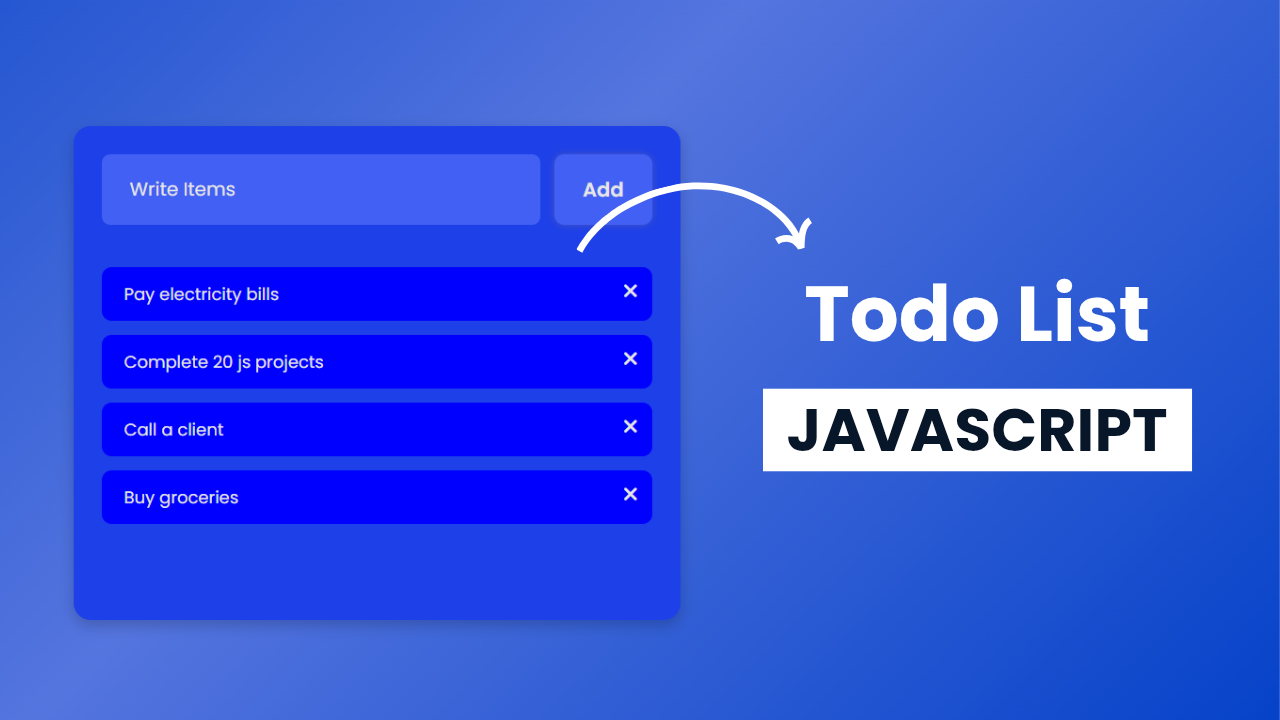
In this project, we are going to build a simple yet functional To-Do List application using HTML, CSS, and JavaScript. The interface will allow users to add tasks dynamically, mark them as completed, and remove them when no longer needed. The input field will let users type in a task, and clicking the “Add” button will display the task in a list format. Each task will have a delete button to remove it from the list. Clicking on a task will apply a strikethrough effect, indicating its completion.
HTML Code:
....
<!DOCTYPE html>
<html lang="en">
<head>
    <meta charset="UTF-8">
    <meta name="viewport" content="width=device-width, initial-scale=1.0">
    <title>Document</title>
    <link rel="stylesheet" href="style.css">
    <link rel="stylesheet" href="https://cdnjs.cloudflare.com/ajax/libs/font-awesome/6.7.2/css/all.min.css">
</head>
<body>
    <div class="wrapper">
        <div class="box">
            <input placeholder="Write Items" type="text" id="inputData" autofocus>
            <button onclick="addItem()" id="clickBtn">Add</button>
        </div>
        <ul id="content"></ul>
    </div>

    <script src="script.js"></script>
</body>
</html>
...
Explanation:
The HTML file begins by linking external resources to enhance the project’s functionality and design. The first <link> tag imports style.css, which contains custom styling for the to-do list.
The second <link> tag imports Font Awesome from a CDN, which provides access to various icons, such as the “X” mark used for deleting tasks. These external files improve the visual appeal and usability of the to-do list.
The <body> section contains a main wrapper <div class="wrapper">, which acts as the container for the entire to-do list application. Inside this wrapper, a <div class="box"> holds the input field and button.
The input field (<input id="inputData">) allows users to type their tasks, while the button (<button onclick="addItem()">Add</button>) is used to add new tasks to the list dynamically.
Below this input section, an unordered list (<ul id="content">) is included, serving as a placeholder for tasks that will be added dynamically.
Each new task is inserted as a list item (<li>) inside this <ul>. The id="content" helps JavaScript locate this section and manipulate it by inserting, updating, or removing tasks as needed.
The <script> tag at the bottom of the <body> section links to an external JavaScript file (script.js). Placing the script tag at the end ensures that all HTML elements are loaded before JavaScript executes, preventing errors when trying to manipulate elements that do not yet exist in the DOM.
CSS Code:
...
@import url('https://fonts.googleapis.com/css2?family=Poppins:ital,wght@0,100;0,200;0,300;0,400;0,500;0,600;0,700;0,800;0,900;1,100;1,200;1,300;1,400;1,500;1,600;1,700;1,800;1,900&display=swap');

* {
    padding: 0;
    margin: 0;
    box-sizing: border-box;
    font-family: "Poppins", serif;
}

body {
    height: 100vh;
    display: flex;
    justify-content: center;
    align-items: center;
    background: linear-gradient(135deg, #0240c8, #5575df, #0240c8);
}

.wrapper {
    width: 430px;
    min-height: 350px;
    border-radius: 12px;
    background: #1e40e8;
    padding: 20px;
    overflow: hidden;
    box-shadow: 0 4px 10px rgba(0, 0, 0, 0.2);
    display: flex;
    flex-direction: column;
    position: relative;
}

.box {
    display: flex;
    width: 100%;
    margin-bottom: 10px;
}

.box input {
    width: 100%;
    margin-right: 10px;
    border: 0;
    outline: none;
    padding: 15px 20px;
    border-radius: 6px;
    background: #4360f4;
    color: #e6e6e6;
}

input::placeholder {
    color: #e6e6e6;
}

.box button {
    border: 0;
    outline: none;
    padding: 10px 20px;
    font-size: 14px;
    font-weight: 600;
    border-radius: 7px;
    background: #4360f4;
    cursor: pointer;
    color: #e6e6e6;
    box-shadow: 0px 0px 5px rgba(128, 128, 128, 0.409);
}

li {
    position: relative;
    list-style: none;
    margin-top: 10px;
    padding: 10px 16px;
    font-size: 12px;
    border-radius: 7px;
    background: rgb(0, 0, 255);
    color: #e6e6e6;
    user-select: none;
    box-shadow: 0px 4px 10px rgba(128, 128, 128, 0.409);
}

li.done {
    background: rgba(0, 0, 255, 0.37);
    text-decoration: line-through;
}

i {
    position: absolute;
    right: 10px;
    top: 10px;
    font-size: 14px;
    cursor: pointer;
}

...
Explanation:
It begins by importing the “Poppins” font from Google Fonts, which is applied throughout the project to give it a modern and clean look. A universal selector (*) is used to reset default margin and padding for all elements while setting box-sizing: border-box to ensure that width and height calculations include padding and borders.
The body is styled with a full-height layout (height: 100vh) and uses display: flex with justify-content: center and align-items: center to keep the to-do list centered on the screen. The background is a gradient transitioning between shades of blue, giving the interface a smooth and attractive look.
The .wrapper class is the main container for the to-do list. It is given a fixed width of 430px and a minimum height of 350px, ensuring that the content is neatly contained. It has a border-radius: 12px for rounded corners and a box-shadow effect to create a subtle depth, making it stand out from the background.
The background: #1e40e8 color gives it a deep blue appearance, matching the overall gradient theme. The .wrapper also includes padding: 20px to ensure the inner content has enough spacing and does not touch the edges.
Inside the wrapper, the .box class is used to style the input and button section. The display: flex property ensures that the input field and button are aligned in a row. The input field (.box input) is styled with width: 100% to take up the available space and has padding: 15px 20px for a comfortable typing experience.
Its border: 0 and outline: none create a clean and seamless design, while the border-radius: 6px gives it a soft rounded shape. The background of the input field is a slightly darker blue (#4360f4), and the text color is #e6e6e6, ensuring good readability. The ::placeholder selector is used to style the placeholder text in the input field with the same color for consistency.
The .box button follows a similar styling approach to match the input field. It has a border: 0 and outline: none for a clean appearance, and padding: 10px 20px to make it easy to click. The font size is set to 14px, and font-weight: 600 makes the text bold for better visibility.
The background color matches the input field, and the button has a slight box-shadow effect to enhance its visual appeal. The cursor: pointer property ensures that the button changes when hovered, indicating interactivity.
Each task in the to-do list is styled using the li selector. The list items are given a background: rgb(0, 0, 255), making them stand out against the wrapper. They have padding: 10px 16px, border-radius: 7px, and box-shadow for a modern look.
The text color is set to #e6e6e6 for readability. The user-select: none property ensures that users cannot accidentally highlight the text while interacting with the list.
When a task is marked as complete, the .done class is applied. This changes the background color to a transparent blue (rgba(0, 0, 255, 0.37)) and adds a text-decoration: line-through effect to indicate that the task has been completed. This visual change helps users differentiate between pending and completed tasks.
The delete icon (<i>) is styled to be positioned absolutely within each task item. The right: 10px and top: 10px properties place it in the upper right corner of each list item. The font-size: 14px ensures it is easily visible but not too large. The cursor: pointer makes it clear that the icon is clickable, allowing users to remove tasks when needed.
JavaScript Code:
....

const data = document.querySelector("#inputData");
const contentItem = document.querySelector("#content");

const addItem = () => {
  if (data.value) {
    const listItem = document.createElement("li");
    listItem.innerHTML = `
                 ${data.value}
                 <i class="fa-solid fa-xmark">
            `;
    data.value = "";
    listItem.addEventListener("click", () => {
      listItem.classList.toggle("done");
    });

    listItem.querySelector("i").addEventListener("click", () => {
      listItem.remove();
    });
    contentItem.prepend(listItem);
  }
};
Explanation:
It starts by selecting two important elements from the HTML document using document.querySelector(): #inputData (the input field where users type tasks) and #content (the unordered list where tasks are displayed). These elements are stored in the variables data and contentItem, respectively, for easy access throughout the script.
The core functionality is handled by the addItem() function, which is triggered when the “Add” button is clicked. First, the function checks if the input field (data.value) contains any text. If the input is empty, the function does nothing, preventing blank tasks from being added. If there is text, a new <li> element is created using document.createElement("li"). This <li> element represents an individual task and is dynamically inserted into the task list.
The inner HTML of the newly created <li> contains two parts: the task text and a delete icon (<i class="fa-solid fa-xmark">). The task text is taken from data.value, and after creating the task, the input field is cleared (data.value = "") so users can easily type a new task without manually erasing the previous input.
To make the task interactive, an event listener is added to listItem. When a user clicks on a task, the .done class is toggled using listItem.classList.toggle("done"). This class applies a visual effect, changing the background color and adding a strikethrough (text-decoration: line-through) to indicate that the task is completed. Clicking again removes the class, marking the task as incomplete.
The delete functionality is handled by another event listener. The <i> element inside each <li> is selected using listItem.querySelector("i"), and an event listener is added to it. When the user clicks the delete icon, the corresponding <li> element is removed from the list using listItem.remove(). This ensures that tasks can be deleted individually without affecting others.
The final step in the function is inserting the new task into the task list (contentItem.prepend(listItem)). The prepend() method places the new task at the beginning of the list, meaning the most recently added tasks appear at the top. This improves user experience by keeping new tasks easily accessible without scrolling.
Source Code:
Download “To-do-List.7z” To-do-List.7z – Downloaded 532 times – 1.48 KB
Conclusions:
In this project, we built a simple yet interactive to-do list using HTML, CSS, and JavaScript. The HTML structure provides an input field, a button, and a dynamic list where tasks are displayed. The CSS enhances the visual appeal with a modern gradient background, smooth styling, and responsive elements. The JavaScript adds functionality, allowing users to add tasks, mark them as completed, and remove them dynamically. Overall, this project demonstrates how basic web technologies work together to create a fully functional and user-friendly application.