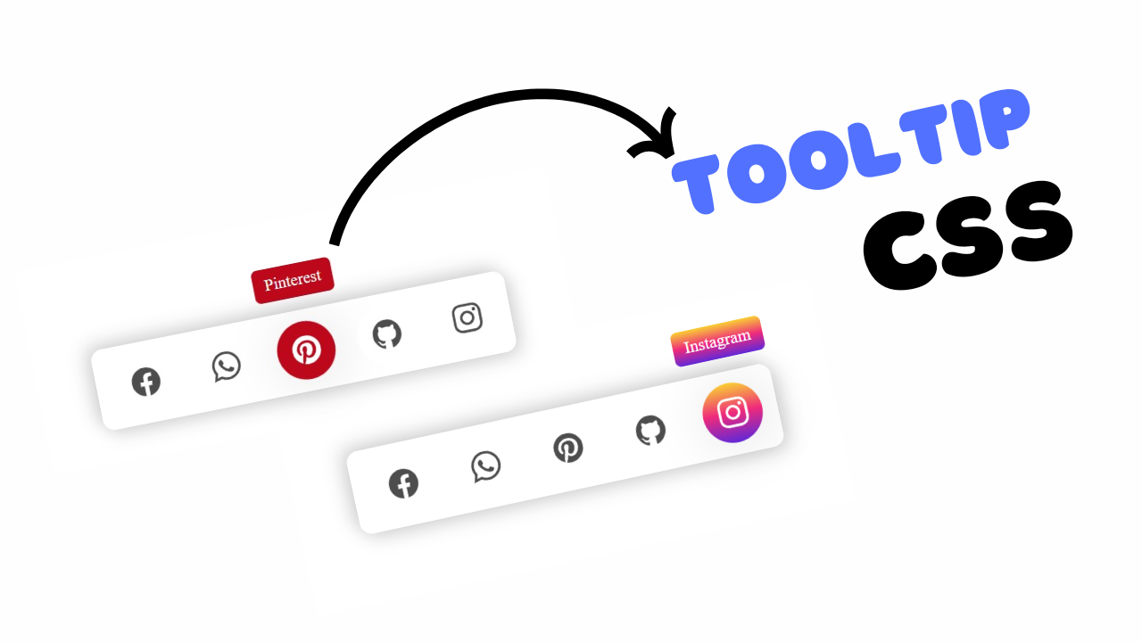
project preview
Folder Structure:
- First we will need to create a folder for our project.
- A second folder will be created for images.
- Then we will need to create files index.html and style.css to get start
- At last we will link our css file with html
Introduction:
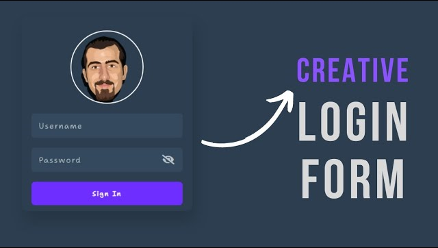
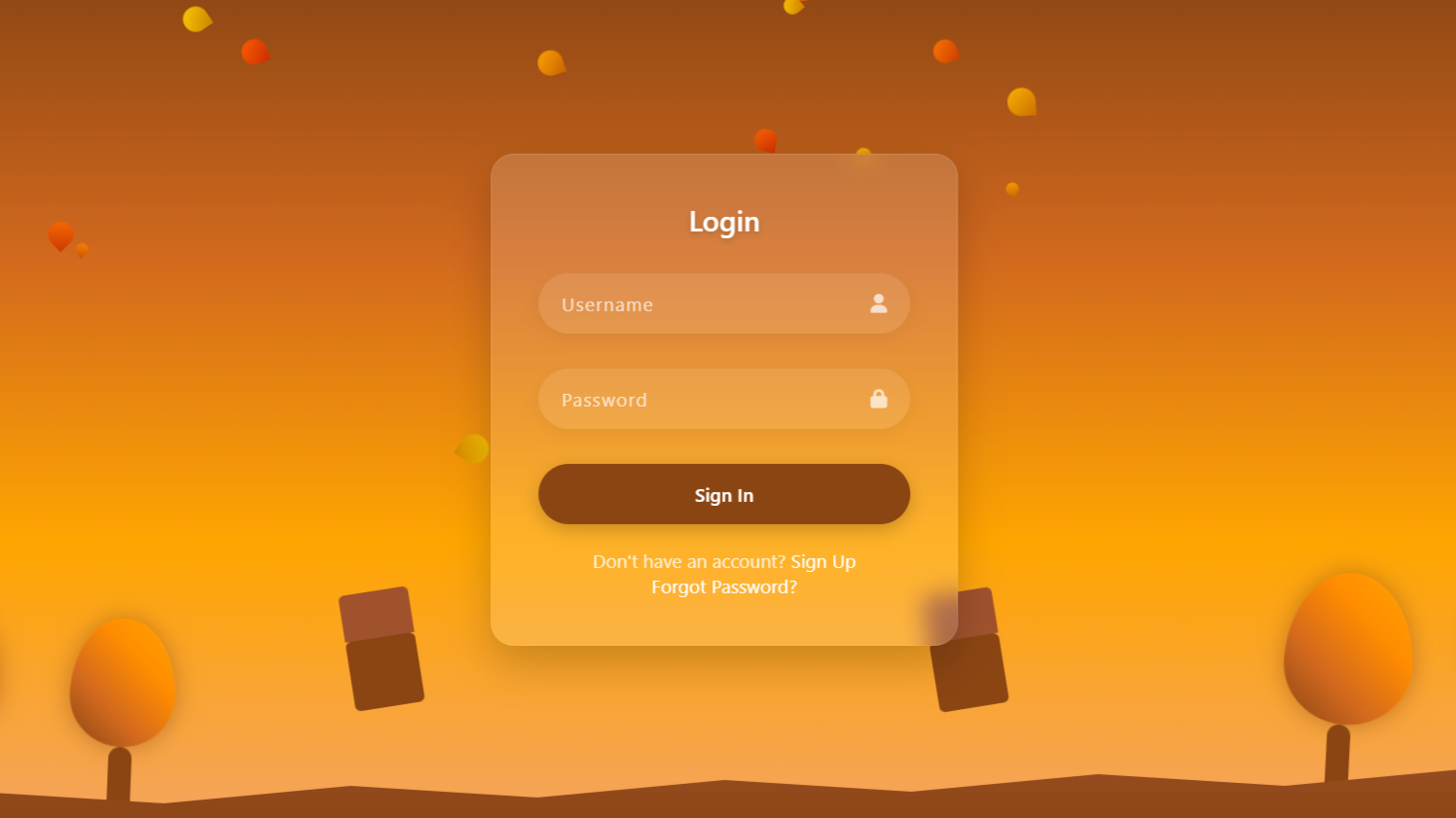
In this tutorial, we will create a stylish login form with a show and hide password using javascript. The form includes fields for a username and password, and a button to toggle the visibility of the password, providing users with an enhanced user experience. We’ll design the form with a modern look, incorporating rounded input boxes and a profile image placeholder. By the end, you’ll have a fully functional login form that can be easily integrated into any website. This project is perfect for beginners looking to improve their frontend development skills.
HTML Code:
...
<!DOCTYPE html>
<html lang="en">

<head>
  <meta charset="UTF-8">
  <meta name="viewport" content="width=device-width, initial-scale=1.0">
  <meta http-equiv="X-UA-Compatible" content="ie=edge">
  <title>Login Form with Hide & Show Password</title>
  <link rel="stylesheet" href="style.css">
  <link rel="stylesheet" href="https://cdnjs.cloudflare.com/ajax/libs/font-awesome/6.6.0/css/all.min.css">
</head>

<body>
  <div class="wrapper">
    <div class="profile">
      <img src="images/user4.png" alt="">
    </div>
    <div class="input-box">
      <input type="text" required>
      <label for="">Username</label>
    </div>
    <div class="input-box">
      <input class="pass" type="password" spellcheck="false" required>
      <label for="">Password</label>
      <i class="fas fa-eye-slash toggle"></i>
    </div>
    <div class="btn">
      <input type="button" name="" value="Sign In">
    </div>
  </div>
  <script type="text/javascript">
    const toggle = document.querySelector(".toggle");
    input = document.querySelector(".pass");

    toggle.addEventListener("click", () => {
      if (input.type === "password") {
        input.type = "text";
        toggle.classList.replace("fa-eye-slash", "fa-eye");
      } else {
        input.type = "password";
        toggle.classList.replace("fa-eye", "fa-eye-slash");
      }
    })
  </script>
</body>

</html>
..
....
Explanation:
The body contains a main div with the class wrapper, which acts as the container for the login form elements. Within this wrapper, there is a profile section featuring an image tag (<img>) for a user profile picture.
Next, there are two div elements with the class input-box that hold the input fields for “Username” and “Password.” The input for the username is a standard text input, while the password input uses the type="password" attribute to mask the characters.
Each input field is followed by a <label> that provides descriptive text for the fields. An icon element <i> is included within the password input box for toggling the password visibility.
The button for submission is created with an <input> element of type="button" and styled to look like a typical submit button. The JavaScript code at the bottom handles the toggle functionality by adding an event listener to the icon.
When clicked, it checks the current type of the password input field. If it’s a password, it changes it to text, revealing the characters, and switches the icon class to indicate the new state. This toggling enhances user experience by allowing them to see or hide their password as needed.
CSS Code:
...
@import url('https://fonts.googleapis.com/css2?family=Shantell+Sans:wght@300&display=swap');

* {
  padding: 0;
  margin: 0;
  box-sizing: border-box;
  font-family: 'Shantell Sans', cursive;
  font-weight: 600;
  letter-spacing: 2px;
}

html,
body {
  display: grid;
  height: 100%;
  place-items: center;
  background: #2c3e50;
}

.wrapper {
  position: absolute;
  width: 350px;
  height: 400px;
  padding: 20px;
  border-radius: 11px;
  box-shadow: 5px 20px 30px rgba(0, 0, 0, 0.15);
}

.profile {
  width: 150px;
  height: 150px;
  border: 2px solid #fff;
  overflow: hidden;
  padding: 10px 20px;
  border-radius: 50%;
  margin: 10px auto;
}

.profile img {
  width: 90%;
}

.wrapper .input-box {
  position: relative;
  height: 50px;
  background-color: #34495e;
  margin-top: 20px;
  border-radius: 10px;
}

.input-box input {
  position: absolute;
  width: 100%;
  height: 100%;
  outline: none;
  padding: 20px;
  color: #fff;
  background: #34495e;
  border: 2px solid #34495e;
  border-radius: 6px;
  font-size: 18px;
  font-weight: 300;
}

input:is(:focus, :valid) {
  border-color: #34495e;
}

.input-box :is(label, i) {
  position: absolute;
  top: 50%;
  transform: translateY(-50%);
  color: #bdc3c7;
  transition: all 0.2s ease;
}

input:is(:focus, :valid)~label {
  color: #bdc3c7;
  top: 0;
  font-size: 12px;
  font-weight: 500;
  background: #34495e;
}

.input-box label {
  left: 15px;
  pointer-events: none;
  font-size: 16px;
  font-weight: 400;
}

.input-box i {
  right: 15px;
  cursor: pointer;
  font-size: 20px;
}

input:is(:focus, :valid)~i {
  color: #bdc3c7;
}

.btn {
  margin-top: 20px;
}

input[type="button"] {
  border: 0;
  outline: 0;
  padding: 15px 125px;
  background: #6E2EFF;
  color: #fff;
  border-radius: 7px;
  cursor: pointer;
  transition: background 0.3s;
}

input[type="button"]:hover {
  background: #6E27D4;
}
..
...
Explanation:
The `@import` statement at the beginning imports the “Shantell Sans” font from Google Fonts, which is applied throughout the form for a consistent, unique look.
The universal selector `*` sets a baseline style by removing default padding and margin from all elements, applying `box-sizing: border-box` to include padding and borders in element dimensions, and setting a cursive font with a weight of 600 and a letter spacing of 2px for a slightly spaced-out text appearance.
The `html` and `body` elements are styled with `display: grid` and `place-items: center` to center the form both horizontally and vertically within the viewport. The background color for the entire page is set to a dark shade `#2c3e50`, creating a contrasting backdrop for the lighter form elements.
The `.wrapper` class styles the container of the form with a fixed width and height, rounded corners, and a subtle shadow (`box-shadow`) to elevate it visually against the background. This container is also positioned `absolute` to stay centered on the screen.
Within the form, the `.profile` class styles a circular area for a profile picture using a border, padding, and `border-radius: 50%` to create a perfect circle. The image inside is scaled to 90% width to fit neatly within this circle.
The `.input-box` class is designed to give each input field a custom look with a specific height, background color (`#34495e`), margin, and rounded corners, ensuring a cohesive design.
For the input fields, the `input` selector sets the width and height to fill the input box, removing outlines to eliminate the default browser styling, and applying padding for text spacing.
It uses the `:is(:focus, :valid)` pseudo-class to change the border color dynamically when the field is focused or contains valid data, ensuring that the user has visual feedback when interacting with the form. The combination of `.input-box :is(label, i)` positions the labels and icons in the center vertically and controls their color and transition, creating a smooth shift when the input is active.
Additionally, the label for each input field (`input:is(:focus, :valid)~label`) animates upwards and shrinks when the field is focused or filled, giving a clean, modern input field design where the label does not overlap the user’s text. The icon (`.input-box i`) for toggling the password visibility is positioned to the right of the input field and changes color on focus or validity to indicate interactivity.
Finally, the `.btn` class styles the container of the button, while `input[type=”button”]` styles the button itself with padding, a background color (`#6E2EFF`), and rounded corners.
The hover state changes the background color to a darker shade (`#6E27D4`), providing a subtle interactive effect. The overall CSS design focuses on creating a sleek, user-friendly interface that guides the user intuitively through the form-filling process.
JavaScript Code:
...
    const toggle = document.querySelector(".toggle");
    input = document.querySelector(".pass");

    toggle.addEventListener("click", () => {
      if (input.type === "password") {
        input.type = "text";
        toggle.classList.replace("fa-eye-slash", "fa-eye");
      } else {
        input.type = "password";
        toggle.classList.replace("fa-eye", "fa-eye-slash");
      }
    })
...
Explanation:
The JavaScript code is responsible for implementing the “Show/Hide Password” functionality in the login form. It begins by selecting the elements needed for this feature: the eye icon (`.toggle`) and the password input field (`.pass`).
An event listener is then added to the eye icon to listen for `click` events. When the icon is clicked, the script checks the current `type` attribute of the password input field.
If the `type` is set to `”password”`, the script changes it to `”text”`, making the password visible to the user. Simultaneously, the icon’s class is updated from `fa-eye-slash` (a closed eye) to `fa-eye` (an open eye), visually indicating that the password is now visible.
If the input field’s type is `”text”`, the script switches it back to `”password”`, hiding the password again, and the icon class is reverted to `fa-eye-slash`. This simple toggle mechanism enhances user experience by allowing users to view or hide their password as needed, improving both security and usability.
Source Code:
Download “Login-H-S-Pass.zip” Login-H-S-Pass.zip – Downloaded 408 times – 336.27 KBConclusions:
In this project, we created a modern and interactive login form using HTML, CSS, and JavaScript. We structured the form with input fields for a username and password, adding a profile image for a personalized touch. The CSS was used to design a visually appealing layout with smooth transitions and responsive elements, ensuring a great user experience across devices. The JavaScript added dynamic functionality, allowing users to toggle the visibility of their password securely and conveniently.
