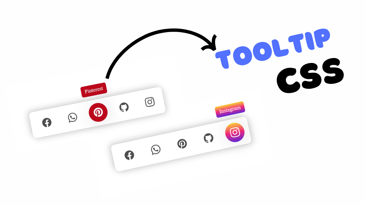
project preview
Folder Structure:
- First we will need to create a folder for our project
- Then inside it we will create files for our project index.html, style.css, and script.js
- At last we will link our css and js files with html.
Introduction:
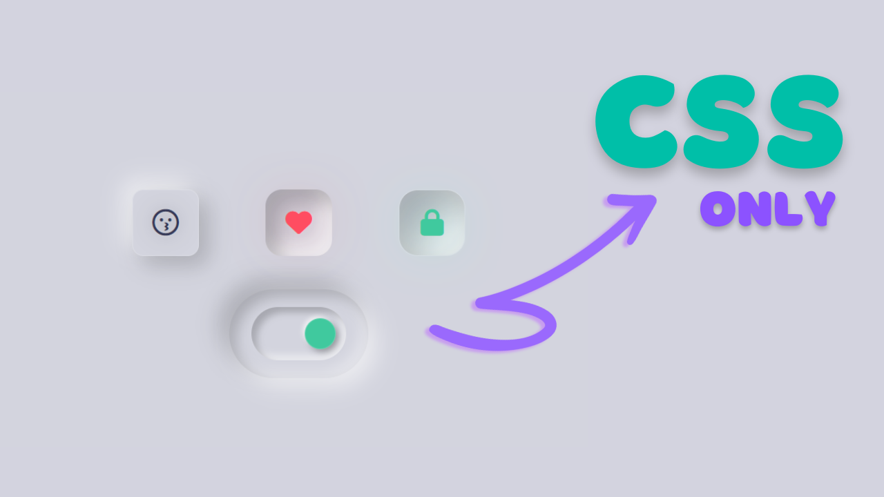
In this tutorial, we are going to create a stunning neumorphism toggle switch using html and css, and a bit of JavaScript. Neumorphism is a popular design trend that combines skeuomorphism and flat design to create a soft, 3D look that appears to emerge from the background. Our toggle switch will feature smooth animations and a glow effect, enhancing the user interaction experience. We will use Font Awesome icons to visually represent the state changes, such as locking and unlocking or showing different emotions.
HTML Code:
...
<!DOCTYPE html>
<html lang="en">

<head>
  <meta charset="UTF-8">
  <meta name="viewport" content="width=device-width, initial-scale=1.0">
  <title>Neumorphic Toggle Switch using Html and CSS</title>
  <link rel="stylesheet" href="style.css">
  <link rel="stylesheet" href="https://cdnjs.cloudflare.com/ajax/libs/font-awesome/6.5.2/css/all.min.css">
</head>

<body>

  <!-- Main wrapper for the content -->
  <div class="wrapper">
    <!-- Container for the toggle buttons -->
    <div class="box">
      <!-- Toggle button 1 -->
      <input type="checkbox" class="cb" id="cb1">
      <label for="cb1" class="button b1">
        <!-- Icons for the toggle button 1 -->
        <i class="far fa-face-kiss nc"></i>
        <i class="fas fa-face-kiss-wink-heart checked"></i>
      </label>
      <!-- Toggle button 2 -->
      <input type="checkbox" class="cb" id="cb2">
      <label for="cb2" class="button b2">
        <!-- Icons for the toggle button 2 -->
        <i class="far fa-heart nc"></i>
        <i class="fas fa-heart checked"></i>
      </label>
      <!-- Toggle button 3 -->
      <input type="checkbox" class="cb" id="cb3">
      <label for="cb3" class="button b3">
        <!-- Icons for the toggle button 3 -->
        <i class="fas fa-unlock nc"></i>
        <i class="fas fa-lock checked"></i>
      </label>
    </div>
    <!-- Centered toggle switch container -->
    <div class="box box-center">
      <div class="neubtn box box-center" id="outer">
        <!-- Main toggle switch -->
        <input type="checkbox" class="cb" id="cb4">
        <label for="cb4" class="toggle" onclick="toggleClasses()">
          <div class="toggle-inner"></div>
        </label>
      </div>
    </div>
  </div>

  <!-- External JavaScript file -->
  <script src="script.js"></script>
</body>

</html>
...
Explanation:
The <link> elements in the <head> section imports external stylesheets, including a custom stylesheet (style.css) and Font Awesome for icon usage.
The <body> contains a main <div> with the class wrapper, acting as a container for the content. Inside this wrapper, there are two main sections: one for the neumorphic toggle buttons and another for a main toggle switch.
Each toggle button is represented by an <input> element of type checkbox and associated <label> elements styled to look like buttons using classes (b1, b2, b3).
Icons within these labels change based on the checked state of the inputs, thanks to the Font Awesome classes and dynamic class handling with JavaScript. The toggle switch, nested within a div with class neubtn, is designed to exhibit a neumorphic design with rounded corners and shadow effects.
The switch’s functionality is enhanced with JavaScript, which dynamically adds or removes classes based on the toggle’s state to create smooth animations and a glowing effect.
This setup makes use of HTML, CSS, and JavaScript to provide an engaging user interface with visually appealing transitions and responsive elements.
CSS Code:
...
html,
body {
  display: grid;
  height: 100%;
  place-items: center;
  background-color: #d3d4de;
  /* Background color of the page */
}

/* Hide the checkboxes */
input[type="checkbox"] {
  display: none;
}

.box {
  display: flex;
  /* Flexbox for horizontal alignment */
}

.box-center {
  justify-content: space-around;
  /* Center items horizontally */
  align-items: center;
  /* Center items vertically */
}

label {
  cursor: pointer;
  /* Pointer cursor on hover */
}

.button {
  height: 60px;
  width: 60px;
  margin: 30px;
  display: flex;
  justify-content: center;
  align-items: center;
  box-sizing: border-box;
  user-select: none;
  /* Prevent text selection */
}

/* Button 1 styling */
.b1 {
  border-radius: 10px;
  border: 1px solid rgba(255, 255, 255, 0.2);
  box-shadow: 8px 8px 20px rgba(0, 0, 0, 0.2),
    -8px -8px 20px rgba(255, 255, 255, 0.6);
}

/* Checked state for button 1 */
.cb:checked+.b1 {
  box-shadow: inset 8px 8px 10px rgba(0, 0, 0, 0.2),
    inset -8px -8px 10px rgba(255, 255, 255, 0.6);
}

/* Button 2 styling */
.b2 {
  border-radius: 15px;
  box-shadow: 12px 12px 26px rgba(0, 0, 0, 0.2),
    -12px -12px 26px rgba(255, 255, 255, 0.6);
}

/* Checked state for button 2 */
.cb:checked+.b2 {
  box-shadow: inset 12px 12px 16px rgba(0, 0, 0, 0.2),
    inset -12px -12px 16px rgba(255, 255, 255, 0.6);
}

/* Button 3 styling */
.b3 {
  border-radius: 17px;
  border: 1px solid rgba(255, 255, 255, 0.2);
  box-shadow: 16px 16px 30px rgba(0, 0, 0, 0.2),
    -16px -16px 30px rgba(255, 255, 255, 0.6);
}

/* Checked state for button 3 */
.cb:checked+.b3 {
  box-shadow: inset 16px 16px 30px rgba(0, 0, 0, 0.2),
    inset -16px -16px 30px rgba(255, 255, 255, 0.6);
}

/* Hide non-checked icons */
.cb:checked+label .nc {
  display: none;
}

/* Hide checked icons */
.cb:not(:checked)+label .checked {
  display: none;
}

i {
  font-size: 24px;
  color: #353857;
  text-shadow: 0 0 20px rgba(0, 0, 0, 0.3);
  transform: all 0.5s ease;
}

/* Glow effect for checked state of button 1 */
.cb:checked+.b1.glow i {
  color: #e3a34f;
  text-shadow: 0 0 50px rgba(255, 174, 69, 0.9);
}

/* Glow effect for checked state of button 3 */
.cb:checked+.b3.glow i {
  color: #40c99e;
  text-shadow: 0 0 50px rgba(82, 255, 100, 0.9);
}

/* Glow effect for checked state of button 2 */
.cb:checked+.b2.glow i {
  color: #ff4d61;
  text-shadow: 0 0 50px rgba(201, 64, 80, 0.9);
}

/* Remove focus outline */
:focus {
  -webkit-tap-highlight-color: transparent;
  outline: none !important;
}

/* Toggle switch styling */
.toggle {
  border-radius: 100px;
  width: 65px;
  max-height: 40px;
  padding: 10px;
  box-shadow: inset 5px 5px 6px rgba(0, 0, 0, 0.2),
    inset -5px -5px 6px rgba(255, 255, 255, 0.5);
  display: flex;
  flex-direction: column;
}

/* Move toggle inner element on checked state */
.cb:checked+.toggle>.toggle-inner {
  transform: translateX(38px);
  background: #40c99e;
}

/* Inner element of the toggle switch */
.toggle-inner {
  width: 28px;
  height: 28px;
  border-radius: 50px;
  box-sizing: border-box;
  border: 1px solid rgba(255, 255, 255, 0.2);
  background-color: rgba(0, 0, 0, 0.25);
  box-shadow: 3px 3px 6px rgba(0, 0, 0, 0.3),
    -2px -2px 4px rgba(255, 255, 255, 0.7);
  transition: all 0.3s ease-out;
}

/* Outer element of the toggle switch */
.neubtn {
  width: 100px;
  height: 40px;
  padding: 20px 12.5px;
  border-radius: 100px;
  transition: box-shadow 2s ease;
  box-shadow: 8px 8px 20px rgba(0, 0, 0, 0.2),
    -8px -8px 20px rgba(255, 255, 255, 0.6);
}

/* Add shadow effect when toggled */
.neubtn-move {
  box-shadow: 8px 8px 20px rgba(255, 255, 255, 0.6),
    -8px -8px 20px rgba(0, 0, 0, 0.2),
    inset 6px 6px 12px rgba(0, 0, 0, 0.2),
    inset -6px -6px 12px rgba(255, 255, 255, 0.4);
}
...
Explanation:
The CSS code provided is designed to create a neumorphic design effect for toggle buttons and switches, which involves using soft shadows and subtle gradients to give elements a 3D appearance that seems to be carved out of or raised above the background.
The `html` and `body` elements are set to use a CSS Grid layout, centering all content vertically and horizontally within the viewport, and applying a soft background color (`#d3d4de`).
The checkboxes themselves are hidden (`display: none`), and their visual appearance is controlled through adjacent sibling selectors (e.g., `.cb:checked + .b1`).
The `.box` class uses Flexbox for horizontal alignment, while `.box-center` centers its contents both horizontally and vertically. Each toggle button (`.b1`, `.b2`, `.b3`) has unique border-radius and box-shadow properties that create the illusion of depth through shadows on both the inside and outside of the buttons.
When checked, these buttons display inset shadows to simulate a pressed state, further enhanced by a glowing effect around the icons, managed by toggling the `.glow` class. The `i` elements, representing Font Awesome icons, are styled with font size, color, and a text shadow to match the neumorphic theme.
The `.toggle` class for the main switch includes rounded corners, padding, and inner shadows, giving the switch a three-dimensional look. Its child, `.toggle-inner`, is styled to simulate a draggable button with smooth transitions for movement and background changes when the switch is toggled (`.cb:checked + .toggle > .toggle-inner`).
The `.neubtn` and `.neubtn-move` classes control the outer switch’s shadow effects, creating dynamic visual feedback as the switch state changes. Overall, this CSS leverages shadows, gradients, and responsive positioning to craft an interactive, visually appealing neumorphic user interface.
JavaScript Code:
...
// Get references to the toggle switch and buttons
var switchButton = document.getElementById("cb4");
var switchOuter = document.getElementById("outer");
var buttons = document.getElementsByClassName("button");

// Function to toggle classes on the switch and buttons
function toggleClasses() {
    if (this.switchButton.checked == false) {
        // Add 'neubtn-move' class to switch outer element
        this.switchOuter.classList.add("neubtn-move");
        // Add 'glow' class to all buttons
        for (i =0; i < this.buttons.length; i++) {
            this.buttons[i].classList.add("glow");
        }
    } else {
        // Remove 'neubtn-move' class from switch outer element
        this.switchOuter.classList.remove("neubtn-move");
        // Remove 'glow' class from all buttons
        for (i =0; i < this.buttons.length; i++) {
            this.buttons[i].classList.remove("glow");
        }
    }
}

...
Explanation:
The JavaScript code provided is designed to handle the interactive behavior of a neumorphic toggle switch and three buttons, dynamically applying and removing specific CSS classes based on user interaction.
At the start, the script retrieves references to the HTML elements for the toggle switch (cb4), its outer container (outer), and all elements with the class button using document.getElementById and document.getElementsByClassName. The function toggleClasses() is defined to manage the visual state changes when the switch is toggled.
Inside the function, it first checks whether the toggle switch (switchButton) is not checked (this.switchButton.checked == false). If the switch is not checked, it adds the neubtn-move class to the outer container (switchOuter), giving it a pressed or active appearance, and also iterates through all button elements using a for loop to add the glow class to each, enhancing them with a glowing effect.
Conversely, if the toggle switch is checked, it removes the neubtn-move class from the outer container and the glow class from all buttons, returning them to their default, inactive state.
This functionality relies on class manipulation (classList.add() and classList.remove()) to dynamically adjust the CSS styling, providing visual feedback to users based on their interaction with the toggle switch.
The function is intended to be triggered by a click event listener attached to the label of the toggle switch (label for="cb4"), which calls toggleClasses() whenever the switch is toggled, effectively toggling the visual states of the elements in real time.
This script enhances user experience by seamlessly integrating JavaScript with CSS, creating an interactive and visually appealing neumorphic interface.
Source Code:
Download “Toggle-Switch.zip” Toggle-Switch.zip – Downloaded 561 times – 2.44 KB
Conclusions:
In this project, we created an interactive neumorphic toggle switch and button interface using HTML, CSS, and JavaScript. We utilized HTML to structure the toggle switch and buttons, CSS to style them with a modern neumorphic design, and JavaScript to add interactivity by dynamically toggling classes based on user actions. The project demonstrates how combining these technologies can create visually appealing and responsive user interfaces. By applying various effects and styles, we achieved an engaging design that responds to user input, enhancing both the functionality and aesthetic appeal of the elements.
