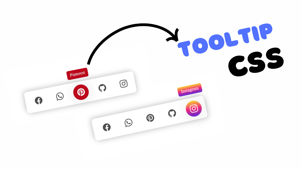
Project Preview
Folder Structure:
- First we will create a folder for our project
- Then inside it we will create a our files index.html and style.css
- At last we will link our css code in html file
Introduction:
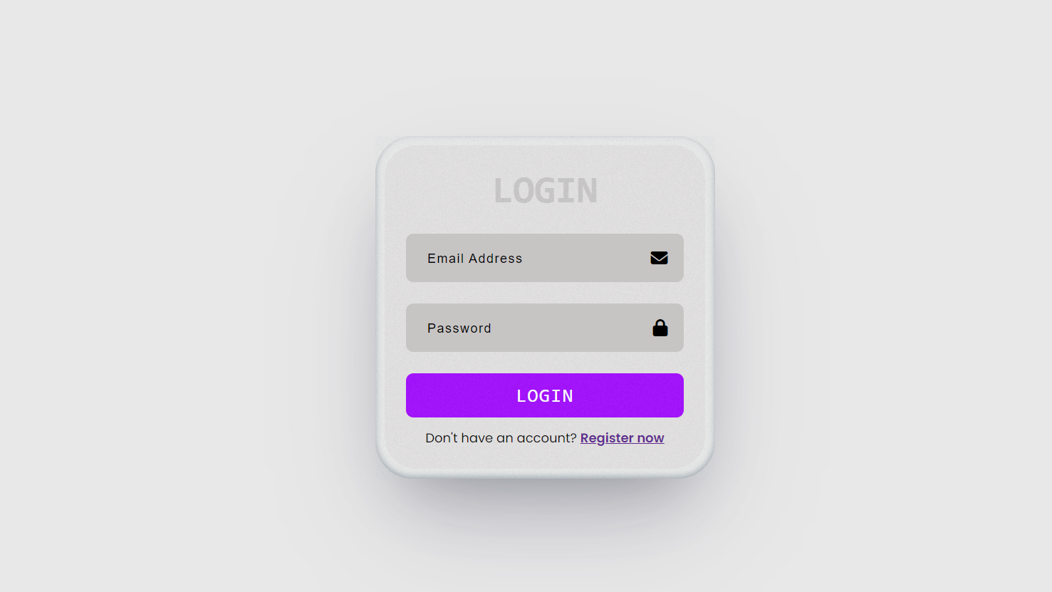
In this project, we are going to create a sleek and modern login form design using HTML and CSS, enhanced with Font Awesome icons for a visually appealing user interface. The form includes input fields for email and password, styled within a responsive card layout. We’ll also add interactive hover effects to the login button and links for enhanced user engagement. The design features a subtle overlay effect and a clean color palette, making it both functional and aesthetically pleasing. This form is ideal for use in any website’s login system.
HTML Code:
....
<!DOCTYPE html>
<html lang="en">
<head>
    <meta charset="UTF-8">
    <meta name="viewport" content="width=device-width, initial-scale=1.0">
    <title>Document</title>
    <link rel="stylesheet" href="style.css">
    <link rel="stylesheet" href="https://cdnjs.cloudflare.com/ajax/libs/font-awesome/6.6.0/css/all.min.css">
</head>
<body>
    <div class="card">
        <div class="card-overlay"></div>
        <div class="content">
            <h2>login</h2>
            <div class="input-group">
                <input type="email" name="" id="" placeholder="Email Address">
                <i class="fa-solid fa-envelope"></i>
            </div>
            <div class="input-group">
                <input type="password" placeholder="Password" name="" id="">
                <i class="fa-solid fa-lock"></i>
            </div>
            <button>Login</button>
            <p>Don't have an account? <a href="">Create now</a></p>
        </div>
    </div>
</body>
</html>
...
Explanation:
Inside the <body>, a <div> with the class card serves as the container for the login form. Another <div> with the class card-overlay is placed inside to add a background effect over the card, enhancing the design without affecting user interactions. The main content of the login form is housed in the content div, which is centered both horizontally and vertically.
The form includes a title (h2) that displays “Login” in uppercase letters. There are two input fields: one for the email and another for the password. Each input field is wrapped in an input-group div for easy layout management.
Font Awesome icons for the envelope and lock are placed next to the respective input fields using the <i> tag. A “Login” button follows, styled for a modern, sleek look, and there’s a prompt for users who don’t have an account, linking them to a signup page. Overall, the structure is clean, intuitive, and user-friendly.
CSS Code:
...
@import url('https://fonts.googleapis.com/css2?family=Poppins:ital,wght@0,100;0,200;0,300;0,400;0,500;0,600;0,700;0,800;0,900;1,100;1,200;1,300;1,400;1,500;1,600;1,700;1,800;1,900&display=swap');

* {
    margin: 0;
    padding: 0;
    box-sizing: border-box;
    font-family: 'Poppins', sans-serif;
}

html,
body {
    display: grid;
    height: 100%;
    place-items: center;
    background-color: #e8e8e8;
}

.card {
    position: relative;
    padding: 9px;
    background-color: #e8e8e8;
    border-radius: 35px;
    box-shadow: rgba(50, 50, 93, 0.25) 0px 50px 100px -20px,
        rgba(0, 0, 0, 0.3) 0px 30px 60px -30px,
        rgba(10, 37, 64, 0.35) 0px -2px 6px 0px inset;
}

.card-overlay {
    position: absolute;
    inset: 0;
    pointer-events: none;
    background: repeating-conic-gradient(#e8e8e8 0.0000001%, #93a1a1 0.000104%) 60% 60%/600% 600%;
    filter: opacity(10%) contrast(105%);
}

.content {
    display: flex;
    justify-content: center;
    align-items: center;
    flex-direction: column;
    width: 300px;
    background-color: #e2e0e0;
    border-radius: 30px;
    padding: 20px;
}

.content h2 {
    margin-bottom: 10px;
    font-size: 36px;
    font-weight: 900;
    color: #c7c4c4;
    text-align: center;
    text-transform: uppercase;
    font-family: monospace;
}

.content .input-group {
    position: relative;
    margin: 10px 0;
    width: 100%;
}

.content .input-group input {
    border: 0;
    outline: none;
    width: 100%;
    padding: 15px 20px;
    background-color: #c7c4c4;
    border-radius: 7px;
}

.content .input-group i {
    position: absolute;
    right: 15px;
    top: 50%;
    transform: translateY(-50%);
    color: #4d5151;
}

.content button {
    width: 100%;
    border: 0;
    outline: none;
    padding: 10px 20px;
    border-radius: 7px;
    font-size: 18px;
    background-color: #9d00ff;
    color: #fff;
    text-transform: uppercase;
    font-family: monospace;
    margin: 10px 0;
    cursor: pointer;
    letter-spacing: 1px;
    transition: 0.3s;
}

button:hover {
    background-color: #8200d3;
}

.content p {
    font-size: 12px;
}

.content p>a {
    font-weight: 600;
    transition: 0.3s;
}

.content p>a:hover {
    color: blue;
}

...
Explanation:
The global styles, such as resetting margins, padding, and setting the box-sizing property, ensure consistent behavior across all elements. The font family is set to ‘Poppins’ from Google Fonts, giving the form a modern and clean look.
The html and body tags use grid layout and centering techniques to ensure that the card is always placed in the center of the viewport. The background color of the page is a light grey, providing a subtle contrast to the card itself.
The .card class defines the structure of the login form, giving it padding, a light background color, rounded corners, and box-shadow effects to create a sense of depth.
The .card-overlay adds a gradient effect on top of the card, using a repeating-conic-gradient for a textured, artistic look, while keeping it subtle with reduced opacity.
The .content class, which holds the actual form elements, is flexbox-centered with rounded edges and a padding for spacing, making the form compact and neat.
Text elements like the form title (h2) are styled with large, bold fonts to grab attention, while input fields are styled with rounded corners and background colors that match the card’s theme.
Icons inside input fields are positioned absolutely, aligning to the right of the input for a clean, integrated design. The button has a bright, bold purple background with hover effects to encourage interactivity, while links are underlined with hover color transitions for better user engagement.
Overall, the CSS creates a cohesive and polished design with subtle effects to improve the user experience.
Source Code:
Download “Login-Form-Design.7z” Login-Form-Design.7z – Downloaded 423 times – 1.45 KB
Conclusions:
In this project, we successfully created a modern and responsive login form using HTML and CSS, enhanced with Font Awesome icons for visual appeal. We implemented a clean card layout with smooth hover effects, focusing on user interactivity and aesthetics. The design features a subtle overlay effect and a minimalistic color scheme, making the form both functional and attractive. We also ensured that the form is fully responsive, providing a seamless experience across different devices. This login form can be easily integrated into various web projects for a professional touch.
