Project Preview
Folder Structure:
- First we will need to create our main folder for our project so we are going to name it ImageGallery.
- Create files inside that folder index.html and style.css and then link the style.css with index.html
- Then at last create a folder name it Images and add images from that you want.
Introduction:
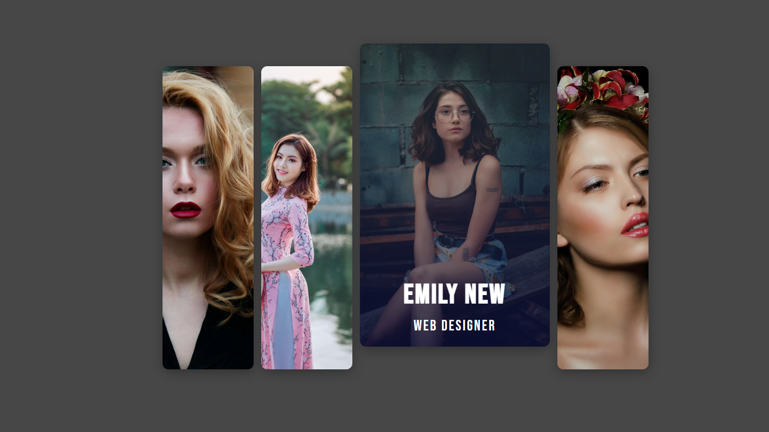
In this project, we are going to create responsive image gallery using HTML and CSS. The gallery will showcase multiple images arranged in a grid layout, with each image expanding smoothly upon hovering to reveal additional details, such as a name and title overlay.
Html Code:
...
<!DOCTYPE html>
<html lang="en">

<head>
  <meta charset="UTF-8">
  <!-- Sets the viewport to ensure the website is responsive -->
  <meta name="viewport" content="width=device-width, initial-scale=1.0">
  <title>Create Responsive Image Gallery using Html and CSS</title>
  <!-- Link to the external CSS stylesheet -->
  <link rel="stylesheet" href="style.css">
</head>

<body>
  <!-- Wrapper div that contains all the profile cards -->
  <div class="wrapper">
    <!-- Profile card for Jane Doe -->
    <div>
      <div class="content">
        <h2>Jane Doe</h2>
        <span>UI & UX Designer</span>
      </div>
    </div>
    <!-- Profile card for Alex Smith -->
    <div>
      <div class="content">
        <h2>Alex Smith</h2>
        <span>CEO Expert</span>
      </div>
    </div>
    <!-- Profile card for Emily New -->
    <div>
      <div class="content">
        <h2>Emily New</h2>
        <span>Web Designer</span>
      </div>
    </div>
    <!-- Profile card for Lisa Boley -->
    <div>
      <div class="content">
        <h2>Lisa Boley</h2>
        <span>Marketing Coordinator</span>
      </div>
    </div>
  </div>
</body>

</html>

..
Explanation:
The <body> section is where the main content of the webpage is placed, specifically the responsive image gallery. It starts with a <div> element with the class name “wrapper.” This “wrapper” serves as the container that holds all the individual image cards and controls the overall layout of the gallery using CSS.
Within the “wrapper” <div>, there are several child <div> elements, each representing an individual image card. These cards are designed to display an image in the background and overlay text information, such as the name and a title or role. Each image card <div> contains a nested <div> with the class “content.” The “content” <div> is structured to hold an <h2> element for the person’s name or the title of the image and a <span> element for the additional descriptive text, like a job title or description.
These nested “content” elements are initially hidden or partially visible and will only fully appear when the user hovers over the image card. The hover effect is controlled by CSS, allowing for a smooth transition that reveals more information in an engaging manner.
CSS Code:
...
@import url('https://fonts.googleapis.com/css2?family=Bebas+Neue&display=swap');

* {
    padding: 0;
    margin: 0;
    box-sizing: border-box;
}

html,
body {
    display: grid;
    height: 100%;
    place-items: center;
    background-color: #474747;
    font-family: "Bebas Neue", sans-serif;
}

.wrapper {
    width: 100%;
    display: flex;
    justify-content: center;
    height: 400px;
    gap: 10px;
    font-weight: 400;
    letter-spacing: 2px;
}

.wrapper>div {
    flex: 0 0 120px;
    border-radius: 0.5rem;
    transition: 0.5s ease-in-out;
    box-shadow: 1px 5px 15px rgba(0, 0, 0, 0.3);
    position: relative;
    cursor: pointer;
    overflow: hidden;
}

.wrapper>div:nth-of-type(1) {
    background: url("images/image1.webp") no-repeat 50% / cover;
}

.wrapper>div:nth-of-type(2) {
    background: url("images/image2.jpeg") no-repeat 50% / cover;
}

.wrapper>div:nth-of-type(3) {
    background: url("images/image3.webp") no-repeat 50% / cover;
}

.wrapper>div:nth-of-type(4) {
    background: url("images/image4.webp") no-repeat 50% / cover;
}

.wrapper>div .content {
    font-size: 1.5rem;
    color: #fff;
    display: flex;
    align-items: center;
    padding: 15px;
    flex-direction: column;
    height: 100%;
    opacity: 0;
    justify-content: flex-end;
    background: linear-gradient(0deg, rgba(2, 2, 46, 0.67) 0%, rgba(255, 255, 255, 0) 100%);
    transform: translateY(100%);
    transition: 0.5s ease-in-out, transform 0.5s 0.2s;
    visibility: hidden;
}

.wrapper>div .content span {
    display: block;
    margin-top: 5px;
    font-size: 1.2rem;
}

.wrapper>div:hover {
    flex: 0 0 250px;
    transform: translateY(-30px);
}

.wrapper>div:hover .content {
    opacity: 1;
    transform: translateY(0%);
    visibility: visible;
}

/* Media query for tablets (768px and below) */
@media (max-width: 768px) {
    .wrapper>div {
        flex: 0 0 90px;
        height: 300px;
    }

    .wrapper>div:hover {
        transform: translateY(0);
        flex: 0 0 150px;
    }

    .wrapper>div .content {
        font-size: 1.3rem;
    }

    .wrapper>div .content span {
        font-size: 1rem;
    }
}

/* Media query for mobile devices (480px and below) */
@media (max-width: 480px) {
    .wrapper {
        gap: 5px;
    }

    .wrapper>div {
        flex: 0 0 70px;
        height: 200px;
    }

    .wrapper>div:hover {
        transform: translateY(0);
        flex: 0 0 120px;
    }

    .wrapper>div .content {
        font-size: 1rem;
        padding: 10px;
    }

    .wrapper>div .content span {
        font-size: 0.9rem;
    }
}

..
Explanation:
The CSS code provided is responsible for styling the responsive image gallery, defining how the gallery looks and behaves across different devices and screen sizes. Here’s a breakdown of the CSS code:
Importing Google Fonts:
The `@import` statement imports the “Bebas Neue” font from Google Fonts, which is used throughout the gallery for a consistent and stylish typography.
Global Reset and Box Sizing:
The `*` selector resets the padding, margin, and sets `box-sizing` to `border-box` for all elements. This ensures that padding and borders are included within the element’s total width and height, making layout calculations more predictable.
Basic Styling for `html` and `body`:
The `html` and `body` selectors set up the main styling for the page, using CSS Grid to center the gallery both vertically and horizontally. The `height` is set to 100% to make the gallery occupy the full viewport, and a background color of `#474747` is applied to give a dark, neutral backdrop. The font family is set to “Bebas Neue” to match the imported font.
Styling the `.wrapper` Container:
The `.wrapper` class styles the main container for the gallery. It uses `display: flex` to arrange the image cards in a horizontal row and `justify-content: center` to center the cards within the container. The `gap` property adds space between the cards, and `height` is set to 400px to control the overall height of the gallery.
Styling Individual Image Cards:
The `.wrapper > div` selector targets each image card inside the `.wrapper`. The `flex` property controls the card size, initially set to a width of 120px. Each card has rounded corners (`border-radius`), a smooth transition effect (`transition`), a box shadow for depth, and `position: relative` to allow for absolute positioning of its child elements. `cursor: pointer` is added to indicate the cards are interactive, and `overflow: hidden` ensures content doesn’t spill out of the card’s boundaries.
Setting Background Images for Each Card:
The `.wrapper > div:nth-of-type(n)` selectors apply different background images to each card using the `background` property. This property also sets the image to cover the entire card and centers it within the card.
Styling the `.content` Overlay:
The `.wrapper > div .content` selector styles the overlay content that appears when hovering over a card. It sets the font size and color, centers the text vertically and horizontally, and uses flexbox to organize the content. Initially, the content is hidden by setting `opacity` to 0, `transform` to translate the element 100% downwards, and `visibility` to `hidden`. The background has a gradient that transitions from a dark color at the bottom to transparent at the top, adding a subtle overlay effect to the image.
Hover Effects for Image Cards:
The `.wrapper > div:hover` selector defines the hover effect for each card. When a user hovers over a card, it expands its width to 250px, and slightly translates upwards (`transform: translateY(-30px)`), creating a dynamic effect. The `.wrapper > div:hover .content` selector modifies the `.content` overlay on hover, making it fully visible by setting `opacity` to 1, `transform` to translate back to its original position, and `visibility` to `visible`. The transitions make these changes smooth and visually appealing.
Media Queries for Responsiveness:
The CSS includes two media queries to ensure the gallery is responsive:
– Tablets (768px and below): Adjusts the flex width to 90px, reduces the card height to 300px, and modifies font sizes for better readability on smaller screens. The hover effects are also adjusted to prevent the card from translating upwards.
– Mobile Devices (480px and below): Further reduces the size of the cards (`flex: 0 0 70px; height: 200px`) and adjusts the font sizes and padding to ensure the gallery remains functional and visually appealing on very small screens.
This CSS code effectively combines styling, hover effects, and media queries to create a visually appealing, interactive, and responsive image gallery that works seamlessly across all devices.
Source Code:
Download “Image-Gallery.zip” Image-Gallery-with-Hover-Effects.zip – Downloaded 237 times – 487.71 KB
Conclusions:
In this project, we successfully created a responsive image gallery using HTML and CSS. We structured the gallery with individual image cards, each featuring a hover effect that expands the card and reveals additional content. The CSS was carefully designed to provide a smooth user experience with visual transitions and dynamic interactions. Additionally, we implemented media queries to ensure that the gallery is fully responsive, adapting to various screen sizes from desktops to mobile devices.
