Introduction:
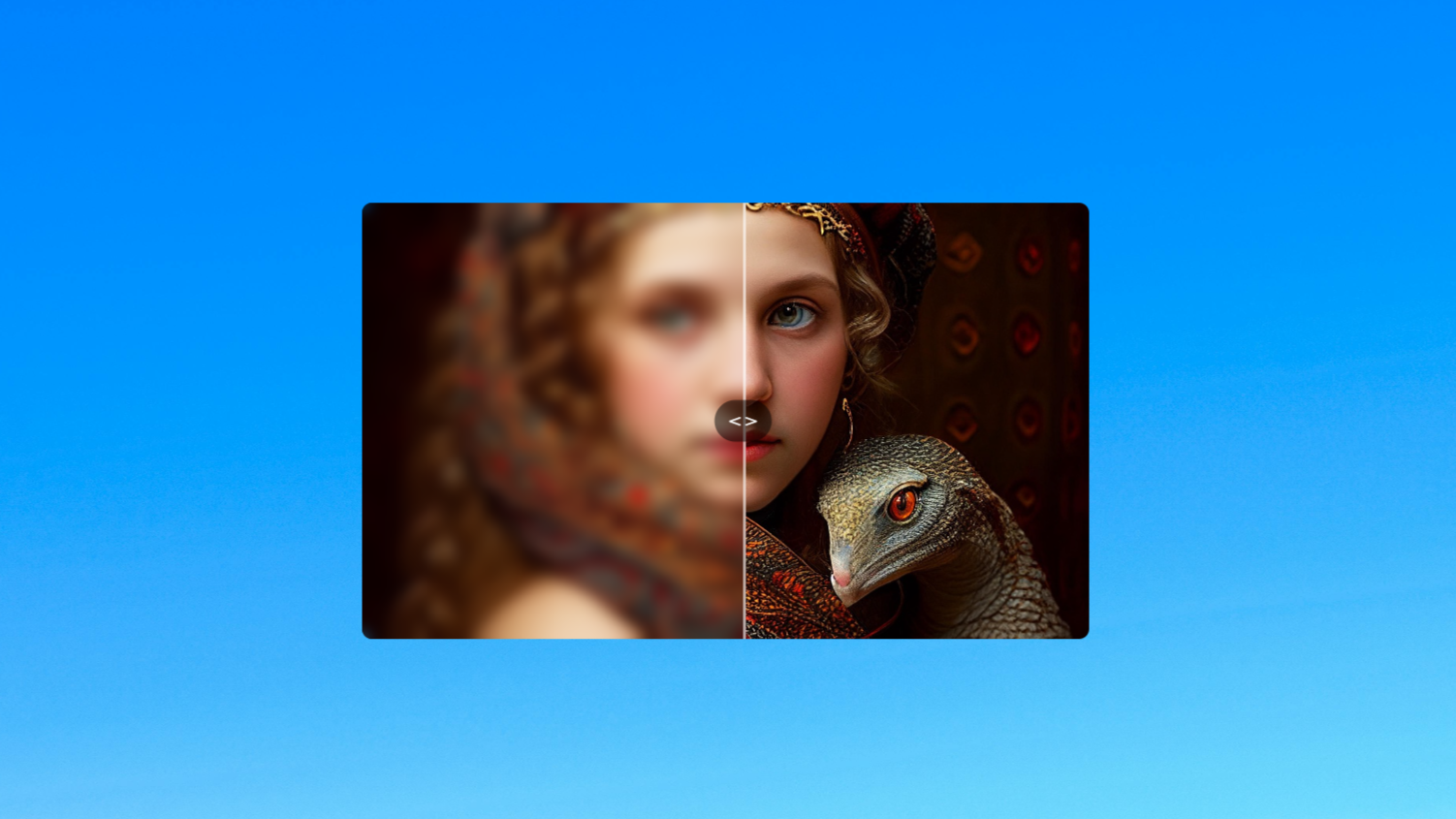
In this tutorial, we are going to create an interactive image blur slider effect using HTML, CSS, and JavaScript. The concept is simple yet visually appealing: we’ll display an image with a blur “mask” overlay on top. When the user clicks and drags horizontally across the image, the blurred portion dynamically resizes based on the cursor’s position.
Html Code:
....


<!DOCTYPE html>
<html lang="en">

<head>
  <meta charset="UTF-8" />
  <meta name="viewport" content="width=device-width, initial-scale=1.0" />
  <title>Image Blur Slider</title>
  <link rel="stylesheet" href="style.css">
</head>

<body>
  <div class="container">
    <img src="images/img1.jpg" alt="">
    <div class="mask" id="mask"></div>
  </div>

  <script src="script.js"></script>
</body>

</html>

....
Explanation:
Within the <body>, we place a single container <div> with the class container, which acts as a wrapper for the image and the blur mask. Inside this container, there’s an <img> tag that loads an image (img1.jpg) from the images folder. This image serves as the base visual content.
Following the image, there is another <div> with the class mask and an ID of mask. This div will serve as the interactive blur layer that users can drag to reveal or hide parts of the image. At the bottom of the body, we include a JavaScript file (script.js) using the <script> tag. This script will handle the dynamic dragging behavior of the blur mask, making the entire component interactive.
CSS Code:
...

* {
    box-sizing: border-box;
    user-select: none;
    margin: 0;
    padding: 0;
}

html,
body {
    display: grid;
    height: 100%;
    place-items: center;
}

body {
    background: url('images/gradient.jpg') center center;
    background-size: cover;
}

.container {
    position: relative;
    width: 500px;
    height: 300px;
    overflow: hidden;
    border-radius: 7px;
    cursor: ew-resize;
}

.container img {
    width: 100%;
    height: 100%;
    object-fit: cover;
    display: block;
}

.mask {
    position: absolute;
    top: 0;
    left: 0;
    height: 100%;
    width: 50%;
    backdrop-filter: blur(5px);
    -webkit-backdrop-filter: blur(5px);
    border-right: 2px solid rgba(255, 255, 255, 0.6);
    z-index: 2;
}

.mask:after {
    content: '< >';
    position: absolute;
    top: 50%;
    right: 0;
    transform: translate(50%, -50%);
    background: rgba(0, 0, 0, 0.5);
    color: #fff;
    padding: 10px;
    border-radius: 50%;
    font-size: 14px;
    font-weight: bold;
    pointer-events: none;
}

...
Explanation:
We begin with a universal selector * that applies to all elements. It sets box-sizing: border-box to make width and height calculations more intuitive, disables text selection with user-select: none, and removes default margin and padding to ensure a clean layout.
The html and body elements are styled to use CSS Grid, centering their content both vertically and horizontally using display: grid and place-items: center. The body also has a full-screen background image (gradient.jpg) that is centered and scaled to cover the entire viewport, creating a smooth and modern backdrop.
The .container class defines the image wrapper. It has a fixed width and height, relative positioning, and overflow: hidden to clip anything outside its bounds. A slight border-radius gives it smooth corners, and cursor: ew-resize changes the mouse pointer to indicate that the user can drag horizontally.
The image inside .container is set to fill its container using width: 100% and height: 100%, with object-fit: cover ensuring the image maintains its aspect ratio while covering the entire space.
The .mask class represents the blur overlay. It is absolutely positioned at the top-left corner of the container, with a height of 100% and an initial width of 50%. The blur effect is created using backdrop-filter: blur(5px) and the webkit prefix for cross-browser support. A white semi-transparent border-right gives a subtle visual divider between blurred and unblurred sections, and a z-index ensures the mask stays above the image.
Finally, the .mask:after pseudo-element is used to display a draggable visual handle (< >) in the center-right of the mask. It is absolutely positioned, centered vertically using top: 50% and transformed to align properly. It has a semi-transparent black background with white bold text, rounded into a circle, giving users a visual cue that the mask can be dragged. It also has pointer-events: none to ensure it doesn’t interfere with mouse dragging.
JavaScript Code:
...

const container = document.querySelector(".container");
const mask = document.getElementById("mask");

let isDragging = false;

container.addEventListener("mousedown", (e) => {
  isDragging = true;
  mask.style.transition = "none";
  moveMask(e);
});

container.addEventListener("mousemove", (e) => {
  if (isDragging) {
    moveMask(e);
  }
});

container.addEventListener("mouseup", (e) => {
  isDragging = false;
});

container.addEventListener("mouseleave", (e) => {
  isDragging = false;
});

const moveMask = (e) => {
  const rect = container.getBoundingClientRect();
  let offsetX = e.clientX - rect.left;
  offsetX = Math.max(0, Math.min(offsetX, rect.width));
  const perc = (offsetX / rect.width) * 100;
  mask.style.width = `${perc}%`;
};

mask.style.width = "50%";

....
Explanation:
First, it selects the main image container and the blur layer (mask) from the HTML. A variable isDragging is used to keep track of whether the user is currently clicking and dragging.
When the user clicks (mousedown) on the image, dragging is activated, and any transition effect is removed so the blur can move smoothly. As the user moves the mouse (mousemove), the width of the blur mask updates based on how far the cursor has moved inside the container. This is done by calculating the cursor’s position and converting it into a percentage of the total width.
Dragging stops when the user releases the mouse button (mouseup) or moves the cursor out of the container (mouseleave).
The moveMask function is responsible for calculating how far the user’s cursor is from the left edge of the container. It uses getBoundingClientRect() to get the container’s dimensions, then calculates the horizontal offset. This offset is converted into a percentage of the container’s total width, and the mask’s width is updated accordingly using mask.style.width.
At the end, the mask is set to 50% width by default so the effect is visible when the page first loads. Overall, this code lets users click and drag to control how much of the image is blurred.
Download Source Code:
Download “Image-Slider.7z” Image-Slider.7z – Downloaded 257 times – 1,005.52 KB
Conclusions:
In this project, we created a smooth and interactive image blur slider using HTML, CSS, and JavaScript. We started by setting up a basic HTML structure with an image and a blur mask overlay. With CSS, we styled the layout to look clean and modern, applied a blur effect to part of the image, and added a visual handle to indicate that the mask can be dragged. Then, using JavaScript, we made the blur mask draggable so that users can move it left or right to control how much of the image is blurred in real time.