project demo
Introduction:
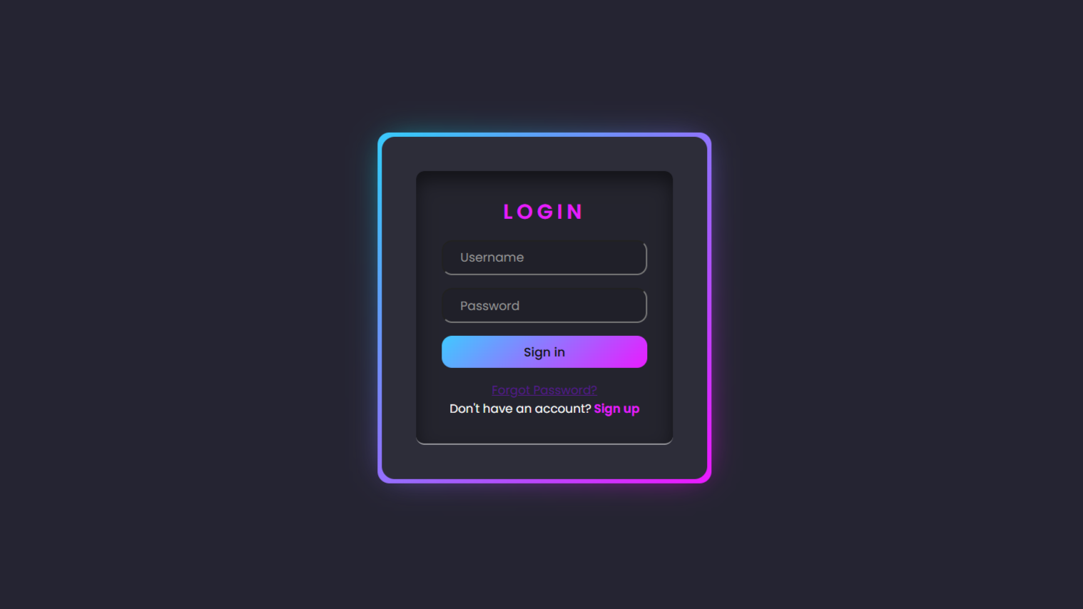
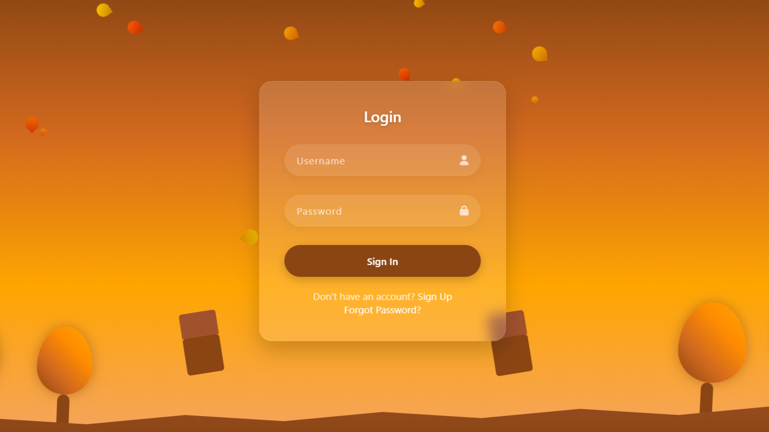
Happy coding to all the amazing coders out there! 👋 Today we’re going to create a glowing animated login form in HTML and CSS. This form will have a smooth gradient border that glows beautifully when hovered, giving it a modern and eye-catching look. The background will be dark to make the neon colors pop, and the input fields will have a clean, minimal design. It will also include options like “Forgot Password?” and “Sign up,” making it look just like a real login interface.
SOURCE CODE 👉 Zip file of code in provided at the end of this project.
HTML:
In Html code, we have a main container that holds everything in the center of the screen. Inside this container, there’s a box that creates the glowing effect and holds the login form. The inner-box works as a transparent layer that gives the glassy background style. Inside it, we have a form section that contains the heading “Login” along with input fields for username and password. There’s also a submit button that says “Sign in” to log in. At the bottom, a small section includes links for “Forgot Password?” and “Sign up” options.
<!DOCTYPE html>
<html lang="en">

<head>
  <meta charset="UTF-8">
  <title>Glowing Animated Login Form | Dark CSS</title>
  <link rel="stylesheet" href="./style.css">
</head>

<body>

  <div class="container">
    <div class="box">
      <div class="inner-box">
        <div class="form">
          <h2>
            Login
          </h2>
          <input type="text" placeholder="Username">
          <input type="password" placeholder="Password">
          <input type="submit" value="Sign in" />
          <div class="btns">
            <a href="#">Forgot Password?</a>
            <span>
              Don't have an account?<a href="#">Sign up</a>
            </span>
          </div>
        </div>
      </div>
    </div>
  </div>

</body>

</html>

.
CSS:
In the CSS, we first reset all default margins and paddings and apply the Poppins font for a clean look. The body is styled with a dark background and centered layout using flexbox. The container and box create the main structure, with the box having a glowing gradient border that animates smoothly on hover. The ::before and ::after pseudo-elements add the neon gradient and blur effects to make the box glow beautifully. The inner-box adds a glass-like transparent layer with shadows and borders for depth. The form is centered inside with neatly spaced input fields and a stylish heading. Input fields are given rounded corners and a subtle dark background to match the theme. Lastly, the submit button has a colorful gradient and hover glow, while the bottom links are styled to stand out clearly.
.
@import url("https://fonts.googleapis.com/css2?family=Poppins:ital,wght@0,100;0,200;0,300;0,400;0,500;0,600;0,700;0,800;0,900;1,100;1,200;1,300;1,400;1,500;1,600;1,700;1,800;1,900&display=swap");

* {
  margin: 0;
  padding: 0;
  box-sizing: border-box;
  font-family: "Poppins", sans-serif;
}

body {
  display: flex;
  justify-content: center;
  align-items: center;
  height: 100vh;
  background: #252432;
}

.container {
  inset: 4px;
  background: #2d2d39;
  border-radius: 15px;
}

.box {
  position: relative;
  width: 380px;
  height: 400px;
  border-radius: 20px;
  display: flex;
  justify-content: center;
  align-items: center;
}

.box::before {
  content: '';
  position: absolute;
  inset: 0;
  left: -5px;
  margin: auto;
  width: 390px;
  height: 410px;
  border-radius: 14px;
  background: linear-gradient(-45deg, #e81cff 0%, #40c9ff 100%);
  z-index: -10;
  pointer-events: none;
  transition: all 0.6s cubic-bezier(0.175, 0.885, 0.32, 1.275);
}

.box::after {
  content: "";
  z-index: -1;
  position: absolute;
  inset: 0;
  background: linear-gradient(-45deg, #fc00ff 0%, #00dbde 100%);
  transform: translate3d(0, 0, 0) scale(0.95);
  filter: blur(20px);
}

.box:hover::after {
  filter: blur(30px);
}

.box:hover::before {
  transform: rotate(90deg) scaleX(1.05) scaleY(.95);
}

.inner-box {
  position: absolute;
  inset: 40px;
  display: flex;
  justify-content: center;
  align-items: center;
  border-radius: 10px;
  flex-direction: column;
  background: rgba(0, 0, 0, 0.2);
  z-index: 1000;
  box-shadow: inset 0 10px 20px rgba(0, 0, 0, 0.5);
  border-bottom: 2px solid rgba(255, 255, 255, 0.5);
  transition: 0.5s;
  color: #fff;
  overflow: hidden;
}

.form {
  position: relative;
  display: flex;
  justify-content: center;
  align-items: center;
  flex-direction: column;
  gap: 15px;
  width: 80%;
  transition: 0.5s;
}

.form h2 {
  text-transform: uppercase;
  letter-spacing: 0.2em;
  font-weight: 600;
  color: #e81cff;
}

.form input {
  width: 100%;
  padding: 8px 20px;
  outline: none;
  font-size: .9em;
  color: #fff;
  background: rgba(0, 0, 0, 0.1);
  border-radius: 12px;
}

.form input::placeholder {
  color: #999;
}

.form input[type="submit"] {
  background: linear-gradient(-45deg, #e81cff 0%, #40c9ff 100%);
  border: none;
  font-weight: 500;
  color: #111;
  cursor: pointer;
  transition: 0.5s;
}

.form input[type="submit"]:hover {
  box-shadow: 0 0 5px #e81cff, 0 0 20px #45f3ff;
}

.btns {
  display: flex;
  flex-direction: column;
  width: 100%;
  align-items: center;
  justify-content: center;
}

.btns> {
  text-decoration: underline;
  color: rgb(0, 110, 255);
}

.btns a,
.btns span {
  font-size: 14px;
}

.btns span a {
  color: #e81cff;
  font-weight: 600;
  margin-left: 3px;
  text-decoration: none;
}
.
SOURCE CODE 👇
Download “Glowing-Login-Form.zip” Glowing-Login-Form.zip – Downloaded 299 times – 1.90 KB