project preview
Folder Structure:
- First we will need to create a folder for our project
- Then we will create files index.html, style.css and script.js
- At last we will link our css and js files with main html file to get start our project
Introduction:
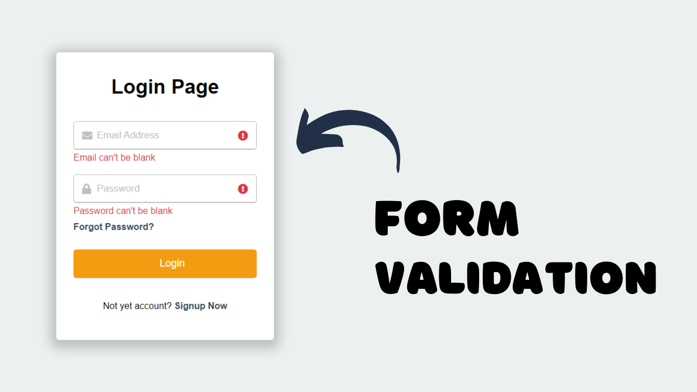
In this project, we will create a login form validation using javaScript. This form will check if the user has entered a valid email and a non-empty password, displaying error messages if the input is incorrect or missing. The CSS will provide a modern, responsive design with visual feedback through animations for any validation errors. JavaScript will handle the validation logic, providing a smooth and interactive user experience by highlighting errors and guiding users to correct them.
HTML Code:
..
<!DOCTYPE html>
<html lang="en">

<head>
  <meta charset="UTF-8">
  <meta name="viewport" content="width=device-width, initial-scale=1.0">
  <meta http-equiv="X-UA-Compatible" content="ie=edge">
  <title>Form Validation Using JavaScript</title>
  <link rel="stylesheet" href="style.css">
  <link rel="stylesheet" href="https://cdnjs.cloudflare.com/ajax/libs/font-awesome/6.6.0/css/all.min.css">
</head>

<body>
  <div class="wrapper">
    <header>Login Page</header>
    <form action="">
      <div class="field email">
        <div class="input-area">
          <input type="text" placeholder="Email Address">
          <i class="icon fas fa-envelope"></i>
          <i class="error error-icon fas fa-exclamation-circle"></i>
        </div>
        <div class="error error-txt">Email can't be blank</div>
      </div>
      <div class="field password">
        <div class="input-area">
          <input type="password" placeholder="Password">
          <i class="icon fas fa-lock"></i>
          <i class="error error-icon fas fa-exclamation-circle"></i>
        </div>
        <div class="error error-txt">Password can't be blank</div>
      </div>
      <div class="pass-link"><a href="">Forgot Password?</a></div>
      <input type="submit" value="Login">
    </form>
    <div class="signup-link">Not yet account? <a href="">Signup Now</a></div>
  </div>
  <script src="script.js"></script>
  <!-- Don't forget to subscribe our Channel https://www.youtube.com/@darkcss77 -->
</body>

</html>
...
..
Explanation:
The <title> tag defines the title of the page, and two <link> tags are used to link an external CSS stylesheet (style.css) and Font Awesome icons (fontawesome/css/all.min.css), which provide visual icons for the form fields.
Within the <body>, a div with the class wrapper contains all the form elements. This div includes a <header> displaying “Login Page” and a <form> element that encompasses the input fields for the email address and password.
Each input field is wrapped in a div with the class field and further enclosed in another div with the class input-area, which houses the input element itself, an icon, and an error icon.
The email field includes a text input with a placeholder “Email Address,” an envelope icon (fa-envelope), and an error icon (fa-exclamation-circle). Below each input area, a div with the class error error-txt displays error messages when validation fails.
Similarly, the password field contains a password input, a lock icon (fa-lock), and an error icon. Below the password field is a div for a “Forgot Password?” link, providing a recovery option.
The form also includes a submit button input of type “submit,” and below the form, there is a div with a class signup-link that provides a link to sign up, encouraging new users to register.
Finally, a <script> tag at the bottom links to an external JavaScript file (script.js) that handles form validation and error display. The HTML is structured to be both functional and visually guided, utilizing icons and error messages to enhance user interaction and provide a robust login form experience.
CSS Code:
...
/* Base styles */
* {
  padding: 0;
  margin: 0;
  box-sizing: border-box;
  font-family: sans-serif;
}

html,
body {
  display: grid;
  height: 100%;
  place-items: center;
  background: #ecf0f1;
}

.wrapper {
  width: 380px;
  background: #fff;
  border-radius: 5px;
  text-align: center;
  padding: 40px 30px 50px 30px;
  box-shadow: 0px 5px 20px 10px rgba(0, 0, 0, 0.2);
}

.wrapper header {
  font-size: 35px;
  font-weight: 600;
}

.wrapper form {
  margin: 30px 0;
}

form .field {
  width: 100%;
  margin-bottom: 20px;
}

form .field.shake {
  animation: shake 0.3s ease-in-out;
}

@keyframes shake {

  0%,
  100% {
    margin-left: 0;
  }

  20%,
  80% {
    margin-left: -12px;
  }

  40%,
  60% {
    margin-left: 12px;
  }
}

form .field .input-area {
  position: relative;
}

form input {
  height: 50px;
  width: 100%;
  outline: none;
  padding: 0 15px;
  padding-left: 40px;
  font-size: 18px;
  border-radius: 5px;
  border: 1px solid #bfbfbf;
  border-bottom-width: 2px;
}

form input::placeholder {
  color: #bfbfbf;
  font-size: 17px;
}

form .field i {
  position: absolute;
  top: 50%;
  font-size: 18px;
  pointer-events: none;
  transform: translateY(-50%);
}

form .field .icon {
  left: 15px;
  margin-right: 5px;
  color: #bfbfbf;
}

input:is(:focus)~.icon {
  color: #34495e;
}

input:is(:focus) {
  border-color: #34495e;
}

form .field .error-icon {
  right: 15px;
  color: #dc3545;
}

form .field .error-txt {
  color: #dc3545;
  margin-top: 5px;
  text-align: left;
}

form .field .error {
  display: none;
}

form .field.error .error {
  display: block;
}

form .pass-link {
  text-align: left;
  margin-top: -10px;
}

.wrapper a {
  color: #34495e;
  text-decoration: none;
  font-weight: 600;
}

.wrapper a:hover {
  text-decoration: underline;
}

form input[type="submit"] {
  margin-top: 30px;
  border: none;
  background: #f39c12;
  color: #fff;
  font-size: 18px;
  cursor: pointer;
  transition: background 0.2s ease;
}

form input[type="submit"]:hover {
  background: #f1c40f;
}

/* Responsive styles for screens up to 768px */
@media (max-width: 768px) {
  .wrapper {
    width: 304px;
    padding: 32px 24px 20px 24px;
  }

  form input::placeholder {
    font-size: 12px;
  }

  form .pass-link {
    font-size: 12px;
  }

  .signup-link {
    font-size: 12px;
  }

  .signup-link a {
    font-size: 10px;
  }

  .wrapper header {
    font-size: 22px;
  }

  form input {
    height: 40px;
    font-size: 14px;
    padding-left: 32px;
  }

  form .field i {
    font-size: 14px;
  }

  form input[type="submit"] {
    font-size: 14px;
    padding: 12px;
  }

  form .field .error-txt {
    font-size: 12px;
  }
}

/* Responsive styles for screens up to 468px */
@media (max-width: 468px) {
  .wrapper {
    width: 248px;
    padding: 24px 16px 22px 16px;
  }

  .wrapper header {
    font-size: 16px;
  }

  form input {
    height: 32px;
    font-size: 12px;
    padding-left: 24px;
  }

  form .field i {
    font-size: 12px;
  }

  form input::placeholder {
    font-size: 10px;
    margin-left: 5px;
  }

  form .pass-link {
    font-size: 10px;
  }

  .signup-link {
    font-size: 10px;
  }

  .signup-link a {
    font-size: 10px;
  }

  form input[type="submit"] {
    font-size: 12px;
    padding: 10px;
  }

  form .field .error-txt {
    font-size: 12px;
  }
}
...
Explanation:
It begins with a universal selector `*` to reset the default margin and padding for all elements and sets the `box-sizing` property to `border-box` to ensure padding and borders are included in an element’s total width and height, providing a more predictable layout.
The `font-family` is set to `sans-serif` for a modern, clean look. The `html` and `body` elements are styled with `display: grid` and `place-items: center` to center the form both horizontally and vertically in the viewport, while the background color `#ecf0f1` gives a light, neutral backdrop that contrasts well with the form elements.
The `.wrapper` class is designed to be the main container for the form, with a fixed width of `380px` and a white background, rounded corners (`border-radius: 5px`), and padding to provide space around the content. It is also given a subtle box-shadow effect (`box-shadow: 0px 5px 20px 10px rgba(0, 0, 0, 0.2)`) to create depth, making the form stand out against the page background.
Inside the wrapper, the `header` is styled with a larger font size and bold weight to act as a visual focal point. Each form field (`.field`) is styled with a width of `100%` and a margin to separate them vertically, while `.field.shake` includes a `shake` animation to draw attention to fields that need correction.
The `@keyframes` rule defines this animation by shifting the field’s margin left and right to create a shaking effect.
The `.input-area` class positions its contents relative, allowing for absolute positioning of icons and error indicators. The `input` elements have a fixed height and width, with internal padding to align text properly and a font size for readability.
The placeholder text color is muted with `#bfbfbf` to distinguish it from user input. Icons are styled to position absolutely within the input area, with a `pointer-events: none` to ensure they do not interfere with user input.
The `.icon` class and its variations change color based on focus or input validity, guiding the user visually. The error icons and messages are initially hidden with `display: none`, but become visible when the corresponding field has an error state, styled in red (`#dc3545`) to indicate an issue.
The `pass-link` and `.signup-link` classes style text links for additional form options, ensuring they are visually integrated with the rest of the form.
Finally, the submit button is styled with a distinct color (`#f39c12`) to stand out, with a hover effect that subtly changes its background color (`#f1c40f`) to encourage interaction. This comprehensive CSS styling creates a cohesive and user-friendly form experience, with a focus on clarity, usability, and visual appeal.
JavaScript Code:
...

// JavaScript Code Starts here

const form = document.querySelector("form"),
  eField = form.querySelector(".email"),
  eInput = eField.querySelector("input"),
  pField = form.querySelector(".password"),
  pInput = pField.querySelector("input");

form.onsubmit = (e) => {
  e.preventDefault(); // Prevent default form submission

  if (eInput.value === "") {
    setError(eField, "Email can't be blank");
  } else {
    checkEmail();
  }

  if (pInput.value === "") {
    setError(pField, "Password can't be blank");
  }

  setTimeout(() => {
    eField.classList.remove("shake");
    pField.classList.remove("shake");
  }, 500);

  function checkEmail() {
    let pattern = /^[^ ]+@[^ ]+\.[a-z]{2,3}$/;
    if (!eInput.value.match(pattern)) {
      setError(eField, "Enter a valid email address");
    } else {
      removeError(eField);
    }
  }

  pInput.onkeyup = () => {
    if (pInput.value === "") {
      setError(pField, "Password can't be blank");
    } else {
      removeError(pField);
    }
  }

  if (!eField.classList.contains("error") &&
   !pField.classList.contains("error")) {
    window.location.href = "#";
  }
};

// function for adding and removing error

function setError(field, message) {
  field.classList.add("shake", "error");
  let errorTxt = field.querySelector(".error-txt");
  errorTxt.innerText = message;
}

function removeError(field) {
  field.classList.remove("shake", "error");
  let errorTxt = field.querySelector(".error-txt");
  errorTxt.innerText = "";
}

...
Explanation:
It begins by selecting the form and its associated input fields for email and password using `querySelector` and stores these references in variables (`form`, `eField`, `eInput`, `pField`, `pInput`). The `onsubmit` event handler is attached to the form to intercept the form submission event (`e.preventDefault()`), preventing the default browser behavior and allowing custom validation to occur first.
The code then checks whether the email input is empty; if it is, it calls the `setError` function, which adds the `shake` and `error` classes to the field to trigger visual error indicators (shaking animation and red-colored error text) and sets a specific error message (“Email can’t be blank”).
If the email field is not empty, it proceeds to `checkEmail()`, a function that uses a regular expression (`/^[^ ]+@[^ ]+.[a-z]{2,3}$/`) to validate the email format. If the email doesn’t match the pattern, `setError` is called again with an appropriate message (“Enter a valid email address”).
Otherwise, if the email is correctly formatted, the `removeError` function is invoked to clear any error indications by removing the `shake` and `error` classes and clearing the error message. For the password field, a similar check is performed to ensure it isn’t blank, using `setError` to show an error if necessary.
The `onkeyup` event handler is attached to the password input (`pInput.onkeyup`), providing real-time validation that checks the input every time a key is released.
This allows the form to immediately remove error messages and styles when the user starts typing, making the interface more responsive and user-friendly. After the initial checks, a `setTimeout` function removes the `shake` class from both fields after 500 milliseconds to reset the animation and prevent it from looping indefinitely.
Finally, the code checks if both fields are free of errors by ensuring neither field’s parent element contains the `error` class. If no errors are present, it redirects the user (`window.location.href = “#”`) to a specified location (currently a placeholder).
This JavaScript enhances the form’s usability by preventing submission errors, providing real-time feedback, and guiding the user to correct their inputs before submitting the form.
Source Code:
Download “Form-Validation.zip” Form-Validation.zip – Downloaded 301 times – 25.27 KB
Conclusions:
In this project, we developed a login form that incorporates real-time validation using HTML, CSS, and JavaScript. The form dynamically checks for empty fields and valid email formats, providing immediate feedback through visual indicators and error messages. The CSS ensures a modern and user-friendly design with animations for error states and responsive elements. JavaScript handles the validation logic and user interaction, preventing form submission if errors are present and guiding users to correct their input.
