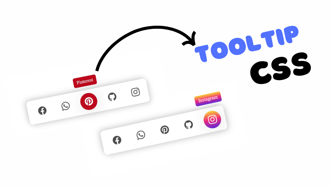
Project Preview
Folder Structure:
Create a main folder for your project, for example, FacebookReactButtons.
- Inside the main folder, create a folder named
Mediato store your GIF images (e.g.,like.gif,love.gif, etc.). - Create an
index.htmlfile inside the main project folder. - Create a
style.cssfile inside the main project folder and link it the index.html folder.
Introduction:
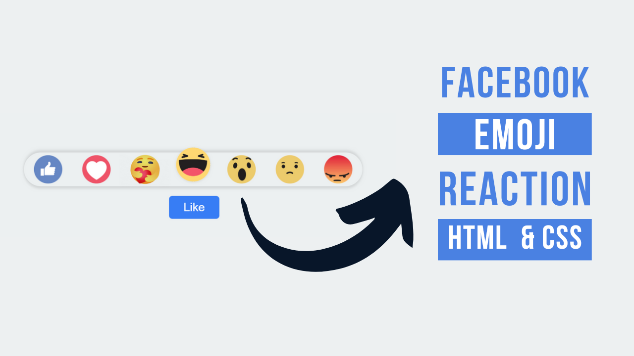
This project demonstrates how to create interactive facebook emoji reactions using Html and CSS. Users can hover over a “Like” button to reveal a variety of emoji reactions, such as “Like,” “Love,” “Haha,” “Wow,” “Sad,” and “Angry,” which animate upon hover.
HTML Code:
...
<!DOCTYPE html>
<html lang="en">

<head>
    <meta charset="UTF-8">
    <meta name="viewport" content="width=device-width, initial-scale=1.0">
    <link rel="stylesheet" href="style.css">
    <title>Facebook emoji reactions using Html and CSS</title>
</head>

<body>
    <div class="wrapper">
        <div class="content">
            <div class="emoji">
                <div class="btn">
                    <img src="Media/like.gif" alt="">
                </div>
                <div class="btn">
                    <img src="Media/love.gif" alt="">
                </div>
                <div class="btn">
                    <img class="item" src="Media/care.gif" alt="">
                </div>
                <div class="btn">
                    <img src="Media/haha.gif" alt="">
                </div>
                <div class="btn">
                    <img class="item" src="Media/wow.gif" alt="">
                </div>
                <div class="btn">
                    <img class="item" src="Media/sad.gif" alt="">
                </div>
                <div class="btn">
                    <img src="Media/angry.gif" alt="">
                </div>
            </div>
            <button>Like</button>
        </div>
    </div>
</body>

</html>
...
Explanation:
The HTML code provided sets up a simple webpage to display Facebook-style reaction buttons.
It begins with the <!DOCTYPE html> declaration, specifying the HTML version, and includes necessary meta tags for character encoding (UTF-8) and responsive design (viewport). The <link> tag links the style.css file, which contains the CSS styles for the page.
Inside the <body>, a div with the class wrapper serves as a container for the interactive content. Within this wrapper, another div with the class content holds a set of div elements with the class emoji, each containing a btn class div and an <img> tag displaying a different reaction GIF (like, love, care, haha, wow, sad, angry). A button element labeled “Like” is placed below the emojis to replicate the Facebook-like button experience. The overall structure is designed to make the reaction emojis appear on hover, enhancing user interactivity.
CSS Code:
...
* {
    padding: 0;
    margin: 0;
    box-sizing: border-box;
}

html,
body {
    display: grid;
    height: 100%;
    place-items: center;
    background-color: #ecf0f1;
}

.wrapper {
    display: flex;
    flex-direction: column;
    justify-content: center;
    align-items: center;
    position: relative;
}

.content button {
    border: 0;
    outline: 0;
    font-size: 24px;
    padding: 10px 30px;
    background: rgb(54, 148, 248);
    color: #fff;
    margin-top: 20px;
    cursor: pointer;
    border-radius: 7px;
    margin-left: 300px;
    font-family: 'Lucida Sans' sans-serif;
}

.emoji {
    width: 100%;
    height: 70px;
    margin-top: 10px;
    display: flex;
    justify-content: center;
    align-items: center;
    background-color: #ecf0f1;
    border-radius: 50px;
    box-shadow: 0 5px 5px rgba(0, 0, 0, 0.1),
        0 -5px 7px rgba(0, 0, 0, 0.1);
    visibility: hidden;
    opacity: 0;
    transition: all 0.4s;
}

.emoji img {
    display: block;
    width: 100px;
    transition: all 0.4s;
}

.emoji img:hover {
    transform: translateY(-10%) scale(1.2);
    filter: drop-shadow(0 1px 2px rgba(0, 0, 0, 0.1));
}

.item {
    mix-blend-mode: multiply;
}

.wrapper:hover .emoji {
    visibility: visible;
    opacity: 1;
}
...
Explanation:
It starts with a universal selector (`*`) that resets the default margin, padding, and sets `box-sizing` to `border-box` to ensure consistent sizing across all elements.
The `html` and `body` selectors use CSS Grid to center the content both vertically and horizontally, providing a clean and focused layout with a light gray background color (`#ecf0f1`).
The `.wrapper` class serves as a flexible container that vertically aligns its child elements (the reaction emojis and button), using Flexbox for precise positioning and alignment.
The `.content` button is styled to resemble the familiar Facebook “Like” button, featuring a blue background (`rgb(54, 148, 248)`), white text, rounded corners (`border-radius: 7px`), and a slight hover effect for a more interactive feel.
The `.emoji` class defines a hidden container for the reaction emojis, using Flexbox for horizontal alignment, and CSS properties such as `visibility: hidden`, `opacity: 0`, and `transition` to smoothly animate the appearance of the emoji reactions when the user hovers over the wrapper.
Each emoji image is styled with a fixed width (`100px`) and a hover effect that scales the image and slightly moves it upwards, adding a playful bounce effect.
Additionally, the `.item` class applies a blend mode to some images, ensuring the images blend seamlessly with the background. The `wrapper:hover .emoji` selector reveals the emoji container by changing its visibility and opacity on hover, creating a smooth transition for a dynamic user interaction effect.
This comprehensive use of CSS techniques like Flexbox, Grid, transitions, and hover effects not only creates an engaging UI but also demonstrates advanced styling and animation skills.
Source Code:
Download “Facebook-Reaction.zip” Facebook-Reaction.zip – Downloaded 167 times – 3.43 MB
Conclusions:
In this project, we have successfully created an interactive Facebook-style reaction button using HTML and CSS, showcasing the power of hover effects and transitions. The implementation uses Flexbox and Grid to achieve a clean, centered layout while ensuring responsive design. By utilizing animations and opacity changes, the project delivers a smooth and engaging user experience, simulating social media interactions. This exercise not only enhances your understanding of CSS properties but also demonstrates how to create dynamic web elements that can be integrated into modern web applications. Overall, it’s a great example of combining visual design with user interactivity.
