Folder Structure:
- First we will create our main folder for our project
- Then we will create a index.html and style.css files inside it
Introduction:
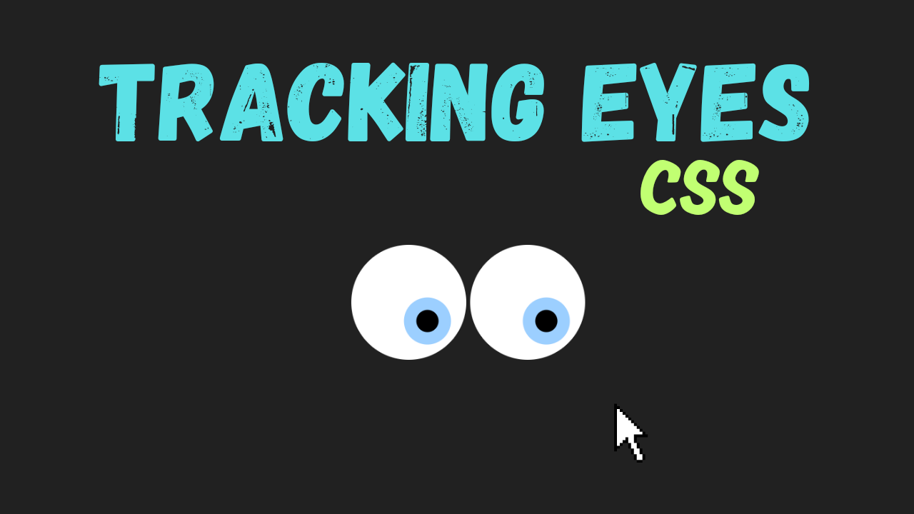
In this tutorial, you’ll learn how to create a fun and interactive eye-tracking animation using HTML, CSS, and a touch of creativity. This project features two buttons designed to look like eyes, complete with pupils that follow the movement of the cursor. The buttons are surrounded by invisible sensors that detect the mouse’s direction, making the pupils shift dynamically. Additionally, the project includes hover and click animations for added engagement, where the “eyes” blink and react to clicks.
HTML CODE:
....
<!DOCTYPE html>
<html lang="en">
<head>
  <meta charset="UTF-8">
  <meta name="viewport" content="width=device-width, initial-scale=1.0">
  <title>Tracking Eyes in Html CSS</title>
  <link rel="stylesheet" href="style.css">
</head>
<body>
  <div class="wrapper">
    <div style="--a: 0;" class="btn-sensor sensor-n"></div>
    <div style="--a: 45;" class="btn-sensor sensor-ne"></div>
    <div style="--a: 90;" class="btn-sensor sensor-e"></div>
    <div style="--a: 135;" class="btn-sensor sensor-se"></div>
    <div style="--a: 180;" class="btn-sensor sensor-s"></div>
    <div style="--a: 225;" class="btn-sensor sensor-sw"></div>
    <div style="--a: 270;" class="btn-sensor sensor-w"></div>
    <div style="--a: 315;" class="btn-sensor sensor-nw"></div>

    <button class="btn-button">
      <div class="btn-lid"></div>
      <div class="btn-pupil"></div>
    </button>

    <button class="btn-button">
      <div class="btn-lid"></div>
      <div class="btn-pupil"></div>
    </button>

  </div>
</body>
</html>
.....
Explanation:
The <body> contains the core structure of the project, wrapped within a <div> with a class of wrapper, which acts as a container for all elements.
The wrapper holds eight directional “sensors,” each represented by a <div> with the class btn-sensor and an inline CSS custom property --a to define their angular position (e.g., 0°, 45°, 90°, etc.). These sensors detect mouse hover events, and their positioning is handled using CSS.
Next, there are two <button> elements styled as “eyes.” Each button has a btn-button class and contains two nested <div> elements: btn-lid and btn-pupil. The btn-lid represents the eyelid and is positioned over the button, while the btn-pupil acts as the moving pupil inside the button.
These elements work together to simulate eye movements and interactions, such as blinking and responding to clicks.
This HTML structure is clean and semantic, using divs and buttons appropriately for interactive and visual elements.
Each class serves a specific purpose for styling and functionality, making the code easy to understand and modify. The sensors and buttons are logically grouped, ensuring the layout is both accessible and visually engaging.
CSS CODE:
....
* {
    padding: 0;
    margin: 0;
    box-sizing: border-box;
}

html,
body {
    display: grid;
    height: 100%;
    place-items: center;
    background-color: #212121;
}

body {
    overflow: hidden;
}

.wrapper {
    position: relative;
}

.btn-button {
    background: #fff;
    border: 3px solid #fff;
    border-radius: 10rem;
    cursor: pointer;
    padding: 2rem;
    position: relative;
    z-index: 100;
}

.btn-button:hover,
.btn-button:hover .btn-lid {
    animation: eye-lid 100ms forwards;
}

.btn-button:active .btn-pupil {
    animation: pupil 100ms infinite 500ms;
    border-width: 0.5rem;
    padding: 1rem;
}

.btn-lid {
    border-radius: 10rem;
    height: 100%;
    left: 0;
    position: absolute;
    top: 0;
    width: 100%;
    z-index: 101;
}

.btn-pupil {
    background: #000;
    border: 0.8rem solid rgb(156, 207, 255);
    border-radius: 10rem;
    padding: 0.7rem;
    transition: all 200ms ease-out;
}

.btn-sensor {
    clip-path: polygon(0 0, 100% 0, 50% 100%, 0 0);
    height: 130dvmax;
    overflow: hidden;
    position: absolute;
    left: calc(50% - 130dvmax / 2);
    top: calc(50% - 130dvmax / 2);
    transform: rotate(calc(var(--a) * 1deg)) translateY(calc(130dvmax * -50 / 100));
    width: 130dvmax;
    z-index: 99;
}

.sensor-n:hover~.btn-button .btn-pupil {
    transform: translateX(0) translateY(calc(-3 * 20%));
}

.sensor-ne:hover~.btn-button .btn-pupil {
    transform: translateX(calc(2 * 20%)) translateY(calc(-2 * 20%));
}

.sensor-e:hover~.btn-button .btn-pupil {
    transform: translateX(calc(3 * 20%)) translateY(0);
}

.sensor-se:hover~.btn-button .btn-pupil {
    transform: translateX(calc(2 * 20%)) translateY(calc(2 * 20%));
}

.sensor-s:hover~.btn-button .btn-pupil {
    transform: translateX(0) translateY(calc(3 * 20%));
}

.sensor-sw:hover~.btn-button .btn-pupil {
    transform: translateX(calc(-2 * 20%)) translateY(calc(2 * 20%));
}

.sensor-w:hover~.btn-button .btn-pupil {
    transform: translateX(calc(-3 * 20%)) translateY(0);
}

.sensor-nw:hover~.btn-button .btn-pupil {
    transform: translateX(calc(-2 * 20%)) translateY(calc(-2 * 20%));
}

@keyframes pupil {
    0% {
        transform: scale(1.2) translate(0%, -10%);
    }

    25% {
        transform: scale(1.2) translate(-10%, 10%);
    }

    50% {
        transform: scale(1.2) translate(10%, -5%);
    }

    75% {
        transform: scale(1.2) translate(-10%, -5%);
    }

    100% {
        transform: scale(1.2) translate(10%, 10%);
    }
}

@keyframes eye-lid {
    0% {
        background: #000;
    }

    25% {
        background: linear-gradient(0deg,
                #000 0% 9%,
                transparent 10% 90%,
                #000 91% 100%);
    }

    50% {
        background: linear-gradient(0deg,
                #000 0% 18%,
                transparent 19% 81%,
                #000 82% 100%);
    }

    75% {
        background: linear-gradient(0deg,
                #000 0% 27%,
                transparent 28% 72%,
                #000 73% 100%);
    }

    100% {
        background: linear-gradient(0deg,
                #000 0% 35%,
                transparent 36% 64%,
                #000 65% 100%);
    }
}
...
Explanation:
The CSS code provides the styling and animations to bring the interactive eye-tracking effect to life.
It starts with a universal selector (*) to reset default browser padding and margins, ensuring a consistent layout across all devices. The box-sizing: border-box property is applied globally to include padding and borders within the width and height of elements, simplifying size calculations.
The html and body elements are styled to center the content using CSS grid with display: grid and place-items: center. This setup ensures that the wrapper, containing the buttons and sensors, is perfectly centered on the screen.
The background-color: #212121 gives the entire page a dark background, creating a contrast that highlights the buttons. Additionally, overflow: hidden on the body prevents unwanted scrolling.
The .wrapper class serves as a container for all elements. Its child elements, the .btn-button (buttons), are styled to look like eyes. These buttons have a circular appearance achieved with border-radius: 10rem and a white background with a solid white border. The padding: 2rem adds spacing around the buttons, and the cursor: pointer indicates that they are clickable.
The .btn-lid is positioned absolutely over the button and has the same dimensions, making it look like an eyelid that covers the button. It serves as the element for animating the blinking effect, with its background transitioning during the animation.
The .btn-pupil is styled to look like a black pupil with a light blue border (rgb(156, 207, 255)) and a circular shape (border-radius: 10rem). Its size is defined by padding, and its position and transformations are controlled dynamically with hover and click events.
The .btn-sensor elements act as invisible zones that detect the mouse’s position relative to the buttons. These sensors are styled with clip-path: polygon to create triangular shapes that extend outward from the buttons in eight directions.
The transform property, combined with the custom property --a, rotates and positions each sensor correctly around the button.
Hover effects for the sensors are defined to move the .btn-pupil in corresponding directions using the transform property. For example, hovering over the .sensor-n moves the pupil upward, while hovering over .sensor-e moves it to the right.
The CSS animations bring interactivity to life. The @keyframes pupil animation creates random, small movements for the pupil, simulating natural eye motion when the button is clicked.
The @keyframes eye-lid animation changes the background of the .btn-lid to simulate a blinking effect, transitioning from fully open to partially closed states.
This CSS code integrates positioning, transitions, and animations seamlessly to create a visually dynamic and interactive experience. The use of pseudo-elements, custom properties, and precise hover and click interactions highlights the power and flexibility of CSS.
Source Code:
Download “Tracking-Eyes.zip” Tracking-Eyes.zip – Downloaded 629 times – 1.68 KB
Conclusions:
In this project, we successfully created an engaging eye-tracking animation using HTML and CSS. We designed a pair of interactive “eyes” with pupils that dynamically follow the cursor’s direction, responding to hover events from invisible sensors placed around the buttons. By combining precise layout techniques and creative use of CSS properties, we simulated realistic eye movements and blinking effects. The clip-path property and custom CSS variables allowed us to position directional sensors seamlessly. Hover and click effects added depth to the interaction, making the animation feel natural and responsive. We also implemented keyframe animations for the blinking eyelids and random pupil movements, enhancing the realism