Folder Structure:
- First we will need to create a main folder for our project
- Then we will create index and css files for our project
Introduction:
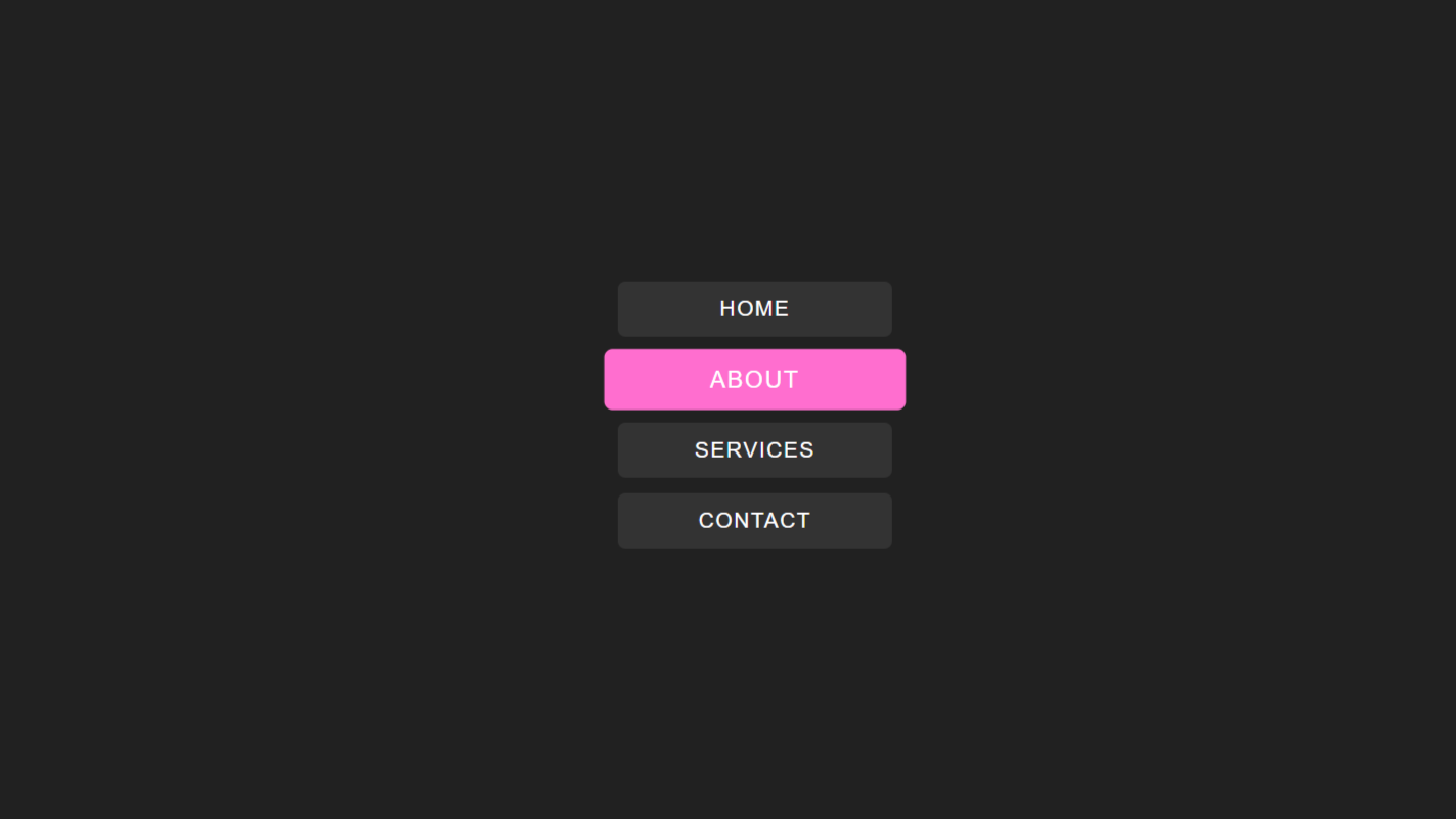
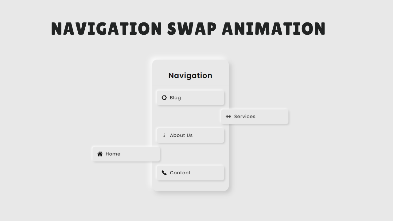
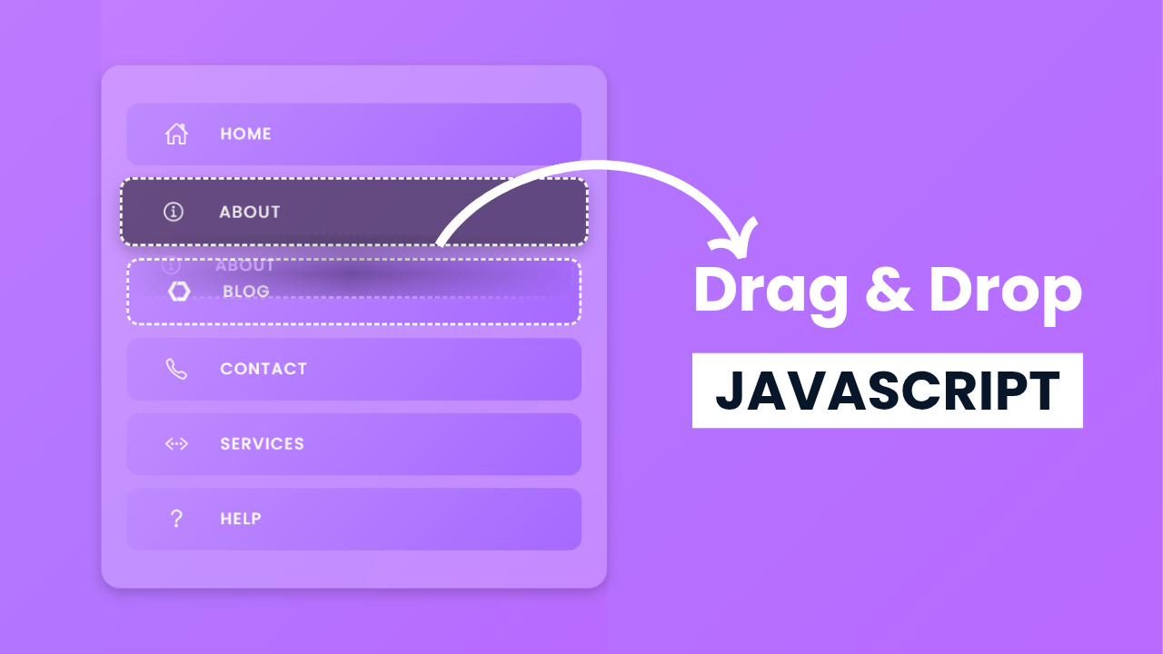
In this tutorial, we will create a drag and drop navigation menu using HTML, CSS, and JavaScript. This interactive menu allows users to reorder navigation items by simply dragging and dropping them. The design features aesthetic gradients, smooth animations, and a glassmorphism effect, making it visually appealing. With just a few lines of JavaScript, we will enable seamless drag-and-drop functionality without relying on external libraries. Let’s dive in and build this stylish and user-friendly navigation menu!
HTML Code:
....

<!DOCTYPE html>
<html lang="en">

<head>
    <meta charset="UTF-8">
    <meta name="viewport" content="width=device-width, initial-scale=1.0">
    <title>Drag & Drop in JavaScript</title>
    <link rel="stylesheet" href="style.css">
</head>

<body>
    <div class="container">
        <ul>
            <li draggable="true"><ion-icon class="icon" name="home-outline"></ion-icon> Home</li>
            <li draggable="true"><ion-icon class="icon" name="logo-web-component"></ion-icon> Blog</li>
            <li draggable="true"><ion-icon class="icon" name="code-working-outline"></ion-icon> Services</li>
            <li draggable="true"><ion-icon class="icon" name="information-circle-outline"></ion-icon> About</li>
            <li draggable="true"><ion-icon class="icon" name="mail-outline"></ion-icon> Contact</li>
            <li draggable="true"><ion-icon class="icon" name="help-circle-outline"></ion-icon> Help</li>
        </ul>
    </div>

    <script type="module" src="https://unpkg.com/ionicons@7.1.0/dist/ionicons/ionicons.esm.js"></script>
    <script nomodule src="https://unpkg.com/ionicons@7.1.0/dist/ionicons/ionicons.js"></script>
</body>

</html>
....
Explanation:
The HTML structure consists of a simple navigation menu inside a <div> container.
The main wrapper <div class="container"> holds an unordered list (<ul>), which contains six list items (<li>). Each list item represents a navigation link such as Home, Blog, Services, About, Contact, and Help.
Each <li> item includes an Ionicons icon and a text label, making the menu visually appealing. The draggable="true" attribute is added to each <li>, allowing users to drag and reorder menu items.
This is a built-in HTML feature that enables drag-and-drop functionality without additional JavaScript libraries.
The Ionicons icons are imported using <script> tags from the Ionicons CDN.
These scripts load icons dynamically and allow customization via class names. Each <ion-icon> element is assigned a unique icon name corresponding to the menu item.
CSS Code:
...
@import url('https://fonts.googleapis.com/css2?family=Poppins:ital,wght@0,100;0,200;0,300;0,400;0,500;0,600;0,700;0,800;0,900;1,100;1,200;1,300;1,400;1,500;1,600;1,700;1,800;1,900&display=swap');

* {
    padding: 0;
    margin: 0;
    box-sizing: border-box;
    font-family: "Poppins", serif;
}

html,
body {
    display: grid;
    height: 100%;
    place-items: center;
}

body {
    background: linear-gradient(135deg, #c57eff, #b375ff, #ba6aff);
}

.container {
    width: 400px;
    background: rgba(255, 255, 255, 0.2);
    backdrop-filter: blur(10px);
    padding: 20px;
    border-radius: 15px;
    box-shadow: 0 4px 10px rgba(0, 0, 0, 0.2);
}

ul {
    list-style: none;
    padding: 0;
    margin: 0;
}

li {
    display: flex;
    align-items: center;
    gap: 10px;
    padding: 15px;
    margin: 10px 0;
    background: linear-gradient(135deg, #bf8bff, #a66aff);
    color: white;
    font-weight: 500;
    font-size: 0.8rem;
    border-radius: 10px;
    letter-spacing: 1px;
    cursor: grab;
    text-transform: uppercase;
    transition: transform 0.2s, box-shadow 0.2s;
}

.icon {
    margin: 0px 15px;
    font-size: 1.2rem;
}

li:hover {
    transform: scale(1.03);
    box-shadow: 0 4px 10px rgba(0, 0, 0, 0.3);
}

.dragging {
    border: 2px dashed #fff;
    opacity: 0.6;
    color: #edecec;
    background: #0000007f;
}

.drop-target {
    border: 2px dashed rgb(255, 255, 255);
}

.....
Explanation:
The CSS file enhances the navigation menu’s appearance with modern styling, including gradients, shadows, and smooth animations.
The @import rule imports the Poppins font from Google Fonts, ensuring a sleek and professional look.
The universal selector (*) applies margin: 0, padding: 0, and box-sizing: border-box to maintain a clean layout. The html, body are set to display: grid and place-items: center, keeping the navigation menu perfectly centered.
The body background features a diagonal gradient (linear-gradient(135deg)) with shades of purple for a visually appealing effect.
The .container has a semi-transparent glassmorphism effect using backdrop-filter: blur(10px), enhancing its modern UI design.
The unordered list (ul) is styled to remove default padding and margins, ensuring a compact layout. Each list item (li) has a rounded design, a smooth gradient background, and white text for high contrast.
The icons (.icon) inside <li> are styled with font-size: 1.2rem and proper spacing for better alignment. A hover effect is applied to li:hover, making items scale slightly and cast a shadow for an interactive feel.
The .dragging class is used to reduce opacity and change the border to a dashed white line while dragging.
The .drop-target class highlights the drop area with a dashed white border, improving the user experience.
Transitions (transform 0.2s, box-shadow 0.2s) ensure smooth animations when interacting with the navigation items.
Overall, the CSS makes the drag-and-drop menu visually stunning, interactive, and user-friendly while maintaining a modern and clean design.
JavaScript Code:
...

document.addEventListener("DOMContentLoaded", () => {
            const items = document.querySelectorAll("li");
            let draggedItem = null;

            items.forEach(item => {
                item.addEventListener("dragstart", () => {
                    draggedItem = item;
                    item.classList.add("dragging");
                });

                item.addEventListener("dragend", () => {
                    item.classList.remove("dragging");
                    document.querySelectorAll(".drop-target").forEach(el => el.classList.remove("drop-target"));
                });

                item.addEventListener("dragover", (e) => {
                    e.preventDefault();
                    if (draggedItem !== item) {
                        item.classList.add("drop-target");
                    }
                });

                item.addEventListener("dragleave", () => {
                    item.classList.remove("drop-target");
                });

                item.addEventListener("drop", () => {
                    if (draggedItem && draggedItem !== item) {
                        let parent = item.parentNode;
                        let next = item.nextSibling === draggedItem ? item : item.nextSibling;
                        parent.insertBefore(draggedItem, next);
                    }
                    item.classList.remove("drop-target");
                });
            });
        });

....
Explanation:
The JavaScript code adds drag-and-drop functionality to the navigation menu by selecting all <li> items and handling drag events.
It first assigns draggedItem as null, which will store the currently dragged list item. When an item is dragged (dragstart event), it is assigned to draggedItem, and the .dragging class is added to change its appearance.
During the dragover event, the default behavior is prevented to allow dropping, and the .drop-target class is applied to highlight the potential drop location.
The dragleave event removes this highlight if the item is dragged away. When the drop event occurs, the script inserts the dragged item before or after the target item, depending on its position in the list.
Finally, the dragend event removes the .dragging class and clears any remaining .drop-target highlights. This script enables a smooth and intuitive drag-and-drop navigation system without requiring external libraries.
Source Code:
Download “Drag-and-Drop.7z” Drag-and-Drop.7z – Downloaded 610 times – 1.56 KB
Conclusions:
In this project, we successfully built a drag-and-drop navigation menu using HTML, CSS, and JavaScript. We structured the menu with simple list items (<li>), styled it with a modern glassmorphism effect and smooth hover animations, and implemented drag-and-drop functionality using JavaScript event listeners. The result is a fully interactive and visually appealing menu where users can reorder items effortlessly. This project showcases how minimal JavaScript and creative CSS can enhance user experience without relying on external libraries.