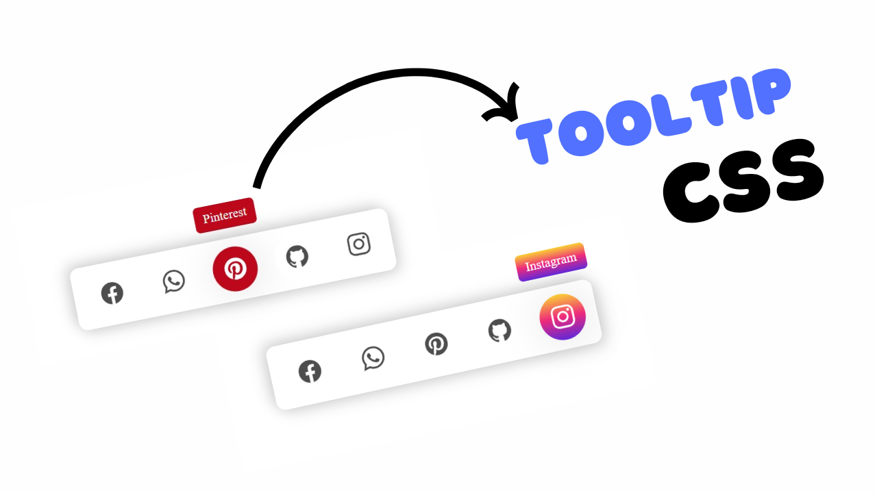
project preview
Folder Structure:
- First we will need to create a folder for our project
- Then we will create files index.html and style.css
- At last we will link our css file with html to start our project work.
Introduction:
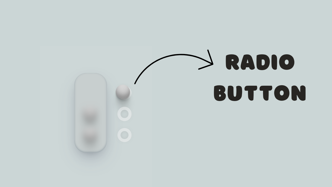
In this project, we are going to create custom radio buttons using HTML and CSS to provide a more visually appealing and interactive user experience. Instead of using the default browser-styled radio buttons, we will design custom circular selectors that include a sleek glass effect background and a smooth transition animation when toggling between options.
HTML Code:
...
<!DOCTYPE html>
<html lang="en">

<head>
    <meta charset="UTF-8">
    <meta name="viewport" content="width=device-width, initial-scale=1.0">
    <title>Custom Radio Button with CSS</title> <!-- Set the page title -->
    <link rel="stylesheet" href="style.css"> <!-- Link to external CSS file -->
</head>

<body>
    <div class="wrapper">
        <div class="glass"></div> <!-- Glass effect background -->
        <div class="selector">
            <!-- Radio button option 1 -->
            <div class="choice">
                <div>
                    <input type="radio" name="number-selector" id="one" class="circle" checked="true">
                    <div class="ball"></div> <!-- Custom radio button indicator -->
                </div>
            </div>
            <!-- Radio button option 2 -->
            <div class="choice">
                <div>
                    <input type="radio" name="number-selector" id="two" class="circle">
                    <div class="ball"></div> <!-- Custom radio button indicator -->
                </div>
            </div>
            <!-- Radio button option 3 -->
            <div class="choice">
                <div>
                    <input type="radio" name="number-selector" id="three" class="circle">
                    <div class="ball"></div> <!-- Custom radio button indicator -->
                </div>
            </div>
        </div>
    </div>
</body>

</html>
...
Explanation:
The <head> section contains metadata and links to the external CSS file style.css for styling, as well as a <title> tag that sets the webpage’s title to “Custom Radio Button with CSS.”
In the <body> section, the code defines a div with the class wrapper, serving as a container for all elements, and another div with the class glass that creates a glass-effect background.
The main content, a div with the class selector, contains three div elements with the class choice, each representing a radio button option. Inside each choice div, there is an input element of type radio with a shared name attribute, “number-selector,” which groups them into a single selection set.
These radio buttons have unique id attributes (“one”, “two”, “three”) and the class circle for styling purposes. Next to each input, a div with the class ball is placed to visually represent the custom radio button indicator.
The ball element is positioned absolutely and initially hidden outside the radio button circle; it moves into place when the corresponding radio button is checked.
This HTML structure provides the basic framework for creating a visually enhanced radio button interface, relying heavily on CSS for its unique appearance and behavior.
CSS Code:
...
/* Global styles for HTML and body */
html,
body {
    display: grid;
    height: 100%;
    place-items: center;
    background-color: rgb(205, 215, 215);
    /* Set the background color */
}

/* Wrapper for the radio button selector */
.wrapper {
    display: flex;
    height: 210px;
    align-items: center;
}

/* Glass effect background */
.glass {
    z-index: 2;
    height: 110%;
    width: 95px;
    margin-right: 25px;
    background-color: rgba(189, 190, 190, 0.3);
    border-radius: 35px;
    box-shadow: rgba(50, 50, 93, 0.2) 0px 25px 50px -10px,
        rgba(0, 0, 0, 0.25) 0px 10px 30px -15px,
        rgba(10, 37, 64, 0.26) 0px -2px 6px 0px inset;
    backdrop-filter: blur(8px);
    /* Apply blur effect */
}

/* Container for radio button options */
.selector {
    display: flex;
    flex-direction: column;
}

/* Styling for each radio button option */
.choice {
    margin: 10px 0 10px 0;
    display: flex;
    align-items: center;
}

/* Styling for the radio button input */
.choice>div {
    position: relative;
    width: 41px;
    height: 41px;
    margin-right: 15px;
    z-index: 0;
}

/* Styling for the actual radio button */
.circle {
    appearance: none;
    /* Remove default appearance */
    height: 100%;
    width: 100%;
    border-radius: 100%;
    border: 9px solid rgba(245, 245, 245, 0.45);
    /* Border style */
    cursor: pointer;
    box-shadow: 0px 0px 20px -13px gray,
        0px 0px 20px -14px gray inset;
    /* Box shadow */
}

/* Styling for the custom radio button indicator */
.ball {
    z-index: 1;
    position: absolute;
    inset: 0;
    transform: translateX(-95px);
    /* Initial position outside the circle */
    border-radius: 100%;
    background-color: rgb(232, 232, 232);
    /* Background color of the ball */
    transition: transform 800ms cubic-bezier(1, -0.4, 0, 0.4);
    /* Smooth transition effect */
    box-shadow: rgba(0, 0, 0, 0.17) 0px -10px 10px 0px inset,
        rgba(0, 0, 0, 0.15) 0px -15px 15px 0px inset,
        rgba(0, 0, 0, 0.1) 0px -40px 40px 0px inset,
        rgba(0, 0, 0, 0.06) 0px 2px 1px,
        rgba(0, 0, 0, 0.09) 0px 4px 2px,
        rgba(0, 0, 0, 0.09) 0px 8px 4px,
        rgba(0, 0, 0, 0.09) 0px 16px 8px,
        0px -1px 15px -8px rgba(0, 0, 0, 0.09);
}

/* Styling for the checked state of the radio button */
.circle:checked+.ball {
    transform: translateX(0px);
    /* Move the ball inside the circle when checked */
}
...
Explanation:
Starting with the global styles, the `html` and `body` elements are set to use a grid display to center the content both vertically and horizontally on the page.
The background color of the body is a soft, muted shade (`rgb(205, 215, 215)`) that complements the form elements.
The `.wrapper` class styles the main container, aligning its child elements vertically and centering them with flexbox. The `.glass` class adds a semi-transparent, frosted-glass effect to a background panel using `background-color` with an `rgba` value for transparency, combined with `backdrop-filter: blur(8px)` to create the blur effect.
This panel is also given rounded corners (`border-radius: 35px`) and multiple box shadows to add depth and realism, enhancing the visual aesthetic.
The `.selector` class sets up a vertical flex container to stack the radio button options. Each `.choice` div is styled to center its contents horizontally with `align-items: center`, and adds margin for spacing between the buttons.
Inside each `.choice`, the inner `div` is positioned relatively, which allows the `.ball` element to be absolutely positioned in relation to it. The actual radio buttons, styled with the `.circle` class, use `appearance: none` to remove the default browser styling, making them visually invisible.
Instead, they are styled to look like custom circles with a solid border (`border: 9px solid rgba(245, 245, 245, 0.45)`) and a shadow effect (`box-shadow`) to give a subtle 3D appearance. The `.ball` element, which represents the custom indicator for a checked radio button, is positioned outside the visible area initially using `transform: translateX(-95px)`.
When a radio button is checked, the adjacent `.ball` is animated into place inside the circle (`transform: translateX(0px)`) with a smooth, 800ms transition, creating a dynamic visual feedback that enhances user interaction.
The use of CSS properties such as `transition`, `box-shadow`, and `backdrop-filter` effectively combines to create a sophisticated, interactive component that enhances the user interface.
Source Code:
Download “Custom-Radio-Button.zip” Custom-Radio-Button.zip – Downloaded 371 times – 1.55 KB
Conclusions:
In this project, we have successfully designed a set of custom radio buttons using HTML and CSS, moving beyond the default browser styling to create a unique, modern look. By employing CSS properties like appearance, backdrop-filter, and transition, we added sophisticated visual effects, such as a glass-like background and smooth animations.
