Project Preview
Folder Structure:
To dive into our project tutorial first we need to create our folder structure.
- First we need to create a folder for our project like CSS Card or any name you want to give.
- Then we will create our project files index.html and style.css
- At last we need to add our style.css file with our html file.
Introduction:
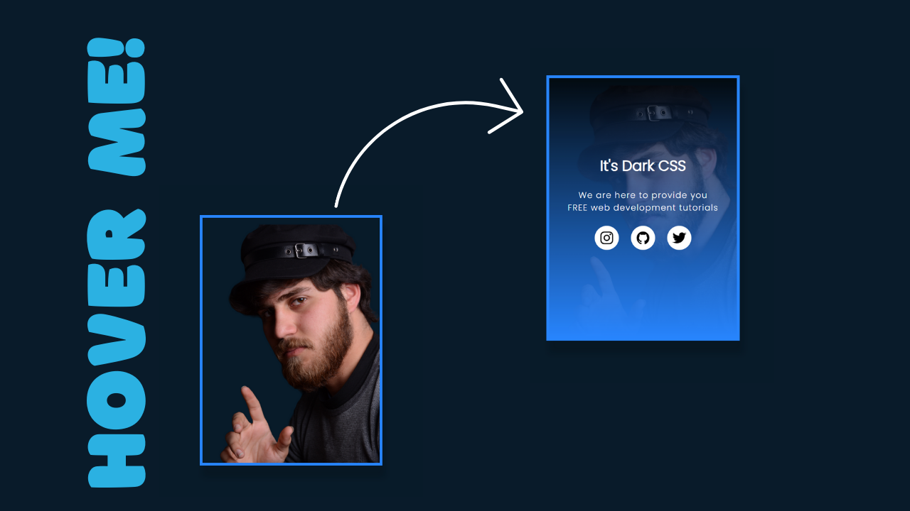
CSS image card hover effects features an image with a title, a brief description, and social media icons. The card comes to life with a smooth transition that reveals the content upon hovering. The project aims to enhance user interaction and provide a modern, polished look to your web development tutorials.
HTML Code:
...
<!DOCTYPE html>
<html lang="en">
<head>
    <meta charset="UTF-8">
    <meta name="viewport" content="width=device-width, initial-scale=1.0">
    <title>Card After Effect On Hover</title>
    <link rel="stylesheet" href="style.css">
</head>
<body>
    <div class="card">
        <img src="images/image.png" alt="">
        <div class="content">
            <h3>It's Dark CSS</h3>
            <p>
                We are here to provide you FREE web development tutorials
            </p>
            <div class="social-icons">
                <span>
                    <a href=""><ion-icon name="logo-instagram"></ion-icon></a>
                </span>
                <span>
                    <a href=""><ion-icon name="logo-github"></ion-icon></a>
                </span>
                <span>
                    <a href=""><ion-icon name="logo-twitter"></ion-icon></a>
                </span>
            </div>
        </div>
    </div>

    <!-- External Link on Icons -->
    <script type="module" src="https://unpkg.com/ionicons@7.1.0/dist/ionicons/ionicons.esm.js"></script>
    <script nomodule src="https://unpkg.com/ionicons@7.1.0/dist/ionicons/ionicons.js"></script>
</body>
</html>
.
..
Explanation:
The <body> section contains the main content of the webpage. The div element with the class card serves as the container for the hover effect. Inside this div, the <img src="images/image.png" alt=""> tag displays an image, sourced from the images folder, and the alt attribute provides alternative text if the image fails to load. Following the image, another div with the class content is used to overlay the card’s text and social media icons. Within this content div, there is an <h3> heading that reads “It’s Dark CSS,” representing the title of the card. A <p> tag follows, containing a brief description: “We are here to provide you FREE web development tutorials.”
Additionally, there is a div with the class social-icons, which holds three span elements, each containing an anchor (<a>) tag. These anchor tags wrap around ion-icon elements, which are used to display icons for Instagram, GitHub, and Twitter. The ion-icon elements are sourced via an external script linked at the bottom of the body section. The <script> tags load the Ionicons library, enabling the use of these icons within the webpage. The type="module" attribute ensures modern JavaScript module support, while the nomodule attribute provides a fallback for older browsers. Together, these elements create a complete, interactive card that will respond to user actions with a smooth hover animation.
CSS Code:
...

/* Importing Google Fonts and setting default styles */
@import url('https://fonts.googleapis.com/css2?family=Poppins:wght@300&family=Schibsted+Grotesk:wght@600&display=swap');

* {
    padding: 0;
    margin: 0;
    box-sizing: border-box;
    font-family: 'Poppins', sans-serif;
}

html,body {
    display: grid;
    height: 100%;
    place-items: center;
    background: #021233;
}

/* Styling the card container */
.card {
    position: relative;
    width: 320px;
    height: 440px;
    border: 5px solid #2885fe;
    overflow: hidden;
    box-shadow: 5px 20px 10px rgba(0, 0, 0, 0.1);
}

/* Styling the card image */
.card img {
    width: 103%;
    display: block;
}

/* Styling the content overlay */
.content {
    width: 100%;
    height: 0%;
    background: linear-gradient(rgba(0, 0, 0, 0.6), #2885fe);
    position: absolute;
    bottom: 0;
    left: 0;
    display: flex;
    justify-content: center;
    flex-direction: column;
    align-items: center;
    overflow: hidden;
    color: #fff;
    padding: 0 30px;
    text-align: center;
    transition: height 0.5s;
}

/* Styling content text */
.content p {
    letter-spacing: 1px;
    font-size: 14px;
}

.content h3 {
    font-size: 24px;
    font-weight: 600;
    margin-bottom: 20px;
}

/* Styling social media icons */
.social-icons {
    display: flex;
    flex-direction: row;
}

.social-icons span {
    display: flex;
    justify-content: center;
    align-items: center;
    height: 40px;
    width: 40px;
    background-color: #fff;
    border-radius: 50%;
    cursor: pointer;
    margin: 20px 10px;
}

.social-icons a {
    font-size: 24px;
    color: #000;
    text-decoration: none;
    display: flex;
    align-items: center;
}

/* Hover effect */
.card:hover .content {
    height: 100%;
}

..
Explanation:
The CSS code provided styles the animated card hover effect, ensuring a visually appealing and responsive design. Let’s go through each section:
Importing Google Fonts: The @import url(...) statement at the top imports two Google Fonts: “Poppins” and “Schibsted Grotesk.” These fonts are used throughout the card to give it a clean and modern look, with Poppins being the primary font for text content.
Global Styles: The * selector applies a universal style to all elements, setting padding and margin to 0, and enabling box-sizing: border-box. This ensures that padding and borders are included within an element’s total width and height. The font-family property is set to “Poppins,” making it the default font across the entire page.
Page Layout: The html, body selectors style the entire page by using display: grid, which allows centering of content both horizontally and vertically (place-items: center). The height: 100% ensures that the page occupies the full height of the viewport. The background: #021233 property sets a dark blue background, giving the page a sleek and modern appearance, aligning with the ‘Dark CSS’ theme.
Card Container: The .card class styles the main card element. The position: relative allows for the positioning of child elements within the card, such as the overlay content. The card is given a fixed size of 320px width and 440px height. A border: 5px solid #2885fe adds a vibrant blue border around the card. The overflow: hidden ensures that any content exceeding the card’s dimensions is hidden. A box-shadow is applied to give the card a subtle depth effect with a shadow extending slightly to the right and below the card.
Card Image: The .card img selector styles the image inside the card. By setting the width: 103%, the image slightly exceeds the card’s width, ensuring that there are no visible gaps on the sides. The display: block ensures that the image behaves as a block-level element, eliminating any unwanted spacing.
Content Overlay: The .content class styles the overlay that appears when the card is hovered. Initially, the height: 0% hides the overlay at the bottom of the card. The background: linear-gradient(...) applies a gradient background, starting with a semi-transparent black at the top and blending into the vibrant blue #2885fe at the bottom. This creates a smooth visual transition as the overlay expands. The position: absolute places the overlay at the bottom of the card. The display: flex along with flex-direction: column, justify-content: center, and align-items: center centers the content (text and icons) within the overlay. The overflow: hidden ensures that the content doesn’t spill outside its boundaries. The color: #fff makes the text white, standing out against the dark background, and padding: 0 30px adds some padding inside the overlay. The transition: height 0.5s ensures that the overlay expands smoothly when the card is hovered over.
Text Styling: The .content p selector styles the paragraph text inside the overlay. It sets the letter-spacing: 1px, slightly spacing out the letters for better readability, and font-size: 14px, ensuring the text is clear but not overpowering. The .content h3 styles the heading, setting font-size: 24px and font-weight: 600, making the title prominent. The margin-bottom: 20px provides space between the heading and the paragraph.
Social Media Icons: The .social-icons class sets up the container for the social media icons with display: flex and flex-direction: row, ensuring the icons are aligned horizontally. The .social-icons span selector styles each icon’s container, setting height: 40px and width: 40px to create uniform, circular buttons with background-color: #fff (white). The border-radius: 50% makes the buttons circular. These buttons are made interactive with cursor: pointer, and spacing is provided by margin: 20px 10px.
Icon Links: The .social-icons a selector styles the anchor tags that wrap around the icons. It sets font-size: 24px to ensure the icons are visually prominent. The color: #000 makes the icons black, contrasting well with the white background of the circular buttons. The text-decoration: none removes the default underline from the links, and display: flex along with align-items: center ensures the icons are centered within their containers.
Hover Effect: The .card:hover .content selector defines the hover effect. When the card is hovered over, the height of the .content overlay transitions from 0% to 100%, fully covering the card and revealing the hidden content. This creates an engaging interactive effect, enticing users to explore the card’s details.
Source Code:
Download “Card-Hover-Effect.zip” Card-Hover-Effect.zip – Downloaded 323 times – 6.13 MB
Conclusions:
In conclusion, the animated card hover effect you’ve created using HTML and CSS is a powerful way to add interactivity and visual appeal to your website. By combining clean design with smooth transitions, this effect not only enhances the user experience but also demonstrates your skill in modern web development. The project showcases how subtle animations and thoughtful layout can make content more engaging, encouraging users to explore further. Whether you’re looking to impress visitors or simply enhance your design portfolio, this hover effect is a great addition to any web project.


