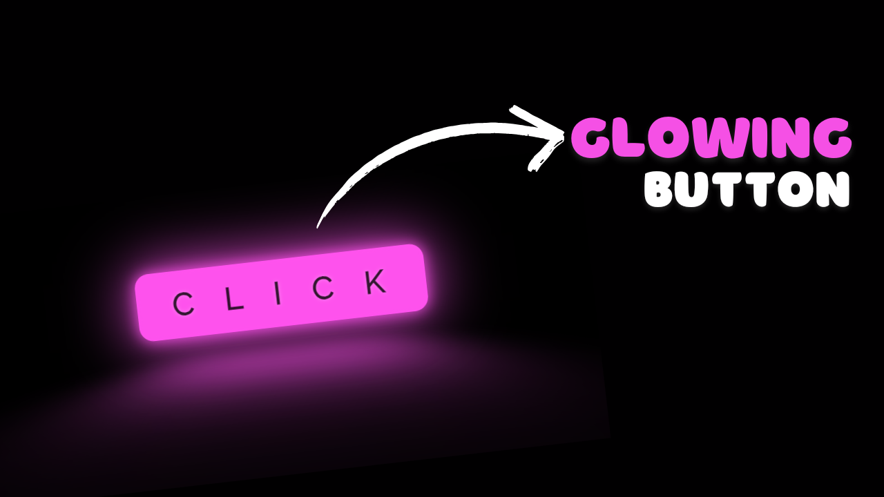
project preview
Folder Structure:
- Firstly we will create folder for our project CSSGlowingButtion or etc.
- Then we will create files index.html and style.css for our project
- At last we will link css file with index.html
Introduction:
In this project, we will create a CSS glowing button animation using HTML and CSS. The button features a glowing border and text that flickers, creating a dynamic and engaging visual effect. This project uses CSS animations and keyframes to create the glow and flicker effects, making the button stand out with a neon-like appearance. The button also has hover effects that enhance the animation, making it interactive and visually appealing.
HTML Code:
...
<!DOCTYPE html>
<html lang="en">

<head>
    <meta charset="UTF-8">
    <meta name="viewport" content="width=device-width, initial-scale=1.0">
    <title>CSS Glowing Button Animation</title>
    <!-- Link to external stylesheet -->
    <link rel="stylesheet" href="style.css">
</head>

<body>
    <!-- Button with glowing effect -->
    <button class="glowing_btn">
        <!-- Span for text with glowing effect -->
        <span class="glowing_txt">C<span class="faulty_letter">L</span>ICK</span>
    </button>
</body>

</html>
..
Explanation:
The HTML code for the CSS Glowing Button Animation sets up a basic web page structure featuring a single button with a glowing effect. Inside the <head> section, a link to the external CSS file (style.css) is provided for styling. The <body> section contains the main content, which includes a button element with the class glowing_btn. Within this button, a nested <span> with the class glowing_txt wraps the text “CLICK,” with an inner <span> for the letter “L” to apply a distinct flickering effect. This structure ensures that the button’s glowing and flickering animations are applied correctly, creating an engaging visual effect.
CSS Code:
...
/* Importing Google font 'Raleway' */
@import url("https://fonts.googleapis.com/css?family=Raleway");

/* Root variables for glow color */
:root {
  --glow-color: hsl(306, 99%, 66%);
}

/* General reset for padding, margin, and box-sizing */
* {
  padding: 0;
  margin: 0;
  box-sizing: border-box;
}

/* Centering the content vertically and horizontally */
html,
body {
  display: grid;
  height: 100%;
  place-items: center;
  background: #000;
  /* Background color */
}

/* Styles for the glowing button */
.glowing_btn {
  position: relative;
  color: var(--glow-color);
  cursor: pointer;
  padding: 0.35em 1em;
  border: 0.15em solid var(--glow-color);
  background: none;
  border-radius: 0.45em;
  perspective: 2em;
  font-family: "Raleway", sans-serif;
  font-size: 2em;
  font-weight: 900;
  letter-spacing: 1em;
  box-shadow: inset 0px 0px 0.5em 0px var(--glow-color),
    0px 0px 0.5em 0px var(--glow-color);
  animation: border-flicker 2s linear infinite;
  /* Flickering border animation */
}

/* Adding glow effect behind the button */
.glowing_btn::before {
  content: '';
  position: absolute;
  top: 0;
  bottom: 0;
  left: 0;
  right: 0;
  opacity: 0.7;
  filter: blur(1em);
  transform: translateY(120%) rotateX(95deg) scale(1, 0.35);
  background: var(--glow-color);
  pointer-events: none;
}

/* Adding background glow effect */
.glowing_btn::after {
  content: '';
  position: absolute;
  top: 0;
  left: 0;
  bottom: 0;
  right: 0;
  opacity: 0;
  z-index: -1;
  background-color: var(--glow-color);
  box-shadow: 0 0 2em 0.2em var(--glow-color);
  transition: opacity 100ms linear;
}

/* Styles for the glowing text */
.glowing_txt {
  float: left;
  margin-right: -0.8em;
  text-shadow: 0 0 0.45em hsl(0 0% 100% / 0.3),
    0 0 0.45em var(--glow-color);
  animation: text-flicker 3s linear infinite;
  /* Flickering text animation */
}

/* Styles for the faulty letter */
.faulty_letter {
  opacity: 0.5;
  animation: faulty-flicker 3s linear infinite;
  /* Flickering animation for faulty letter */
}

/* Hover effects */
.glowing_btn:hover {
  color: rgba(0, 0, 0, 0.8);
  text-shadow: none;
  animation: none;
}

.glowing_btn:hover .glowing_txt {
  animation: none;
}

.glowing_btn:hover .faulty_letter {
  animation: none;
  text-shadow: none;
  opacity: 1;
}

.glowing_btn:hover::before {
  filter: blur(1.5em);
  opacity: 1;
}

.glowing_btn:hover::after {
  opacity: 1;
}

/* Keyframes for faulty letter flicker animation */
@keyframes faulty-flicker {
  0% {
    opacity: 0.1;
  }

  2% {
    opacity: 0.1;
  }

  4% {
    opacity: 0.5;
  }

  19% {
    opacity: 0.5;
  }

  21% {
    opacity: 0.1;
  }

  23% {
    opacity: 1;
  }

  80% {
    opacity: 0.5;
  }

  83% {
    opacity: 0.4;
  }

  87% {
    opacity: 1;
  }
}

/* Keyframes for text flicker animation */
@keyframes text-flicker {
  0% {
    opacity: 0.1;
  }

  2% {
    opacity: 1;
  }

  8% {
    opacity: 0.1;
  }

  9% {
    opacity: 1;
  }

  12% {
    opacity: 0.1;
  }

  20% {
    opacity: 1;
  }

  25% {
    opacity: 0.3;
  }

  30% {
    opacity: 1;
  }

  70% {
    opacity: 0.7;
  }

  72% {
    opacity: 0.2;
  }

  77% {
    opacity: 0.9;
  }

  100% {
    opacity: 0.9;
  }
}

/* Keyframes for border flicker animation */
@keyframes border-flicker {
  0% {
    opacity: 0.1;
  }

  2% {
    opacity: 1;
  }

  4% {
    opacity: 0.1;
  }

  8% {
    opacity: 1;
  }

  70% {
    opacity: 0.7;
  }

  100% {
    opacity: 1;
  }
}
..
Explanation:
The CSS code is designed to create an engaging glowing effect for a button. First, the “Raleway” font is imported to ensure the button text has a distinct, modern appearance. A CSS variable, `–glow-color`, is defined to control the color used in the glowing effect.
The general reset section sets all elements to have no default padding or margin and applies `box-sizing: border-box` to ensure consistent element sizing.
For the button styling, properties such as `color`, `padding`, `border`, `background`, and `border-radius` are used to define its appearance. The button also features a `box-shadow` to create an inner and outer glow. An animation named `border-flicker` is applied to make the border pulse with a flickering effect.
To enhance the glow, pseudo-elements `::before` and `::after` are used. The `::before` pseudo-element creates a blurred, semi-transparent glow effect behind the button, while `::after` adds an additional glow effect around the button, which becomes more prominent on hover.
The text inside the button is styled using `text-shadow` to create a glowing text effect. The `glowing_txt` class animates the text to flicker using the `text-flicker` keyframes, which control the text’s opacity at various stages.
The `faulty_letter` class applies a specific flickering effect to the letter “L” within the text, using the `faulty-flicker` keyframes to simulate a malfunctioning glow.
On hover, the button’s color changes, and the glow animations are disabled to provide a contrasting visual effect. The keyframe animations define how the flickering effects for the border, text, and faulty letter are executed, creating a dynamic and interactive glowing button.
Source Code:
Download “CSS-Glowing-Button.zip” CSS-Glowing-Button.zip – Downloaded 384 times – 1.57 KBConclusions:
In this project, we have created an eye-catching CSS Glowing Button Animation that features a vibrant, dynamic effect. We defined a custom glow color and applied it to the button using various CSS properties and pseudo-elements. The button’s glow is enhanced with animations for both the border and text, creating a pulsating and flickering effect. A special animation for a specific letter adds an additional layer of visual interest. Finally, hover effects provide an interactive experience by altering the button’s appearance and disabling the glow animations.