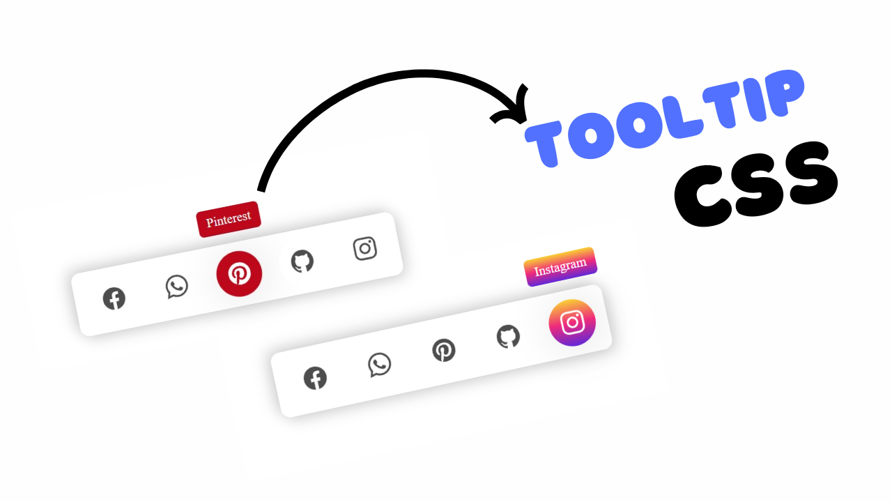
Project Preview
Folder Structure:
- First we will need to create a main folder for our project
- Then we will need to create index.html and style.css files
- At last we will need to link css file with Html
Introduction
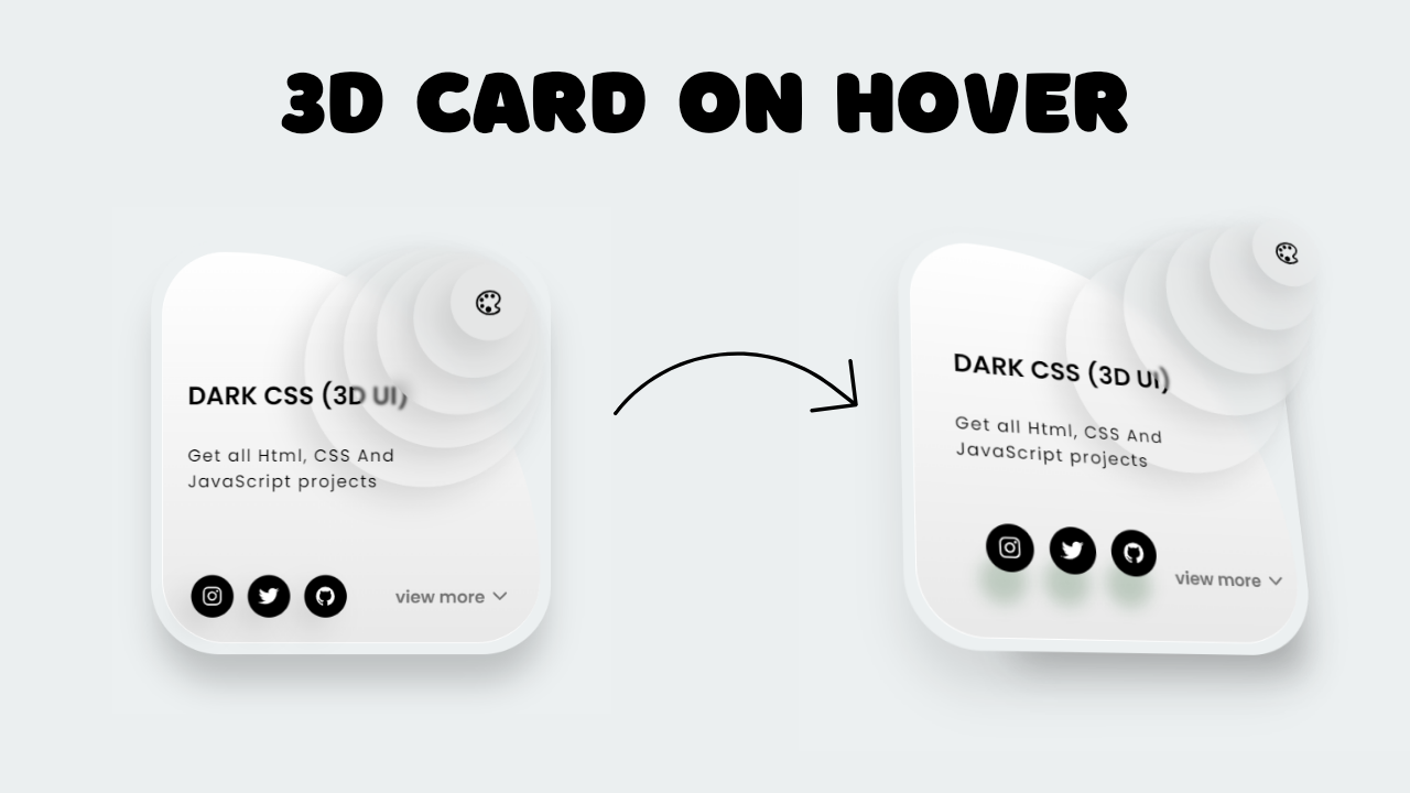
In this project, we will develop a visually striking CSS 3D card design interface that combines modern trends with innovative CSS techniques. The card will feature a multi-layered circular logo with a central icon, all enhanced by glassmorphism effects and smooth 3D transformations.
HTML Code:
...
<!DOCTYPE html>
<html lang="en">

<head>
    <meta charset="UTF-8">
    <meta name="viewport" content="width=device-width, initial-scale=1.0">
    <title>CSS 3D Card UI Design</title>
    <link rel="stylesheet" href="style.css">
</head>

<body>
    <!-- Wrapper div to contain the entire card -->
    <div class="wrapper">
        <!-- Main card div -->
        <div class="card">
            <!-- Logo section with nested circles -->
            <div class="logo">
                <div class="circle circle1"></div>
                <div class="circle circle2"></div>
                <div class="circle circle3"></div>
                <div class="circle circle4"></div>
                <!-- Icon inside the fifth circle -->
                <div class="circle circle5">
                    <a href="">
                        <ion-icon name="color-palette-outline"></ion-icon>
                    </a>
                </div>
            </div>
            <!-- Glass overlay -->
            <div class="glass"></div>
            <!-- Content section with title and text -->
            <div class="content">
                <span class="title">
                    DARK CSS (3D UI)
                </span>
                <span class="text">
                    Get all Html, CSS And JavaScript projects
                </span>
            </div>
            <!-- Bottom section with social buttons and view more button -->
            <div class="bottom">
                <!-- Social buttons -->
                <div class="social_buttons">
                    <button class="social_button social_button1">
                        <a href="">
                            <ion-icon name="logo-instagram"></ion-icon>
                        </a>
                    </button>
                    <button class="social_button social_button2">
                        <a href="">
                            <ion-icon name="logo-twitter"></ion-icon>
                        </a>
                    </button>
                    <button class="social_button social_button3">
                        <a href="">
                            <ion-icon name="logo-github"></ion-icon>
                        </a>
                    </button>
                </div>
                <!-- View more button -->
                <div class="view-more">
                    <button class="view_more_btn">
                        view more
                    </button>
                    <a href="">
                        <ion-icon name="chevron-down-outline"></ion-icon>
                    </a>
                </div>
            </div>
        </div>
    </div>
    <!-- Script to load Ionicons -->
    <script type="module" src="https://unpkg.com/ionicons@7.1.0/dist/ionicons/ionicons.esm.js"></script>
    <script nomodule src="https://unpkg.com/ionicons@7.1.0/dist/ionicons/ionicons.js"></script>
</body>

</html>
...
Explanation:
The <body> tag contains all the visible content of the web page. Inside the <div> element, which serves as a container with perspective properties, the main card structure is built. The <div> is the primary component of the card, which is styled and animated to have 3D transformations. This card contains several nested elements.
The <div> section contains five nested circular elements (<div>) that create a layered effect, with one circle (circle5) containing an icon, which is wrapped in an <a> tag for future linkage.
The <div> element is positioned inside the card, creating a glassmorphism effect by overlaying a semi-transparent background with a blur effect. The <div> section holds the textual information within the card.
This includes a <span> for the card’s main heading and a <span> for the subtitle or additional information. At the bottom of the card, the <div> section is split into two parts: the <div>, which houses social media icons inside buttons, and the <div>, containing a button for further interaction, like “View More,” paired with a down arrow icon.
CSS Code:
...
@import url("https://fonts.googleapis.com/css2?family=Poppins:wght@400;500;600&display=swap");

* {
    padding: 0;
    margin: 0;
    box-sizing: border-box;
    font-family: "Poppins", sans-serif;
}

html,
body {
    display: grid;
    height: 100%;
    place-items: center;
    background-color: #ecf0f1;
}

.wrapper {
    width: 290px;
    height: 300px;
    perspective: 1000px;
}

.card {
    height: 100%;
    border-radius: 50px;
    background: #ecf0f1;
    transform-style: preserve-3d;
    transition: all 0.5s ease-in-out;
    box-shadow: rgba(0, 0, 0, 0) 40px 50px 25px -40px,
        rgba(0, 0, 0, 0.2) 0px 25px 25px -5px;
    position: relative;
}

.glass {
    transform-style: preserve-3d;
    position: absolute;
    inset: 8px;
    border-radius: 55px;
    border-top-right-radius: 100%;
    background: linear-gradient(0deg, #e9e9e9 0%, #fff 100%);
    border-left: 1px solid #fff;
    border-bottom: 1px solid #fff;
    transition: all 0.5s ease-in-out;
}

.content {
    padding: 100px 60px 0px 30px;
    transform: translate3d(0, 0, 26px);
}

.content .title {
    display: block;
    color: #000;
    font-weight: 600;
    font-size: 18px;
}

.content .text {
    display: block;
    color: #000;
    font-size: 12px;
    font-weight: 400;
    letter-spacing: 1px;
    margin-top: 20px;
}

.bottom {
    padding: 10px 12px;
    transform-style: preserve-3d;
    position: absolute;
    bottom: 20px;
    left: 20px;
    right: 20px;
    display: flex;
    align-items: center;
    justify-content: space-between;
    transform: translate3d(0, 0, 26px);
}

.bottom .view-more {
    display: flex;
    align-items: center;
    justify-content: flex-end;
    width: 40%;
    transition: all 0.2s ease-in-out;
}

.bottom .view-more:hover {
    transform: translate3d(0, 0, 10px);
}

.bottom .view-more .view_more_btn {
    border: 0;
    background: none;
    font-weight: bolder;
    color: #727272;
    font-size: 12px;
    cursor: pointer;
}

.bottom .view-more a {
    margin-left: 3px;
    text-decoration: none;
    color: #727272;
    font-size: 15px;
    display: flex;
    align-items: center;
}

.bottom .social_buttons {
    display: flex;
    gap: 10px;
    transform-style: preserve-3d;
}

.bottom .social_buttons .social_button {
    width: 30px;
    aspect-ratio: 1;
    padding: 5px;
    background: rgb(0, 0, 0);
    border-radius: 50%;
    border: none;
    display: grid;
    place-content: center;
    box-shadow: rgba(0, 0, 0, 0.1) -10px 10px 20px 0;
}

.bottom .social_buttons .social_button a {
    font-size: 15px;
    color: #fff;
    text-decoration: none;
    display: flex;
    align-items: center;
}

.logo {
    position: absolute;
    top: 0;
    right: 0;
    transform-style: preserve-3d;
}

.logo .circle {
    display: block;
    position: absolute;
    aspect-ratio: 1;
    border-radius: 50%;
    top: 0;
    right: 0;
    box-shadow: rgba(0, 0, 0, 0.1) -10px 10px 20px 0px;
    backdrop-filter: blur(5px);
    background: rgba(225, 224, 224, 0.2);
    transition: all 0.5s ease-in-out;
}

.logo .circle1 {
    width: 170px;
    transform: translate3d(0, 0, 20px);
    top: 8px;
    right: 8px;
}

.logo .circle2 {
    width: 140px;
    transform: translate3d(0, 0, 40px);
    top: 10px;
    right: 10px;
    backdrop-filter: blur(1px);
    transition-delay: 0.4s;
}

.logo .circle3 {
    width: 110px;
    transform: translate3d(0, 0, 60px);
    top: 17px;
    right: 17px;
    transition-delay: 0.8s;
}

.logo .circle4 {
    width: 80px;
    transform: translate3d(0, 0, 80px);
    top: 23px;
    right: 23px;
    transition-delay: 1.2s;
}

.logo .circle5 {
    width: 50px;
    transform: translate3d(0, 0, 100px);
    top: 30px;
    right: 30px;
    display: grid;
    place-content: center;
    transition-delay: 1.6s;
}

.logo .circle5 a {
    font-size: 20px;
    color: #000;
    display: flex;
    align-items: center;
}

.wrapper:hover .card {
    transform: rotate3d(1, 1, 0, 30deg);
    box-shadow: rgba(61, 61, 61, 0.3) 30px 50px 25px -40px,
        rgba(0, 0, 0, 0.1) 0px 25px 30px 0px;
}

.wrapper:hover .card .bottom .social_buttons .social_button {
    transform: translate3d(0, 0, 50px);
    box-shadow: rgba(5, 71, 17, 0.2) -5px 20px 10px 0px;
}

.wrapper:hover .card .logo .circle2 {
    transform: translate3d(0, 0, 60px);
    color: #2c2c30;
}

.wrapper:hover .card .logo .circle3 {
    transform: translate3d(0, 0, 80px);
}

.wrapper:hover .card .logo .circle4 {
    transform: translate3d(0, 0, 100px);
}

.wrapper:hover .card .logo .circle5 {
    transform: translate3d(0, 0, 120px);
}

/* Responsive styles for mobile view */
@media (max-width: 600px) {
    .wrapper {
        width: 240px;
        height: 260px;
    }

    .card {
        border-radius: 30px;
    }

    .glass {
        inset: 5px;
        border-radius: 35px;
    }

    .content {
        padding: 80px 40px 0px 20px;
    }

    .content .title {
        font-size: 16px;
    }

    .content .text {
        font-size: 10px;
        margin-top: 15px;
    }

    .bottom {
        bottom: 15px;
        left: 15px;
        right: 15px;
    }

    .bottom .view-more .view_more_btn {
        font-size: 10px;
    }

    .bottom .view-more a {
        font-size: 12px;
    }

    .bottom .social_buttons .social_button {
        width: 25px;
    }

    .bottom .social_buttons .social_button a {
        font-size: 12px;
    }

    .logo .circle {
        box-shadow: rgba(0, 0, 0, 0.1) -5px 5px 15px 0px;
    }

    .logo .circle1 {
        width: 120px;
        top: 6px;
        right: 6px;
    }

    .logo .circle2 {
        width: 100px;
        top: 8px;
        right: 8px;
    }

    .logo .circle3 {
        width: 80px;
        top: 13px;
        right: 13px;
    }

    .logo .circle4 {
        width: 60px;
        top: 18px;
        right: 18px;
    }

    .logo .circle5 {
        width: 40px;
        top: 22px;
        right: 22px;
    }

    .logo .circle5 a {
        font-size: 16px;
    }
}
...
Explanation:
The @import url(...) statement at the beginning imports the “Poppins” font from Google Fonts, which is used throughout the card to give it a modern and clean appearance.
The universal selector * is used to apply some basic styles to all elements in the document—specifically, it removes default padding and margins and sets the box-sizing to border-box, which ensures that padding and borders are included within the element’s total width and height.
The html, body rules set the entire webpage to be a grid that centers its content both vertically and horizontally, using display: grid and place-items: center. This also ensures the page takes up the full height of the viewport.
The .wrapper class defines a container for the card, with a fixed width and height and a perspective property. The perspective of 1000px gives the 3D effect by defining the distance from the viewer to the object. Inside the .wrapper, the .card class is where the 3D transformation magic happens.
The transform-style: preserve-3d property ensures that the child elements of the card maintain their 3D positions, and transition: all 0.5s ease-in-out allows smooth animations when the card is interacted with.
The .glass class creates a glassmorphism effect—a popular design trend—by using a semi-transparent background with a blur, achieved through properties like backdrop-filter: blur(5px) and a light gradient background.
This gives the card a frosted glass appearance. The .content class is responsible for the text inside the card. It positions the content with padding, sets the text color to black (color: #000), and defines the font size and weight for the title and text. The transform: translate3d(0, 0, 26px) property slightly moves the content forward in 3D space, making it appear closer to the viewer.
The .bottom class defines the area containing the social buttons and the “View More” button. These elements are positioned at the bottom of the card using position: absolute, with additional 3D effects like transform-style: preserve-3d to keep them in their 3D positions.
The .social_buttons class contains individual buttons for social media, styled as circles with icons inside. They have a subtle shadow and transform properties that make them pop out in 3D space when the card is hovered over. The .view-more class contains the “View More” button and an icon, both of which are styled to be small, clean, and slightly elevated using 3D translation.
The .logo and its nested .circle classes create the layered circular elements at the top-right corner of the card. These circles gradually increase in size and move forward in 3D space, creating a sense of depth.
They also have a blur and shadow effect to enhance the 3D illusion. The hover effect on .wrapper:hover .card rotates the card and makes the circles and social buttons pop out more, adding interactivity.
Source Code:
Download “Animated-3D-Card.zip” Animated-3D-Card.zip – Downloaded 355 times – 2.24 KB
Conclusion:
In conclusion, this project showcases how CSS can be used to create visually engaging and interactive 3D UI designs. By leveraging CSS properties like perspective, transform-style, and translate3d, the card achieves a dynamic 3D effect that responds to user interactions. The implementation of glassmorphism through blurred, semi-transparent elements adds a modern touch, while smooth transitions and hover animations enhance the user experience. The careful structuring and layering of elements, such as the circular logo and social media buttons, demonstrate how CSS can be used creatively to build complex, yet accessible, web designs. This project not only highlights key CSS techniques but also provides a foundation for building sophisticated and responsive web interfaces.
