Folder Structure
- First we will need to create a folder for our project
- Inside it we will need to create files html and css
- Inside main folder we will create Images folder for background image
- At last we will need to link css file with html
Introduction:
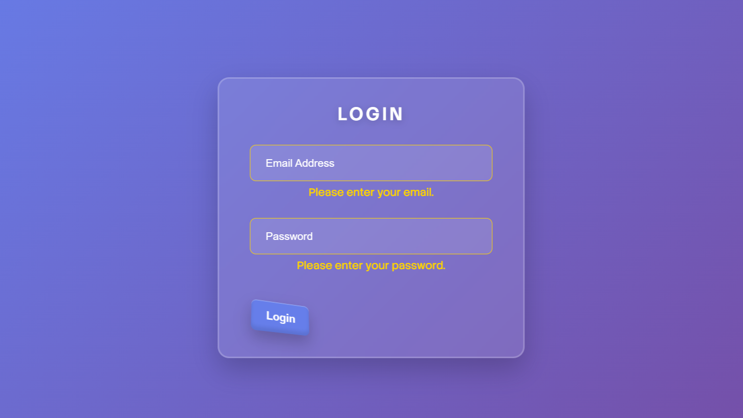
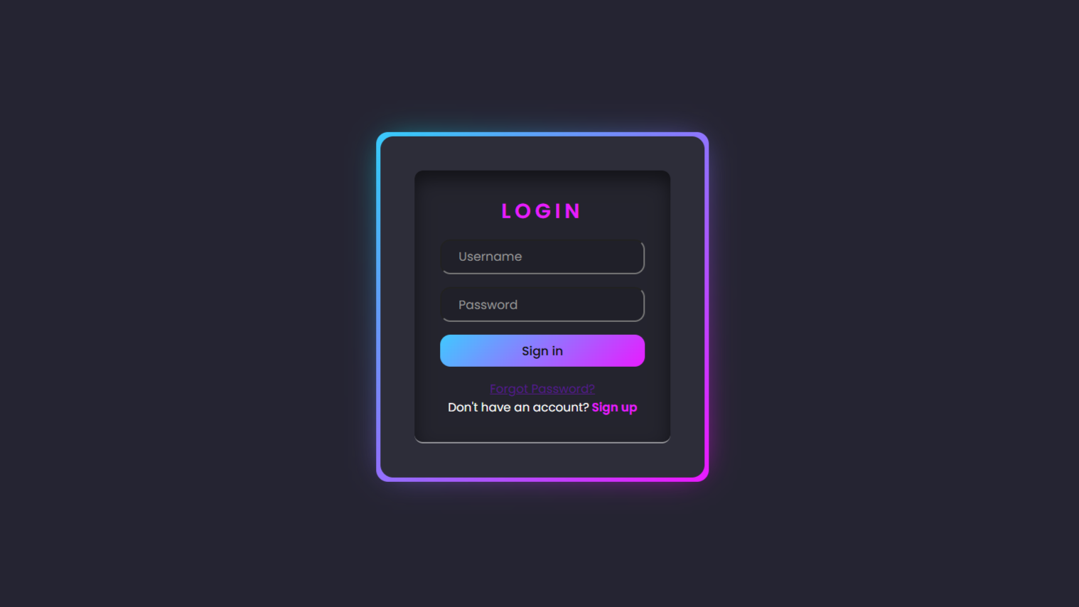
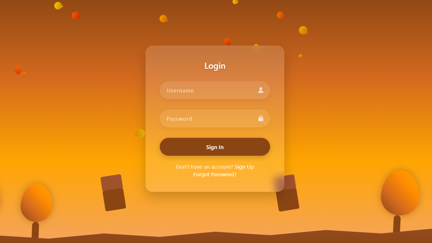
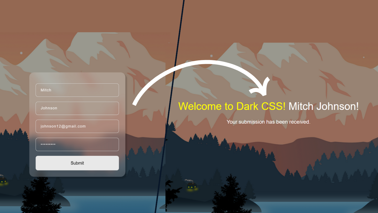
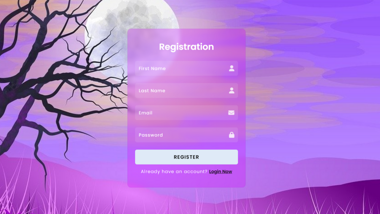
In this project, we will create a modern login and registration form in HTML and CSS. The form has two sides: one for login and one for registration, and the user can toggle between them by clicking a button. The design features an attractive background image, smooth transitions, and a clean, minimalist interface. Font Awesome icons are used to enhance the input fields for better user experience. The project focuses on providing an interactive and responsive UI for users.
HTML Code:
...
<!DOCTYPE html>
<html lang="en">

<head>
  <meta charset="UTF-8">
  <meta name="viewport" content="width=device-width, initial-scale=1.0">
  <meta http-equiv="X-UA-Compatible" content="ie=edge">
  <title>Create Login Form | Html CSS</title>
  <link rel="stylesheet" href="style.css">
  <link rel="stylesheet" href="https://cdnjs.cloudflare.com/ajax/libs/font-awesome/6.6.0/css/all.min.css">
</head>

<body>
<div class="wrapper">
<div class="card login-size">
      <!-- Login Form -->
  <div class="login-form">
    <h2>Login</h2>
    <div class="input-group">
      <i class="fas fa-envelope"></i>
      <input type="email" placeholder="Email">
    </div>
    <div class="input-group">
      <i class="fas fa-lock"></i>
      <input type="password" placeholder="Password">
    </div>
    <a href="#" class="forgot-password">Forgot Password?</a>
    <button class="btn btn-login">Login</button>
    <p class="toggle-text">Don't have an account? <a href="#" class="toggle">Register Now</a></p>
  </div>
</div>

    <div class="content">
      <!-- Registration Form -->
      <h2>Registration</h2>
      <div class="input-group">
        <i class="fas fa-user"></i>
        <input type="text" placeholder="First Name">
      </div>
      <div class="input-group">
        <i class="fas fa-user"></i>
        <input type="text" placeholder="Last Name">
      </div>
      <div class="input-group">
        <i class="fas fa-envelope"></i>
        <input type="email" placeholder="Email">
      </div>
      <div class="input-group">
        <i class="fas fa-lock"></i>
        <input type="password" placeholder="Password">
      </div>
      <button class="btn">Register</button>
      <p class="toggle-text">Already have an account? <a href="#" class="toggle">Login Now</a></p>
    </div>
  </div>
</body>

</html>
...
Explanation:
In the <body>, the main content is wrapped inside a div with the class wrapper, which sets up the card container for the flip effect. Within the wrapper, two sections are defined: one for the login form (login-form) and the other for the registration form (content).
The login-form includes an email and password field, with Font Awesome icons inside the input-group div for visual appeal. There’s also a “Forgot Password?” link and a login button. Below that, a toggle text allows users to switch to the registration form.
The registration form, placed within the content div, contains input fields for first name, last name, email, and password, each accompanied by relevant icons. A registration button is also provided, along with a toggle option to switch back to the login form.
A <script> at the end adds an event listener to the toggle links, enabling the card-flipping animation by adding and removing a flip class on the wrapper when toggled.
CSS Code:
...
@import url('https://fonts.googleapis.com/css2?family=Poppins:ital,wght@0,100;0,200;0,300;0,400;0,500;0,600;0,700;0,800;0,900;1,100;1,200;1,300;1,400;1,500;1,600;1,700;1,800;1,900&display=swap');

* {
  padding: 0;
  margin: 0;
  font-family: "Poppins", sans-serif;
  box-sizing: border-box;
}

body {
  background: url('images/Landscape.jpg') no-repeat;
  width: 100%;
  height: 100vh;
  background-size: cover;
  background-position: center;
}

.wrapper {
  height: 430px;
  width: 320px;
  position: absolute;
  top: 50%;
  left: 50%;
  transform: translate(-50%, -50%);
  perspective: 1000px;
  backdrop-filter: blur(5px);
}

.wrapper .card.login-size {
  height: 340px;
}

.wrapper .card,
.wrapper .content {
  position: absolute;
  width: 100%;
  height: 100%;
  padding: 40px 20px;
  text-align: center;
  background: rgba(212, 0, 255, 0.26);
  color: #fff;
  border-radius: 10px;
  transition: all 0.5s ease-in-out;
  backface-visibility: hidden;
  border: 1px solid #40175815;
  /* Hide the back side of the card */
}

.wrapper .card {
  transform: rotateY(0);
}

.wrapper .content {
  transform: rotateY(90deg);
}

.wrapper.flip .card {
  transform: rotateY(-90deg);
}

.wrapper.flip .content {
  transform: rotateY(0);
}

.wrapper h2 {
  margin-bottom: 20px;
  margin-top: -10px;
  font-weight: 600;
}

.input-group {
  position: relative;
  margin-bottom: 20px;
}

.input-group i {
  position: absolute;
  right: 10px;
  top: 50%;
  transform: translateY(-50%);
  color: #ffffffcf;
}

.input-group input {
  width: 100%;
  padding: 10px 35px 10px 10px;
  border-radius: 5px;
  border: none;
  background: rgba(255, 255, 255, 0.1);
  color: #fff;
  outline: none;
}

.input-group input::placeholder {
  color: #fff;
  letter-spacing: 1px;
  font-size: 12px;
}

.forgot-password {
  display: block;
  margin-left: 160px;
  margin-top: -15px;
  font-size: 10px;
  font-weight: 600;
  color: #060606;
}

.btn-login {
  margin: 20px 0;
}

.btn {
  padding: 10px 20px;
  width: 100%;
  background-color: #dfeaf7;
  border: none;
  text-transform: uppercase;
  font-weight: 600;
  color: #000;
  border-radius: 5px;
  cursor: pointer;
  letter-spacing: 1px;
  margin-bottom: 10px;
}

.toggle-text {
  font-size: 12px;
  letter-spacing: 1px;
  font-weight: 300;
}

.toggle {
  color: #050506;
  cursor: pointer;
  font-weight: 600;
  letter-spacing: 0;
}

.toggle:hover {
  text-decoration: underline;
}
...
Explanation:
The CSS code begins by importing the “Poppins” font from Google Fonts and applying it globally to ensure a clean and modern typography across the form.
Universal selectors (*) reset padding and margin, while box-sizing: border-box ensures consistent element sizing by including padding and borders in width and height calculations. The body styling sets a full-screen background image (Landscape.jpg) with no-repeat to avoid tiling, and background-size: cover ensures the image scales to fill the entire viewport, while background-position: center aligns the image centrally.
The .wrapper class defines a fixed size (320px width, 430px height) for the card container, positioning it absolutely at the center of the viewport using transform: translate(-50%, -50%). A perspective of 1000px is applied to enable the 3D flip effect, and backdrop-filter: blur(5px) adds a subtle blur to the background for a more polished appearance.
The .card and .content classes define the front (login form) and back (registration form) sides of the flipping card. Both sections are styled to be of equal width and height, with a light, semi-transparent background color (rgba(212, 0, 255, 0.26)) and smooth transitions for rotating and flipping the card using transition: all 0.5s ease-in-out. The backface-visibility: hidden property ensures that the back side of the card is hidden when flipped.
The rotation of the .card and .content elements is controlled by transform: rotateY(). Initially, the login form (.card) is set to rotateY(0), while the registration form (.content) is rotated by 90 degrees (rotateY(90deg)) to hide it. When the flip class is applied to the .wrapper via JavaScript, these rotations switch, revealing the other side of the card.
The forms themselves are designed with clean input fields using the .input-group class. Input fields are styled with padding, rounded corners, and a translucent background (rgba(255, 255, 255, 0.1)), along with a white font color for text. Icons within the inputs are positioned absolutely to the right, aligning them visually with the input fields.
The buttons (.btn) are styled with a light blue background, bold uppercase text, and rounded corners, ensuring they are visually distinct and easy to interact with. The .toggle-text and .toggle classes manage the small toggle links for switching between forms, and on hover, the toggle link is underlined for better user interaction.
JavaScript Code:
...
document.querySelectorAll('.toggle').forEach(toggle => {
   toggle.addEventListener('click', () => {
      document.querySelector('.wrapper').classList.toggle('flip');
   });
});
Explanation:
The code begins by selecting all elements with the class .toggle (the “Register Now” and “Login Now” links in both forms) using document.querySelectorAll('.toggle'). This returns a list of elements, and the forEach method is used to loop over each toggle element.
For each toggle link, an event listener is added using toggle.addEventListener('click', () => { ... }). This means that whenever a user clicks on one of the toggle links, the following function is executed.
Inside the function, the classList.toggle('flip') method is called on the .wrapper element, which is selected using document.querySelector('.wrapper'). The classList.toggle() method checks whether the .wrapper already has the flip class:
- If the
flipclass is present, it is removed. - If the
flipclass is not present, it is added.
This toggling of the flip class triggers the CSS transition, which rotates the .card and .content divs. When the flip class is applied, the login form (in the .card div) rotates out of view with transform: rotateY(-90deg), and the registration form (in the .content div) rotates into view with transform: rotateY(0). If the flip class is removed, the process is reversed, showing the login form again.
Source Code:
Download “Login-Registration-Toggle.zip” Login-Registration-Toggle.zip – Downloaded 630 times – 136.43 KBConclusions:
In this project, we successfully created an interactive login and registration form with a 3D card-flipping effect using HTML, CSS, and JavaScript. We styled the form to have a modern, clean design with responsive input fields and Font Awesome icons for enhanced user experience. The flip effect allows seamless toggling between the two forms, providing a visually appealing user interface. The JavaScript enables the flipping animation, making the form dynamic and engaging.