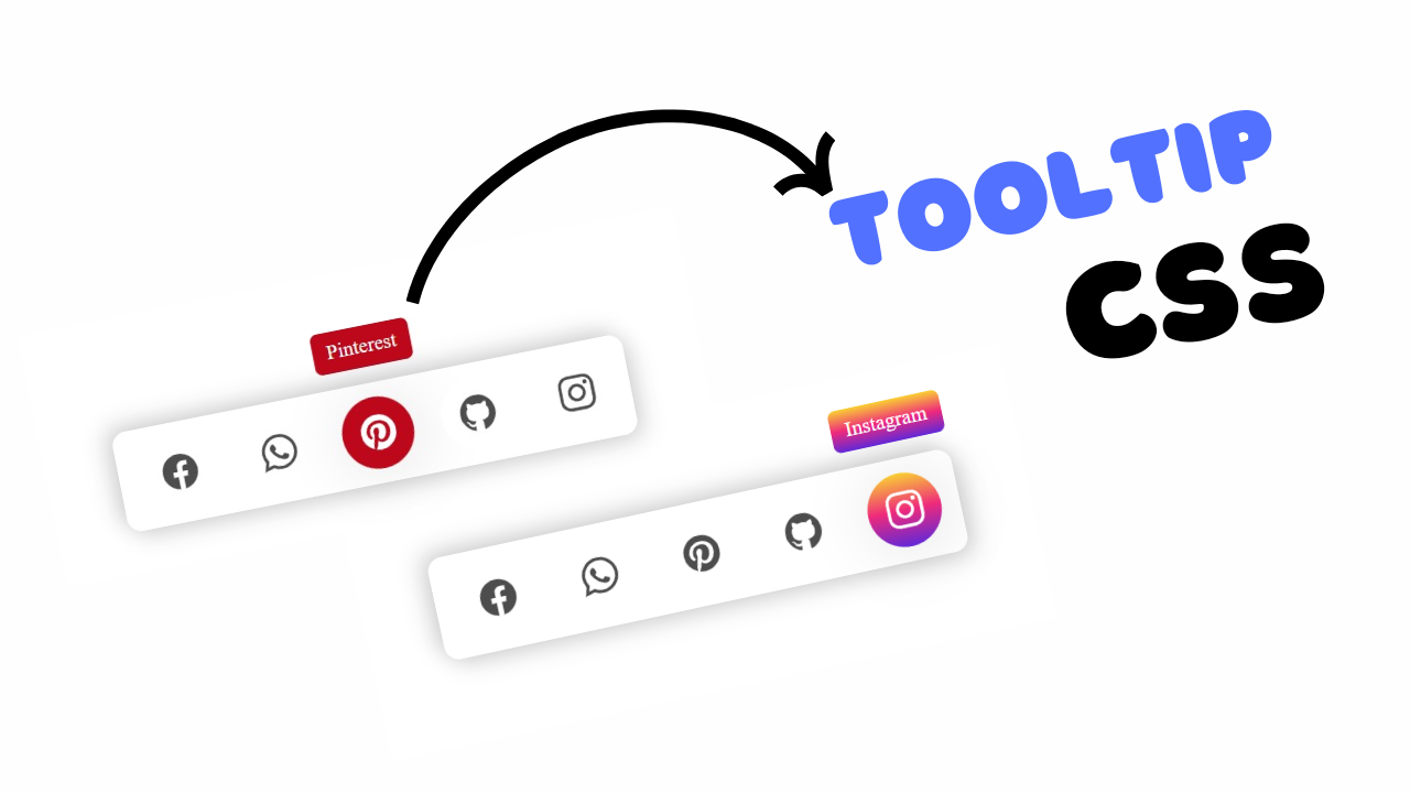
Project preview
First we need to create file structure of our project Checklist using Html CSS.
- Create Project Files:
- Create a new folder for your project, for example,
checklist-project. - Inside this folder, create two files:
index.htmlandstyle.css.
- Create a new folder for your project, for example,
- Set Up the HTML File:
- Open
index.htmland set up the basic HTML structure with a<!DOCTYPE html>,<html>,<head>, and<body>tags. - Link the CSS file (
style.css) to the HTML file using the<link>tag within the<head>section.
- Open
Introduction:
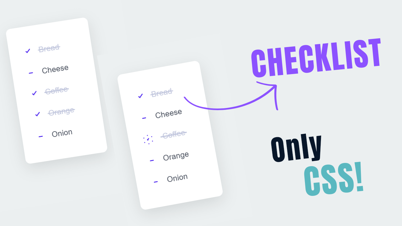
In this project, you’ll learn how to create a interactive checklist using only HTML and CSS. The goal is to build a user-friendly checklist that responds to user interactions with animations and custom styling. The checklist will feature a clean, minimalist design with custom checkboxes, animations for when items are checked or unchecked, and a modern look and feel. By the end of this project.
Html Code Explanation:
....
<!DOCTYPE html>
<html lang="en">
<head>
    <meta charset="UTF-8">
    <meta name="viewport" content="width=device-width, initial-scale=1.0">
    <title>Create Checklist using only Html CSS</title>
    <link rel="stylesheet" href="style.css">
</head>
<body>
    <!-- Checklist container -->

    <div id="checklist">
        <!-- Checkbox input and Label for items -->

        <input checked="" value="1" name="r" type="checkbox" id="01">
        <label for="01">Bread</label>
        <input value="2" name="r" type="checkbox" id="02">
        <label for="02">Cheese</label>
        <input value="3" name="r" type="checkbox" id="03">
        <label for="03">Coffee</label>
        <input value="4" name="r" type="checkbox" id="04">
        <label for="04">Orange</label>
        <input value="5" name="r" type="checkbox" id="05">
        <label for="05">Onion</label>
    </div>

</body>
</html>
....
The <body> tag contains all the content that will be displayed on the webpage, such as text, images, links, and other elements.
<div id="checklist">
- The
<div>tag is a container for HTML elements and is often used to group elements to style them with CSS or to manipulate them with JavaScript. - The
id="checklist"uniquely identifies this<div>as the checklist container. It allows the CSS to apply specific styles to the checklist.
<input type="checkbox">
- Each
<input>element withtype="checkbox"represents a checkbox input control. - These checkboxes allow users to select or deselect items on the checklist.
- Attributes used in
<input>:checked="": This attribute is added to the first checkbox input to make it pre-checked when the page loads.value: This attribute sets the value for the checkbox input. It is useful when the form data is submitted to a server, though in this static example, it’s not being used for submission.name="r": This attribute is the name of the checkbox group. It’s the same for all checkboxes here, but since each checkbox has a differentid, it doesn’t impact this static example. In a form submission scenario, multiple checkboxes can share the same name to form a group.id: Each checkbox has a uniqueid(e.g.,id="01",id="02"). Theidattribute uniquely identifies each checkbox, which is essential for linking it with its corresponding<label>.
- Attributes used in
<label for="id">
- The
<label>tag is used to define labels for the<input>elements. It improves accessibility by making the text clickable to toggle the associated checkbox. - The
forattribute matches theidof a checkbox (<input>element), linking each label to its corresponding checkbox.
Html Code Summary
This HTML code creates a simple checklist with five items: Bread, Cheese, Coffee, Orange, and Onion. Each item consists of a checkbox and a label. When the user checks or unchecks a checkbox, the state of the list item is toggled. This basic structure is the foundation for adding interactivity and animations using CSS.
CSS Code Explanation:
....
/* Import Google Fonts */
@import url('https://fonts.googleapis.com/css2?family=Poppins:wght@400;500;600&display=swap');

/* Global styles */
*{
    padding: 0;
    margin: 0;
    box-sizing: border-box;
    font-family: 'Poppins', sans-serif;
}

/* Styles for HTML and body elements */
html, body{
    display: grid;
    height: 100%;
    place-items: center;
    background: #ecf0f1;
}

/* Styles for the checklist container */
#checklist {
    background: #fff;
    width: 120px;
    height: 280px;
    border-radius: 10px;
    position: relative;
    box-shadow: 0 10px 30px rgba(0, 0, 0, 0.1);
    padding: 30px 85px;
    display: grid;
    grid-template-columns: 30px auto;
    align-items: center;
    justify-content: center;

}

/* Styles for checklist labels */

#checklist label {
    color: #414856;
    position: relative;
    cursor: pointer;
    display: grid;
    align-items: center;
    width: fit-content;
    transition: color 0.3s ease;
    margin-right: 20px;
}

#checklist label::before,
#checklist label::after {
    content: "";
    position: absolute;
}

#checklist label::before {
    height: 2px;
    width: 8px;
    left: -27px;
    background: #4f29f0;
    border-radius: 2px;
    transition: background 0.3s ease;
}

#checklist label:after {
    height: 4px;
    width: 4px;
    top: 8px;
    left: -25px;
    border-radius: 50%;
}

/* Styles for checkbox input */

#checklist input[type="checkbox"] {
    appearance: none;
    position: relative;
    height: 15px;
    width: 15px;
    outline: none;
    border: 0;
    margin: 0 15px 0 0;
    cursor: pointer;
    background: #fff;
    display: grid;
    align-items: center;
    margin-right: 20px;
}

#checklist input[type="checkbox"]::before,
#checklist input[type="checkbox"]::after {
    content: "";
    position: absolute;
    height: 2px;
    top: auto;
    background: #4f29f0;
    border-radius: 2px;
}

#checklist input[type="checkbox"]::before {
    width: 0px;
    right: 60%;
    transform-origin: right bottom;
}

#checklist input[type="checkbox"]::after {
    width: 0px;
    left: 40%;
    transform-origin: left bottom;
}

/* cut line when an item is checked */

#checklist input[type="checkbox"]:checked::before {
    animation: check-01 0.4s ease forwards;
}

#checklist input[type="checkbox"]:checked::after {
    animation: check-02 0.4s ease forwards;
}

#checklist input[type="checkbox"]:checked+label {
    color: #c3c8de;
    animation: move 0.3s ease 0.1s forwards;
}

#checklist input[type="checkbox"]:checked+label::before {
    background: #c3c8de;
    animation: slice 0.4s ease forwards;
}

#checklist input[type="checkbox"]:checked+label::after {
    animation: firework 0.5s ease forwards 0.1s;
}

/* Animation keyframes for checkbox states */

@keyframes move {
    50% {
        padding-left: 8px;
        padding-right: 0px;
    }

    100% {
        padding-right: 4px;
    }
}

@keyframes slice {
    60% {
        width: 100%;
        left: 4px;
    }

    100% {
        width: 100%;
        left: -2px;
        padding-left: 0;
    }
}

@keyframes check-01 {
    0% {
        width: 4px;
        top: auto;
        transform: rotate(0);
    }

    50% {
        width: 0px;
        top: auto;
        transform: rotate(0);
    }

    51% {
        width: 0px;
        top: 8px;
        transform: rotate(45deg);
    }

    100% {
        width: 5px;
        top: 8px;
        transform: rotate(45deg);
    }
}

@keyframes check-02 {
    0% {
        width: 4px;
        top: auto;
        transform: rotate(0);
    }

    50% {
        width: 0px;
        top: auto;
        transform: rotate(0);
    }

    51% {
        width: 0px;
        top: 8px;
        transform: rotate(-45deg);
    }

    100% {
        width: 10px;
        top: 8px;
        transform: rotate(-45deg);
    }
}

/* Animation when an item is checked */

@keyframes firework {
    0% {
        opacity: 1;
        box-shadow: 0 0 0 -2px #4f29f0, 0 0 0 -2px #4f29f0, 0 0 0 -2px #4f29f0, 0 0 0 -2px #4f29f0, 0 0 0 -2px #4f29f0, 0 0 0 -2px #4f29f0;
    }

    30% {
        opacity: 1;
    }

    100% {
        opacity: 0;
        box-shadow: 0 -15px 0 0px #4f29f0, 14px -8px 0 0px #4f29f0, 14px 8px 0 0px #4f29f0,
        0 15px 0 0px #4f29f0, -14px 8px 0 0px #4f29f0, -14px -8px 0 0px #4f29f0;
    }
}
...
The CSS code begins by importing the “Poppins” font from Google Fonts to provide a clean and modern look.
A global reset is applied to all elements using the universal selector (`*`), which removes default padding and margins, sets the box-sizing to `border-box` for consistent sizing, and applies the “Poppins” font.
The `html` and `body` elements are styled to use a CSS Grid layout to center the checklist in the middle of the page, with a light grey background (`#ecf0f1`) that provides a subtle contrast to the checklist container.
The checklist container (`#checklist`) is styled with a white background, rounded corners (`border-radius: 10px`), a soft shadow effect (`box-shadow: 0 10px 30px rgba(0, 0, 0, 0.1)`), and uses a grid layout to arrange checkboxes and labels side by side.
Each label is styled with a specific text color (`#414856`), a pointer cursor to indicate interactivity, and a smooth color transition (`transition: color 0.3s ease`) when hovered.
Checkboxes are customized by removing their default appearance (`appearance: none`) and creating custom checkmarks using pseudo-elements (`::before` and `::after`), which are positioned absolutely to appear within the checkbox area.
When a checkbox is checked, these pseudo-elements are animated to create checkmark effects using keyframe animations like `check-01` and `check-02`, which control the size and rotation of the checkmark lines.
Additional animations (`move`, `slice`, and `firework`) are used to create engaging visual feedback, such as moving the label slightly to the right, slicing a line through it, or creating a “firework” effect around the checkbox when checked, enhancing the interactive experience of the checklist.
Source Code:
Download “CSS-Items-Checklist.zip” CSS-Items-Checklist.zip – Downloaded 419 times – 1.66 KB
Conclusion:
In this project, we created an interactive checklist using only HTML and CSS, showcasing how to style and animate form elements without JavaScript. We structured the checklist with HTML, using checkboxes and labels, and then applied custom styles to create a visually appealing design. Advanced CSS techniques, including pseudo-elements and keyframe animations, were utilized to craft dynamic effects when items are checked, such as animated checkmarks and color transitions. This project demonstrates the power of CSS in creating interactive UI elements, enhancing user experience with engaging visual feedback.
