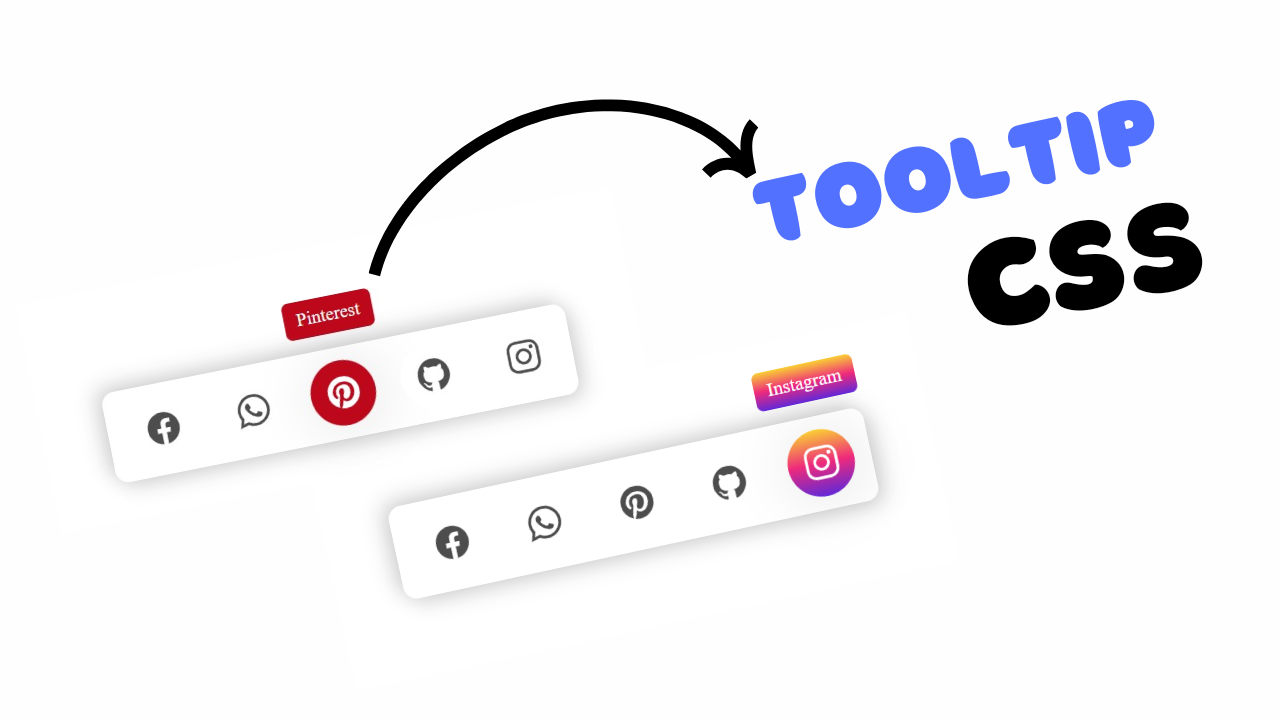
Project Preview
Folder Structure:
- First we will need to create our folder for our project like AnimatedMenu or etc
- Then we will need to create files for our project index.html and style.css
- At last we will need to link style.css file with index.html
Introduction:
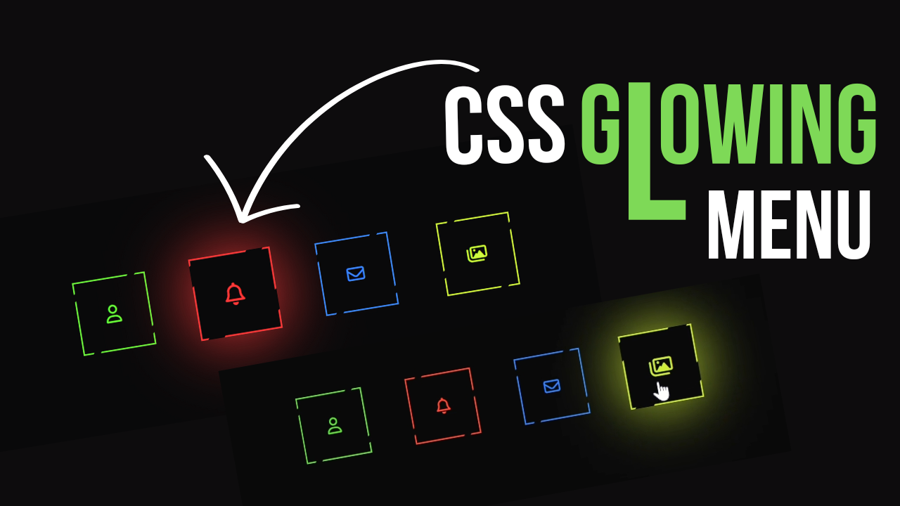
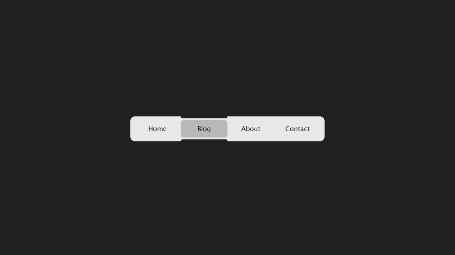
In this project, we are going to create an animated navigation menu bar using HTML and CSS. This stylish menu features a series of icons representing different functions such as user profile, notifications, messages, and gallery, each with its own unique hover effects. When you hover over these icons, they will expand and glow, providing an engaging and interactive user experience.
HTML Code:
...
<!DOCTYPE html>
<html lang="en">

<head>
    <meta charset="UTF-8">
    <meta name="viewport" content="width=device-width, initial-scale=1.0">
    <title>Animated Navigation Menu Bar using Html CSS</title>
    <link rel="stylesheet" href="style.css"> <!-- Linking external CSS file -->
    <link rel="stylesheet" href="https://cdnjs.cloudflare.com/ajax/libs/font-awesome/6.5.1/css/all.min.css">
</head>

<body>
    <div class="wrapper">
        <!-- Menu items -->
        <div class="box">
            <i class="far fa-user"></i>
            <span></span> <!-- Span for animation -->
            <small></small> <!-- Small for animation -->
        </div>
        <div class="box">
            <i class="far fa-bell"></i>
            <span></span>
            <small></small>
        </div>
        <div class="box">
            <i class="far fa-envelope"></i>
            <span></span>
            <small></small>
        </div>
        <div class="box">
            <i class="far fa-images"></i>
            <span></span>
            <small></small>
        </div>
    </div>
</body>

</html>
...
Explanation:
The <body> section, which contains the visible content of the page, is centered using CSS grid properties applied to both <html> and <body>. Inside the body, a <div> with the class wrapper serves as a container for the navigation menu items. Each menu item is represented by a <div> with the class box. Inside each box, an <i> tag is used to display icons from Font Awesome, and empty <span> and <small> tags are included to create additional layers for animation effects. The box elements are styled to be flex containers, centering their content both horizontally and vertically. When hovered over, the box elements scale up and change appearance, creating a dynamic navigation bar that is visually engaging and interactive.
CSS Code:
...
/* Importing Google Fonts */
@import url('https://fonts.googleapis.com/css2?family=Lobster&family=Poppins&display=swap');

/* Resetting default styles */
* {
    padding: 0;
    margin: 0;
    box-sizing: border-box;
}

/* Setting up grid layout for the body */
html,
body {
    display: grid;
    height: 100%;
    place-items: center;
    background: #09090a;
}

/* Container for menu items */
.wrapper {
    display: flex;
    flex-direction: row;
    justify-content: space-between;
    width: 600px;
    height: 150px;
}

/* Styling individual menu items */
.box {
    display: flex;
    justify-content: center;
    align-items: center;
    width: 100px;
    height: 100px;
    position: relative;
    background: #fff;
    color: #fff;
    text-decoration: none;
    font-size: 1.5em;
    text-transform: uppercase;
    padding: 10px 30px;
    transition: 0.5s;
    font-family: "Poppins", sans-serif;
    font-weight: 400;
    letter-spacing: 0.1em;
}

/* Hover effect for menu items */
.box:hover {
    transform: scale(1.12);
    font-size: 1.7em;
    cursor: pointer;
}

/* Styling individual menu items based on their position */
.box:nth-child(1) {
    background: #6eff3e;
    color: #6eff3e;
}

.box:nth-child(2) {
    background: #ff3a3a;
    color: #ff3a3a;
}

.box:nth-child(3) {
    background: #3e88ff;
    color: #3e88ff;
}

.box:nth-child(4) {
    background: #d0fc3f;
    color: #d0fc3f;
}

.box:nth-child(1):hover {
    background: #6eff3e;
    color: #6eff3e;
    box-shadow: 0 0 80px #6eff3e;
}

.box:nth-child(2):hover {
    background: #ff3a3a;
    color: #ff3a3a;
    box-shadow: 0 0 80px #ff3a3a;
}

.box:nth-child(3):hover {
    background: #3e88ff;
    color: #3e88ff;
    box-shadow: 0 0 80px #3e88ff;
}

.box:nth-child(4):hover {
    background: #d0fc3f;
    color: #d0fc3f;
    box-shadow: 0 0 80px #d0fc3f;
}

/* Glowing border animation */
.box::before {
    content: '';
    position: absolute;
    inset: 2px;
    background: #09090a;
}

/* Icon styling */
.box i {
    position: relative;
    z-index: 1;
}

/* Animation elements */
.box span {
    position: absolute;
    inset: 0;
    display: block;
}

/* Glowing border animation for specific menu items */
.box:nth-child(1) span::before,
.box:nth-child(3) span::before {
    content: '';
    position: absolute;
    top: 20%;
    left: 0;
    height: 10px;
    width: 4px;
    background: #09090a;
    transform: translateY(-50%) skewY(325deg);
    transition: 0.5s;
}

.box:nth-child(1):hover span::before,
.box:nth-child(3):hover span::before {
    height: 25px;
    top: 70%;
}

.box:nth-child(1) span::after,
.box:nth-child(3) span::after {
    content: '';
    position: absolute;
    bottom: 10%;
    right: 0;
    height: 10px;
    width: 4px;
    background: #09090a;
    transform: translateY(-50%) skewY(325deg);
    transition: 0.5s;
}

.box:nth-child(1):hover span::after,
.box:nth-child(3):hover span::after {
    height: 25px;
    bottom: 50%;
}

/* Animation for the small element for specific menu items */
.box:nth-child(1) small::before,
.box:nth-child(3) small::before {
    content: '';
    position: absolute;
    top: 0;
    left: 80%;
    height: 4px;
    width: 10px;
    background: #09090a;
    transform: translateX(-50%) skewX(325deg);
    transition: 0.5s;
}

.box:nth-child(1):hover small::before,
.box:nth-child(3):hover small::before {
    width: 20px;
    left: 20%;
}

.box:nth-child(1) small::after,
.box:nth-child(3) small::after {
    content: '';
    position: absolute;
    bottom: 0;
    left: 20%;
    height: 4px;
    width: 10px;
    background: #09090a;
    transform: translateX(-50%) skewX(325deg);
    transition: 0.5s;
}

.box:nth-child(1):hover small::after,
.box:nth-child(3):hover small::after {
    width: 20px;
    left: 80%;
}

.box:nth-child(2) span::before,
.box:nth-child(4) span::before {
    content: '';
    position: absolute;
    top: 0;
    left: 20%;
    height: 4px;
    width: 10px;
    background: #09090a;
    transform: translateX(-50%) skewX(325deg);
    transition: 0.5s;
}

.box:nth-child(2):hover span::before,
.box:nth-child(4):hover span::before {
    width: 20px;
    left: 80%;
}

.box:nth-child(2) span::after,
.box:nth-child(4) span::after {
    content: '';
    position: absolute;
    bottom: 0;
    left: 80%;
    height: 4px;
    width: 10px;
    background: #09090a;
    transform: translateX(-50%) skewX(325deg);
    transition: 0.5s;
}

.box:nth-child(2):hover span::after,
.box:nth-child(4):hover span::after {
    width: 20px;
    left: 20%;
}

.box:nth-child(2) small::before,
.box:nth-child(4) small::before {
    content: '';
    position: absolute;
    top: 70%;
    left: 0;
    height: 10px;
    width: 4px;
    background: #09090a;
    transform: translateY(-50%) skewY(325deg);
    transition: 0.5s;
}

.box:nth-child(2):hover small::before,
.box:nth-child(4):hover small::before {
    height: 25px;
    top: 20%;
}

.box:nth-child(2) small::after,
.box:nth-child(4) small::after {
    content: '';
    position: absolute;
    bottom: 70%;
    right: 0;
    height: 10px;
    width: 4px;
    background: #09090a;
    transform: translateY(-50%) skewY(325deg);
    transition: 0.5s;
}

.box:nth-child(2):hover small::after,
.box:nth-child(4):hover small::after {
    height: 25px;
    bottom: 10%;
}

@media (max-width: 768px) {
    .wrapper {
        width: 420px;
        height: 105px;
    }

    .box {
        width: 70px;
        height: 70px;
        font-size: 1.2em;
    }

    .box:hover {
        font-size: 1.4em;
    }
}


@media (max-width: 480px) {
    .wrapper {
        width: 300px;
        height: 75px;
    }

    .box {
        width: 50px;
        height: 50px;
        font-size: 1em;
    }

    .box:hover {
        font-size: 1.2em;
    }
}
...
Explanation:
The CSS begins by importing two Google Fonts, “Lobster” and “Poppins,” to give the text a distinctive look. A universal selector (*) is used to reset default padding, margin, and set box-sizing to border-box for consistent sizing across all elements.
The html and body elements are styled with display: grid, height: 100%, and place-items: center to center the menu bar vertically and horizontally on the screen, while the background color is set to a dark shade (#09090a) to enhance the glow effects of the animations.
The .wrapper class is styled as a flex container to align the menu items (.box) horizontally with space between them. The width and height of the .wrapper are defined to set the overall size of the menu bar.
Each .box class represents a navigation item and is styled with a fixed width and height, a white background, and centered content using flexbox properties. The text is styled with the “Poppins” font, uppercase, and a slight letter spacing for a clean, modern look. Each .box has a transition effect of 0.5s for smooth hover animations. The hover effect (.box:hover) scales up the item, increases the font size, and changes the cursor to a pointer, providing visual feedback when the user hovers over the items.
Different background colors and corresponding text colors are assigned to each .box using nth-child selectors, allowing each item to have a unique color theme. On hover, each .box also gets a glowing shadow effect (box-shadow) matching its color, creating a vibrant glow.
The .box::before pseudo-element is used to create an inner border effect around each item, with the same dark background as the body. The icons within .box are positioned above these effects using relative positioning with a higher z-index.
Further, each .box uses pseudo-elements (::before and ::after) within nested span and small tags to create additional decorative animations, such as skewed lines and small glowing elements. These animations vary slightly based on the nth-child positioning of each .box, creating unique effects for each menu item. The transitions applied to these pseudo-elements enhance the interactive experience, smoothly animating between their default and hover states. This comprehensive use of CSS properties and pseudo-elements results in a visually dynamic and interactive navigation menu.
Source Code:
Download “CSS-Glowing-Menu.zip” CSS-Glowing-Menu.zip – Downloaded 307 times – 1.78 KB
Conclusions:
In this project, we successfully created an **Animated Navigation Menu Bar** using HTML and CSS, demonstrating how to build an engaging, interactive user interface. We utilized HTML to structure the menu items and integrated Font Awesome icons for visual representation. The CSS provided the styling and animation effects, incorporating flexbox for layout and custom transitions for smooth hover interactions. By applying various CSS techniques, including pseudo-elements and hover effects, we enhanced the visual appeal and functionality of the menu bar. This project showcases the power of CSS animations in creating dynamic web components that enhance user experience.
