Folder Structure:
- Firstly we will create a main folder for our project
- Then inside it we will create a two files index.html and style.css
Introduction:
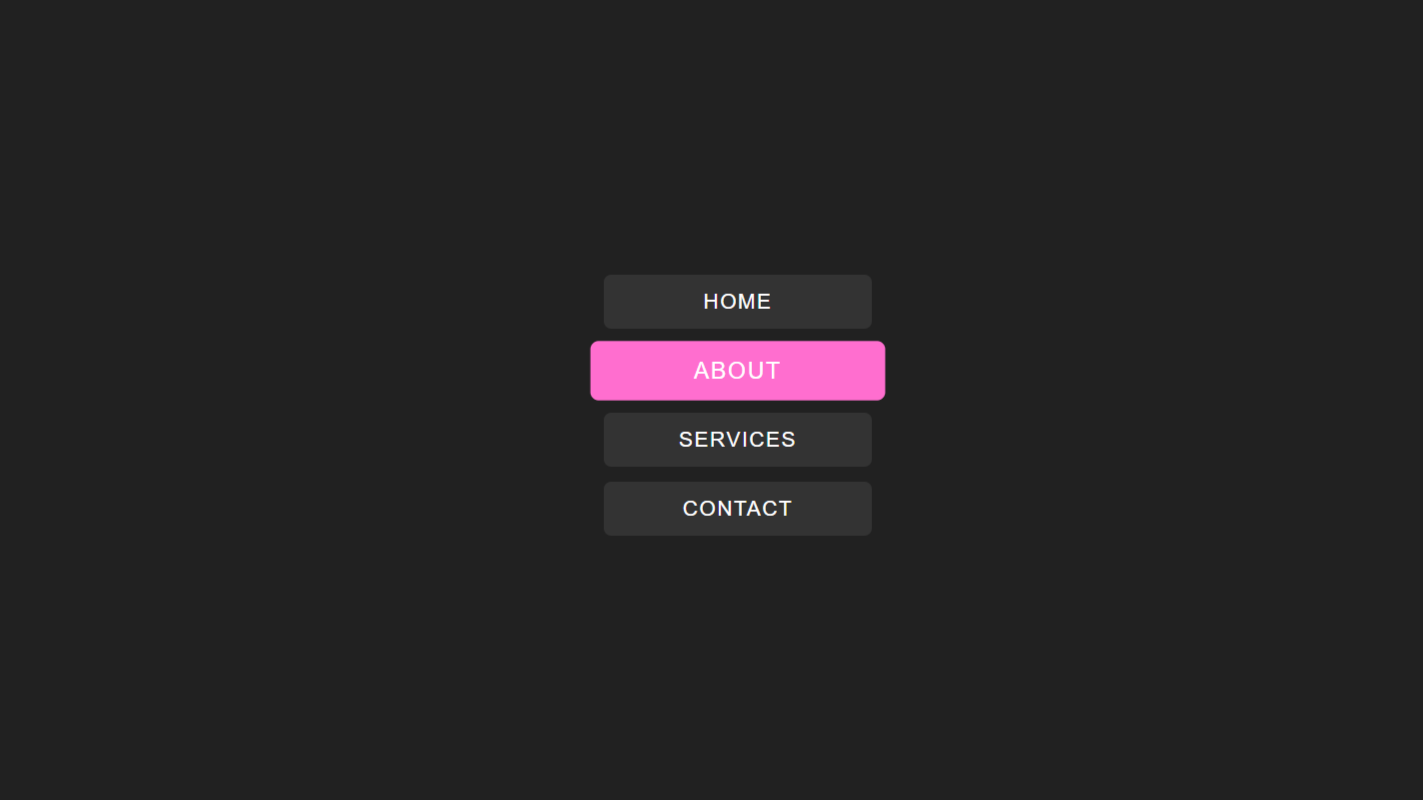
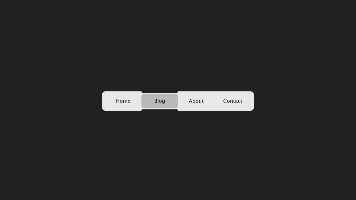
In this tutorial, we’ll create a sleek and an animated navigation menu bar using HTML CSS. The menu will feature a sliding bar effect that dynamically highlights the selected menu option, providing a modern and polished look. We’ll use radio inputs and labels creatively to manage state changes without JavaScript. This approach ensures a lightweight design while maintaining an engaging user experience. Additionally, we’ll style the menu for smooth transitions and responsive behavior.
Html Code:
....

<!DOCTYPE html>
<html lang="en">

<head>
    <meta charset="UTF-8">
    <meta name="viewport" content="width=device-width, initial-scale=1.0">
    <title>Document</title>
    <link rel="stylesheet" href="style.css">
</head>

<body>
    <div class="wrappper">
        <input hidden="" class="radio-1" name="radio" id="radio-1" type="radio" checked="" />
        <label style="--index: 0;" class="label" for="radio-1"><span>Home</span></label>

        <input hidden="" class="radio-2" name="radio" id="radio-2" type="radio" />
        <label style="--index: 1;" class="label" for="radio-2"><span>Blog</span></label>

        <input hidden="" class="radio-3" name="radio" id="radio-3" type="radio" />
        <label style="--index: 2;" class="label" for="radio-3"><span>About us</span></label>

        <input hidden="" class="radio-4" name="radio" id="radio-4" type="radio" />
        <label style="--index: 3;" class="label" for="radio-4"><span>Contact</span></label>

        <div class="bar"></div>
        <div class="slidebar"></div>
    </div>
</body>

</html>
...
Explanation:
Inside <body>, a <div> with the class wrappper acts as the container for the navigation menu. Within this wrapper, four hidden <input> elements of type “radio” are used to create a state for each menu item.
These inputs are given unique IDs (radio-1, radio-2, etc.) and share the same name attribute, ensuring only one can be selected at a time.
Next, <label> elements represent the clickable menu items. Each label is associated with an input via the for attribute, which matches the ID of the corresponding radio button. Inline styles like --index: 0 are used to manage custom properties for animations or effects.
The <span> inside each label contains the text for the menu options, such as “Home,” “Blog,” “About us,” and “Contact.” Below the inputs and labels, two additional <div> elements, bar and slidebar, are added.
These are used to create the sliding effect and highlight the selected menu item. The bar acts as a decorative border, while the slidebar represents the main background of the selected option. Both are positioned absolutely to allow smooth transitions.
CSS Code:
....
* {
    padding: 0;
    margin: 0;
    box-sizing: border-box;
    font-family: Verdana, Geneva, Tahoma, sans-serif;
}

html,
body {
    display: grid;
    height: 100%;
    place-items: center;
    background-color: #212121;
}

/* main style */
.wrappper {
    display: flex;
    align-items: center;
    padding: 4px 8px;
    position: relative;
    background: #e8e8e8;
    border-radius: 10px;
    max-width: 100%;
    overflow-x: auto;
    scrollbar-width: none;
    -webkit-overflow-scrolling: touch;
    top: 0;
    z-index: 1;
}

.wrappper input {
    height: 0;
    width: 0;
    position: absolute;
    overflow: hidden;
    display: none;
    visibility: hidden;
}

.label {
    cursor: pointer;
    outline: none;
    font-size: 0.875rem;
    letter-spacing: initial;
    font-weight: 500;
    color: #212121;
    background: transparent;
    padding: 12px 16px;
    width: 100px;
    min-width: 100px;
    text-decoration: none;
    -webkit-user-select: none;
    user-select: none;
    transition: color 0.25s ease;
    outline-offset: -6px;
    display: flex;
    align-items: center;
    justify-content: center;
    position: relative;
    z-index: 2;
    -webkit-tap-highlight-color: transparent;
}

.label span {
    overflow: hidden;
    display: -webkit-box;
    -webkit-box-orient: vertical;
    -webkit-line-clamp: 1;
}

.wrappper input[class*="radio-"]:checked+label {
    color: #000;
}

.bar {
    display: flex;
    align-items: center;
    justify-content: center;
    flex-shrink: 0;
    position: absolute;
    transform-origin: 0 0 0;
    height: 100%;
    width: 100px;
    z-index: 0;
    transition: transform 0.5s cubic-bezier(0.33, 0.83, 0.99, 0.98);
}

.bar::before,
.bar::after {
    content: "";
    position: absolute;
    height: 4px;
    width: 100%;
    background: #212121;
}

.bar::before {
    top: 0;
    border-radius: 0 0 9999px 9999px;
}

.bar::after {
    bottom: 0;
    border-radius: 9999px 9999px 0 0;
}

.slidebar {
    position: absolute;
    height: calc(100% - (4px * 4));
    width: 100px;
    border-radius: calc(10px - 4px);
    background: #b8b8b8;
    transform-origin: 0 0 0;
    z-index: 0;
    transition: transform 0.5s cubic-bezier(0.33, 0.83, 0.99, 0.98);
}

.radio-1:checked~.bar,
.radio-1:checked~.slidebar,
.radio-1+label:hover~.slidebar {
    transform: translateX(0) scaleX(1);
}

.radio-2:checked~.bar,
.radio-2:checked~.slidebar,
.radio-2+label:hover~.slidebar {
    transform: translateX(100%) scaleX(1);
}

.radio-3:checked~.bar,
.radio-3:checked~.slidebar,
.radio-3+label:hover~.slidebar {
    transform: translateX(200%) scaleX(1);
}

.radio-4:checked~.bar,
.radio-4:checked~.slidebar,
.radio-4+label:hover~.slidebar {
    transform: translateX(300%) scaleX(1);
}

...
Explanation:
The CSS code begins with a universal selector *, which resets the default padding, margin, and box-sizing for all elements to ensure consistent styling across browsers.
The html and body elements are styled to display as a grid and center their content both vertically and horizontally, with a dark background color (#212121) for a modern look.
The .wrappper class is the container for the navigation menu. It uses flexbox to align its child elements and has padding and a light grey background (#e8e8e8). The border-radius: 10px gives it smooth, rounded corners, while overflow-x: auto and scrollbar-width: none ensure the menu remains responsive and scrollable without a visible scrollbar.
The hidden radio inputs inside .wrappper are completely removed from view using properties like height: 0, width: 0, and visibility: hidden. These inputs control the selected state of the navigation options.
The .label class styles each menu option. It gives the labels a pointer cursor for interactivity, sets a medium font size, and centers the text using flexbox. A padding of 12px 16px ensures spacing, and width: 100px standardizes the size of each label. Transitions are applied to color changes for a smooth hover and focus effect.
The .label span ensures that the text inside each label is displayed neatly in one line, even if it’s too long, by using -webkit-line-clamp and -webkit-box.
When a radio input is checked, the corresponding label is styled with color: #000, indicating the active state. This is achieved using the sibling selector input[class*="radio-"]:checked + label.
The .bar class creates a decorative top and bottom border around the navigation items. It uses ::before and ::after pseudo-elements to add these borders, each styled with height: 4px, a dark background (#212121), and rounded edges.
The .slidebar class defines the sliding highlight effect. It is positioned absolutely and matches the dimensions of the labels. Its background (#b8b8b8) contrasts slightly with the main container, and it transitions smoothly between positions using transform and cubic-bezier for a custom easing effect.
For each radio input (e.g., .radio-1, .radio-2), CSS transforms are used to shift the .bar and .slidebar to align with the selected label. For example, .radio-1 aligns the elements to the first label, .radio-2 to the second, and so on. The transition effects ensure a fluid animation as the user navigates between options.
Source Code:
Download “Animated-Navigation-Menu.zip” Animated-Navigation-Menu.zip – Downloaded 441 times – 1.83 KBConclusions:
In this project, we created a modern and interactive navigation menu using only HTML and CSS, showcasing a sleek sliding highlight effect. We used radio buttons to handle the state of menu selection without any JavaScript, keeping the implementation lightweight. Labels were styled as clickable menu options, linked to hidden inputs for seamless user interaction. A sliding bar and background element were added to enhance the visual appeal of the menu. Smooth transitions and responsive design ensured that the navigation works beautifully across different devices and screen sizes.