project demo
Introduction:
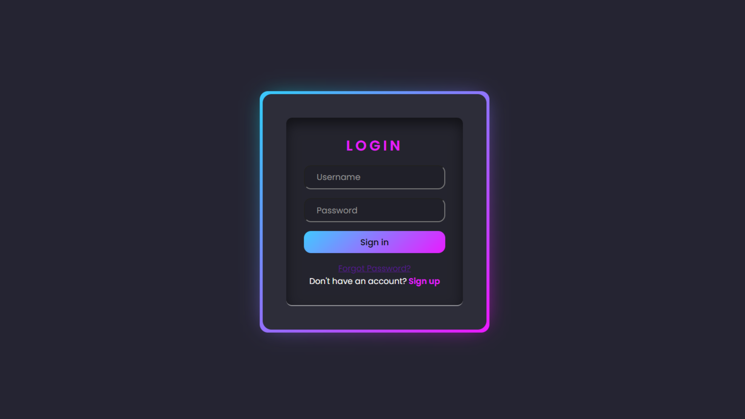
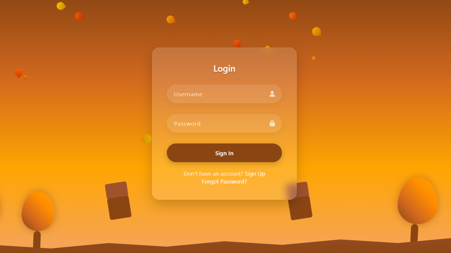
In this tutorial, we are going to create a beautiful animated login page that looks creative and modern. The page will have a peaceful background with trees, chairs, and falling leaves to give a natural feel. Our main focus will be on designing a stylish login form with smooth animations and glass effects. We will use HTML to build the structure of the page. CSS will be used to style everything, add colors, and create the animations. JavaScript will bring life to the design by making the leaves fall and handling form actions. Step by step, we will combine all three languages to make a working and attractive web page. This project will help you understand how design and coding work together. Even beginners can easily follow this tutorial and learn something new. In the end, you will have a cool and responsive login page ready to use.
SOURCE CODE 👉 Zip file of this project is provided at the end of this project, so go and collect it.
HTML:
This HTML code gives the main structure of our animated login page. It has all the parts like trees, chairs, and a path to make a nice background. Inside it, there is a login form where users can enter their username and password. The code also connects CSS and JavaScript files to add style and animation. Everything is arranged properly with classes to make it easy to design. Overall, this HTML creates the base of our beautiful and working login page.
<!DOCTYPE html>
<html lang="en">

<head>
    <meta charset="UTF-8">
    <meta name="viewport" content="width=device-width, initial-scale=1.0">
    <title>Animated Login Form</title>
    <link rel="stylesheet" href="https://cdnjs.cloudflare.com/ajax/libs/font-awesome/6.4.0/css/all.min.css">
    <link rel="stylesheet" href="style.css">
</head>

<body>
    <div class="container">
        <!-- Background Elements -->
        <div class="tree tree-1">
            <div class="trunk"></div>
            <div class="leaves"></div>
        </div>
        <div class="tree tree-2">
            <div class="trunk"></div>
            <div class="leaves"></div>
        </div>
        <div class="tree tree-3">
            <div class="trunk"></div>
            <div class="leaves"></div>
        </div>
        <div class="tree tree-4">
            <div class="trunk"></div>
            <div class="leaves"></div>
        </div>

        <div class="path"></div>

        <div class="chair chair-1">
            <div class="chair-back"></div>
            <div class="chair-base"></div>
        </div>
        <div class="chair chair-2">
            <div class="chair-back"></div>
            <div class="chair-base"></div>
        </div>

        <div class="falling-leaves" id="leaves-container"></div>

        <!-- Login Form -->
        <div class="login-form">
            <h2>Login</h2>
            <form id="loginForm">
                <div class="input-group">
                    <input type="text" placeholder="Username" required>
                    <i class="fas fa-user"></i>
                </div>
                <div class="input-group">
                    <input type="password" placeholder="Password" required>
                    <i class="fas fa-lock"></i>
                </div>
                <button type="submit" class="login-btn">Sign In</button>
                <div class="form-footer">
                    <p>Don't have an account? <a href="#">Sign Up</a></p>
                    <p><a href="#">Forgot Password?</a></p>
                </div>
            </form>
        </div>
    </div>

    <script src="script.js"></script>
</body>

</html>
CSS:
This CSS code makes our login page look beautiful and stylish. It adds colors, animations, and background effects like trees moving and leaves falling. The CSS also gives a glass effect to the login box to make it modern and clean. It controls how everything looks on the screen, like the size, position, and spacing. The buttons, text, and icons are all styled with smooth hover effects. Overall, this CSS makes the whole page attractive and gives it a professional design.
* {
    margin: 0;
    padding: 0;
    box-sizing: border-box;
    font-family: 'Segoe UI', Tahoma, Geneva, Verdana, sans-serif;
}

body {
    display: flex;
    justify-content: center;
    align-items: center;
    min-height: 100vh;
    background: linear-gradient(to bottom, #8B4513, #D2691E, #FFA500, #F4A460);
    overflow: hidden;
    position: relative;
}

.container {
    position: relative;
    width: 100%;
    height: 100vh;
    display: flex;
    justify-content: center;
    align-items: center;
}

/* Login Form */
.login-form {
    position: relative;
    width: 400px;
    padding: 40px;
    background: rgba(255, 255, 255, 0.15);
    backdrop-filter: blur(10px);
    border-radius: 20px;
    box-shadow: 0 15px 35px rgba(0, 0, 0, 0.2);
    border: 1px solid rgba(255, 255, 255, 0.1);
    z-index: 10;
    animation: fadeIn 1s ease-out;
}

.login-form h2 {
    color: #fff;
    text-align: center;
    margin-bottom: 30px;
    font-weight: 600;
    text-shadow: 0 2px 5px rgba(0, 0, 0, 0.2);
}

.input-group {
    position: relative;
    margin-bottom: 30px;
}

.input-group input {
    width: 100%;
    padding: 15px 20px;
    background: rgba(255, 255, 255, 0.1);
    border: none;
    outline: none;
    border-radius: 30px;
    color: #fff;
    font-size: 16px;
    letter-spacing: 1px;
    box-shadow: 0 5px 15px rgba(0, 0, 0, 0.05);
    transition: 0.3s;
}

.input-group input::placeholder {
    color: rgba(255, 255, 255, 0.7);
}

.input-group input:focus {
    background: rgba(255, 255, 255, 0.2);
    transform: translateY(-5px);
}

.input-group i {
    position: absolute;
    right: 20px;
    top: 50%;
    transform: translateY(-50%);
    color: rgba(255, 255, 255, 0.7);
}

.login-btn {
    width: 100%;
    padding: 15px;
    background: #8B4513;
    border: none;
    border-radius: 30px;
    color: #fff;
    font-size: 16px;
    font-weight: 600;
    cursor: pointer;
    transition: 0.3s;
    box-shadow: 0 5px 15px rgba(0, 0, 0, 0.2);
}

.login-btn:hover {
    background: #A0522D;
    transform: translateY(-5px);
}

.form-footer {
    margin-top: 20px;
    text-align: center;
    color: rgba(255, 255, 255, 0.8);
}

.form-footer a {
    color: #fff;
    text-decoration: none;
    transition: 0.3s;
}

.form-footer a:hover {
    text-decoration: underline;
}

/* Background Elements */
.tree {
    position: absolute;
    bottom: 0;
    z-index: 1;
}

.tree-1 {
    left: 5%;
    height: 300px;
    animation: sway 8s infinite ease-in-out;
}

.tree-2 {
    right: 10%;
    height: 350px;
    animation: sway 10s infinite ease-in-out;
}

.tree-3 {
    left: 15%;
    height: 250px;
    animation: sway 12s infinite ease-in-out;
}

.tree-4 {
    right: 20%;
    height: 320px;
    animation: sway 9s infinite ease-in-out;
}

.trunk {
    position: absolute;
    bottom: 0;
    width: 20px;
    background: #8B4513;
    border-radius: 10px 10px 0 0;
}

.tree-1 .trunk {
    height: 80px;
    left: 40px;
}

.tree-2 .trunk {
    height: 100px;
    left: 45px;
}

.tree-3 .trunk {
    height: 70px;
    left: 35px;
}

.tree-4 .trunk {
    height: 90px;
    left: 40px;
}

.leaves {
    position: absolute;
    bottom: 60px;
    width: 100px;
    height: 120px;
    background: linear-gradient(45deg, #8B4513, #D2691E, #FF8C00, #FFA500);
    border-radius: 50% 50% 50% 50% / 60% 60% 40% 40%;
    box-shadow: 0 0 20px rgba(139, 69, 19, 0.5);
}

.tree-1 .leaves {
    bottom: 80px;
}

.tree-2 .leaves {
    bottom: 100px;
    width: 120px;
    height: 140px;
}

.tree-3 .leaves {
    bottom: 70px;
    width: 90px;
    height: 110px;
}

.tree-4 .leaves {
    bottom: 90px;
    width: 110px;
    height: 130px;
}

.path {
    position: absolute;
    bottom: 0;
    left: 0;
    width: 100%;
    height: 100px;
    background: linear-gradient(to top, #8B4513, #A0522D);
    clip-path: polygon(0% 100%, 10% 70%, 20% 80%, 30% 65%, 40% 75%, 50% 60%, 60% 70%, 70% 55%, 80% 65%, 90% 50%, 100% 60%, 100% 100%);
    z-index: 2;
}

.chair {
    position: absolute;
    bottom: 100px;
    z-index: 3;
}

.chair-1 {
    left: 30%;
    transform: rotate(-10deg);
    animation: chairMove 15s infinite ease-in-out;
}

.chair-2 {
    right: 35%;
    transform: rotate(10deg);
    animation: chairMove 18s infinite ease-in-out;
}

.chair-base {
    width: 60px;
    height: 60px;
    background: #8B4513;
    border-radius: 5px;
    position: relative;
}

.chair-back {
    width: 60px;
    height: 40px;
    background: #A0522D;
    border-radius: 5px 5px 0 0;
    position: absolute;
    top: -40px;
}

.falling-leaves {
    position: absolute;
    top: 0;
    left: 0;
    width: 100%;
    height: 100%;
    pointer-events: none;
    z-index: 1;
}

.leaf {
    position: absolute;
    width: 20px;
    height: 20px;
    background: linear-gradient(45deg, #FF8C00, #FF4500, #8B4513);
    border-radius: 50% 0 50% 50%;
    opacity: 0.8;
    animation: fall linear infinite;
}

/* Animations */
@keyframes sway {

    0%,
    100% {
        transform: rotate(0deg);
    }

    50% {
        transform: rotate(3deg);
    }
}

@keyframes chairMove {

    0%,
    100% {
        transform: rotate(-10deg) translateY(0);
    }

    50% {
        transform: rotate(-8deg) translateY(-5px);
    }
}

@keyframes fall {
    0% {
        transform: translateY(-100px) rotate(0deg);
        opacity: 0;
    }

    10% {
        opacity: 1;
    }

    90% {
        opacity: 0.8;
    }

    100% {
        transform: translateY(100vh) rotate(360deg);
        opacity: 0;
    }
}

@keyframes fadeIn {
    from {
        opacity: 0;
        transform: translateY(20px);
    }

    to {
        opacity: 1;
        transform: translateY(0);
    }
}

/* Responsive Design */
@media (max-width: 768px) {
    .login-form {
        width: 90%;
        padding: 30px 20px;
    }

    .tree {
        transform: scale(0.8);
    }
}
JavaScript:
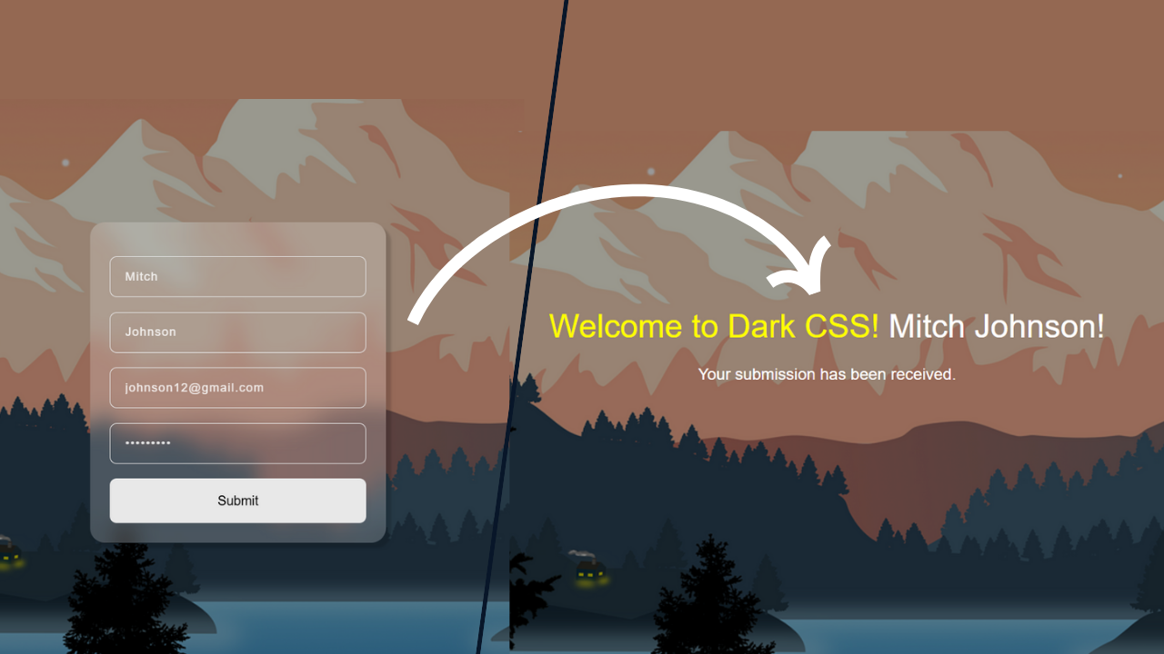
This JavaScript code adds life and action to our login page. It creates the falling leaves animation that keeps moving in the background. Each leaf falls in a different way, which makes the scene look natural and beautiful. The code also controls what happens when the user fills the login form. When someone enters their username and password, it checks if the fields are filled or not. If everything is correct, it shows a welcome message with the username. It also prevents the page from reloading when the form is submitted. The JavaScript makes the whole page interactive and fun to use. Without this code, the page would just look still and simple.
// Create falling leaves
function createLeaves() {
  const leavesContainer = document.getElementById("leaves-container");
  const leafCount = 30;

  for (let i = 0; i < leafCount; i++) {
    const leaf = document.createElement("div");
    leaf.classList.add("leaf");

    // Random properties for each leaf
    const size = Math.random() * 15 + 10;
    const left = Math.random() * 100;
    const animationDuration = Math.random() * 10 + 5;
    const animationDelay = Math.random() * 5;
    const hue = Math.random() * 30 + 20; // Autumn colors

    leaf.style.width = `${size}px`;
    leaf.style.height = `${size}px`;
    leaf.style.left = `${left}vw`;
    leaf.style.animationDuration = `${animationDuration}s`;
    leaf.style.animationDelay = `${animationDelay}s`;
    leaf.style.background = `linear-gradient(45deg, hsl(${hue}, 100%, 50%), hsl(${
      hue - 10
    }, 100%, 40%))`;

    leavesContainer.appendChild(leaf);
  }
}

// Form submission
document.getElementById("loginForm").addEventListener("submit", function (e) {
  e.preventDefault();
  const username = this.querySelector('input[type="text"]').value;
  const password = this.querySelector('input[type="password"]').value;

  // Simple validation
  if (username && password) {
    alert(`Welcome ${username}! Find Awesome projects on darkcssweb`);
    // In a real application, you would send this data to a server
  } else {
    alert("Please fill in all fields.");
  }
});

// Initialize the scene
window.onload = function () {
  createLeaves();
};
SOURCE CODE 👇
Download “Login-Form.zip” Login-Form.zip – Downloaded 256 times – 3.72 KB