Folder Structure
- First we will need to create a main folder
- Inside it we will create two files index.html and style.css
Introduction:
CSS Code:
...
* {
    padding: 0;
    margin: 0;
    box-sizing: border-box;
}

html,
body {
    display: grid;
    height: 100%;
    place-items: center;
    background: #d190ff;
}

.button {
    border-radius: 18px;
    outline: none;
    cursor: pointer;
    font-size: 23px;
    font-family: Arial;
    background: transparent;
    letter-spacing: -1px;
    border: 0;
    position: relative;
    width: 220px;
    height: 80px;
    transform: rotate(353deg) skewX(4deg);
}

.bg {
    position: absolute;
    inset: 0;
    border-radius: inherit;
    filter: blur(1px);
}

.bg::before,
.bg::after {
    content: "";
    position: absolute;
    inset: 0;
    border-radius: calc(18px * 1.1);
    background: #5e2b83;
}

.bg::before {
    filter: blur(5px);
    transition: all 0.3s ease;
    box-shadow:
        -7px 6px 0 0 rgb(115 75 155 / 40%),
        -14px 12px 0 0 rgb(115 75 155 / 30%),
        -21px 18px 4px 0 rgb(115 75 155 / 25%),
        -28px 24px 8px 0 rgb(115 75 155 / 15%),
        -35px 30px 12px 0 rgb(115 75 155 / 12%),
        -42px 36px 16px 0 rgb(115 75 155 / 8%),
        -56px 42px 20px 0 rgb(115 75 155 / 5%);
}

.wrap {
    border-radius: inherit;
    overflow: hidden;
    height: 100%;
    transform: translate(6px, -6px);
    padding: 3px;
    background: linear-gradient(to bottom,
            #f4b1fd 0%,
            #8e26e2 100%);
    position: relative;
    transition: all 0.3s ease;
}

.outline {
    position: absolute;
    overflow: hidden;
    inset: 0;
    opacity: 0;
    outline: none;
    border-radius: inherit;
    transition: all 0.4s ease;
}

.outline::before {
    content: "";
    position: absolute;
    inset: 2px;
    width: 120px;
    height: 300px;
    margin: auto;
    background: linear-gradient(to right,
            transparent 0%,
            white 50%,
            transparent 100%);
    animation: spin 3s linear infinite;
    animation-play-state: paused;
}

.content {
    pointer-events: none;
    display: flex;
    align-items: center;
    justify-content: center;
    z-index: 1;
    position: relative;
    height: 100%;
    gap: 16px;
    border-radius: calc(18px * 0.85);
    font-weight: 600;
    transition: all 0.3s ease;
    background: linear-gradient(to bottom,
            #c389f2 0%,
            #8e26e2 100%);
    box-shadow:
        inset -2px 12px 11px -5px #d190ff,
        inset 1px -3px 11px 0px rgb(0 0 0 / 35%);
}

.content::before {
    content: "";
    inset: 0;
    position: absolute;
    z-index: 10;
    width: 80%;
    top: 45%;
    bottom: 35%;
    opacity: 0.7;
    margin: auto;
    background: linear-gradient(to bottom, transparent, #8e26e2);
    filter: brightness(1.3) blur(5px);
}

.char {
    transition: all 0.3s ease;
    display: flex;
    align-items: center;
    justify-content: center;
}

.char span {
    display: block;
    color: transparent;
    position: relative;
}

.char span:nth-child(5) {
    margin-left: 5px;
}

.char.state-1 span:nth-child(5) {
    margin-right: -3px;
}

.char.state-1 span {
    animation: charAppear 1.2s ease backwards calc(var(--i) * 0.03s);
}

.char.state-1 span::before,
.char span::after {
    content: attr(data-label);
    position: absolute;
    color: #ffe7ff;
    text-shadow: -1px 1px 2px #5e2b83;
    left: 0;
}

.char span::before {
    opacity: 0;
    transform: translateY(-100%);
}

.char.state-2 {
    position: absolute;
    left: 80px;
}

.char.state-2 span::after {
    opacity: 1;
}

.icon {
    animation: resetArrow 0.8s cubic-bezier(0.7, -0.5, 0.3, 1.2) forwards;
    z-index: 10;
}

.icon div,
.icon div::before,
.icon div::after {
    height: 3px;
    border-radius: 1px;
    background-color: #ffe7ff;
}

.icon div::before,
.icon div::after {
    content: "";
    position: absolute;
    right: 0;
    transform-origin: center right;
    width: 14px;
    border-radius: 15px;
    transition: all 0.3s ease;
}

.icon div {
    position: relative;
    width: 24px;
    box-shadow: -2px 2px 5px #8e26e2;
    transform: scale(0.9);
    background: linear-gradient(to bottom, #ffe7ff, #f4b1fd);
    animation: swingArrow 1s ease-in-out infinite;
    animation-play-state: paused;
}

.icon div::before {
    transform: rotate(44deg);
    top: 1px;
    box-shadow: 1px -2px 3px -1px #8e26e2;
    animation: rotateArrowLine 1s linear infinite;
    animation-play-state: paused;
}

.icon div::after {
    bottom: 1px;
    transform: rotate(316deg);
    box-shadow: -2px 2px 3px 0 #8e26e2;
    background: linear-gradient(200deg, #ffe7ff, #f4b1fd);
    animation: rotateArrowLine2 1s linear infinite;
    animation-play-state: paused;
}


.button:hover .char.state-1 span::before {
    animation: charAppear 0.7s ease calc(var(--i) * 0.03s);
}

.button:hover .char.state-1 span::after {
    opacity: 1;
    animation: charDisappear 0.7s ease calc(var(--i) * 0.03s);
}

.button:hover .wrap {
    transform: translate(8px, -8px);
}

.button:hover .outline {
    opacity: 1;
}

.button:hover .outline::before,
.button:hover .icon div::before,
.button:hover .icon div::after,
.button:hover .icon div {
    animation-play-state: running;
}

.button:active .bg::before {
    filter: blur(5px);
    opacity: 0.7;
    box-shadow:
        -7px 6px 0 0 rgb(115 75 155 / 40%),
        -14px 12px 0 0 rgb(115 75 155 / 25%),
        -21px 18px 4px 0 rgb(115 75 155 / 15%);
}

.button:active .content {
    box-shadow: inset -1px 12px 8px -5px rgba(71, 0, 137, 0.4), inset 0px -3px 8px 0px #d190ff;
}

.button:active .outline {
    opacity: 0;
}

.button:active .wrap {
    transform: translate(3px, -3px);
}

.button:focus .icon {
    animation: arrow 1s cubic-bezier(0.7, -0.5, 0.3, 1.5) forwards;
}

.char.state-2 span::after,
.button:focus .char.state-1 span {
    animation: charDisappear 0.5s ease forwards calc(var(--i) * 0.03s);
}

.button:focus .char.state-2 span::after {
    animation: charAppear 1s ease backwards calc(var(--i) * 0.03s);
}

@keyframes spin {
    0% {
        transform: rotate(0deg);
    }

    100% {
        transform: rotate(360deg);
    }
}

@keyframes charAppear {
    0% {
        transform: translateY(50%);
        opacity: 0;
        filter: blur(20px);
    }

    20% {
        transform: translateY(70%);
        opacity: 1;
    }

    50% {
        transform: translateY(-15%);
        opacity: 1;
        filter: blur(0);
    }

    100% {
        transform: translateY(0);
        opacity: 1;
    }
}

@keyframes charDisappear {
    0% {
        transform: translateY(0);
        opacity: 1;
    }

    100% {
        transform: translateY(-70%);
        opacity: 0;
        filter: blur(3px);
    }
}

@keyframes arrow {
    0% {
        opacity: 1;
    }

    50% {
        transform: translateX(60px);
        opacity: 0;
    }

    51% {
        transform: translateX(-200px);
        opacity: 0;
    }

    100% {
        transform: translateX(-128px);
        opacity: 1;
    }
}

@keyframes swingArrow {
    50% {
        transform: translateX(5px) scale(0.9);
    }
}

@keyframes rotateArrowLine {
    50% {
        transform: rotate(30deg);
    }

    80% {
        transform: rotate(55deg);
    }
}

@keyframes rotateArrowLine2 {
    50% {
        transform: rotate(330deg);
    }

    80% {
        transform: rotate(300deg);
    }
}

@keyframes resetArrow {
    0% {
        transform: translateX(-128px);
    }

    100% {
        transform: translateX(0);
    }
}
....
Explanation:
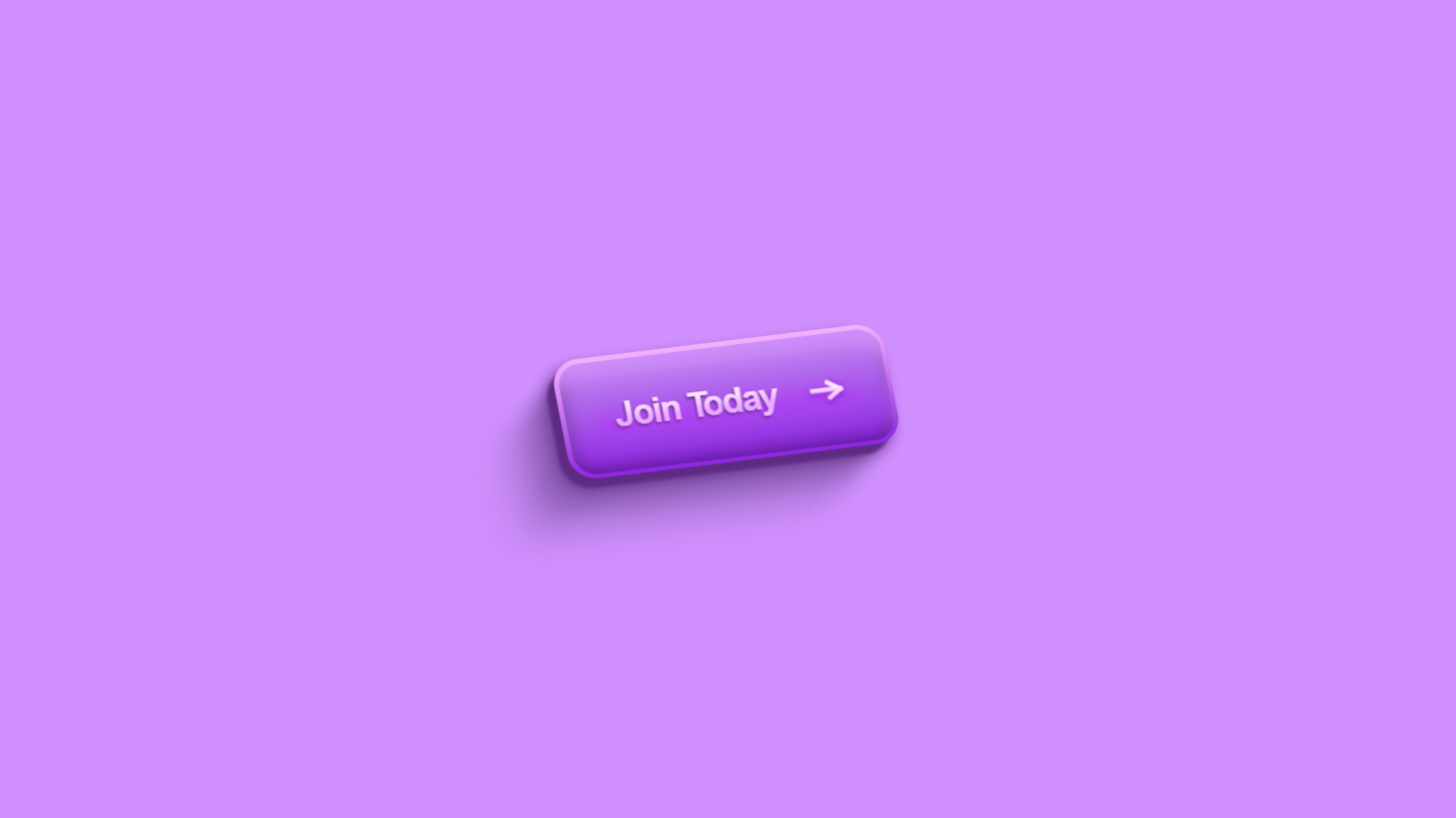
The CSS code provided masterfully crafts an interactive, glowing button with smooth transitions and dynamic animations.
At its core, the design begins with a global reset using the universal selector (*) to eliminate inconsistent margins and paddings across browsers and applies box-sizing: border-box to simplify width and height calculations by including padding and borders.
The body is styled to occupy the full viewport height (min-height: 100vh) and centers the button both vertically and horizontally using Flexbox (display: flex, justify-content: center, align-items: center). A solid black background (background-color: #000) creates the perfect contrast to highlight the button’s vibrant glow.
The .button class defines the main structure, giving it a size of 220px width and 60px height. It removes the default border and background, ensuring a clean and modern look. position: relative is crucial as it allows the button to contain absolutely positioned child elements like the glowing background and animated outline. The cursor is set to pointer, signaling interactivity.
The .bg element serves as the glowing background with a rainbow gradient (linear-gradient(45deg, ...)), softened by a blur effect (filter: blur(10px)). Initially, the glow is subtle with opacity: 0.5, but it intensifies on hover (opacity: 1) to create a striking effect.
The .wrap element, with overflow: hidden, contains all the animated parts, ensuring smooth, controlled animations.
The .outline adds a dynamic rotating border with a gradient (linear-gradient(90deg, transparent, #fff, transparent)) and a soft curve using border-radius: 30px. This border continuously spins due to the spin animation (@keyframes spin), which smoothly rotates the element 360 degrees infinitely, adding motion and energy to the design.
The button’s text is split into two states (.state-1 and .state-2), where each character (.char) is animated separately for a detailed transition effect. In the default state, .state-1 is visible, while .state-2 is hidden below the button (translateY(100%), opacity: 0). On hover, .state-1 moves upward and fades (translateY(-100%), opacity: 0), while .state-2 slides into view (translateY(0), opacity: 1). This dual-layer text animation creates a seamless and engaging text transition.
The .icon—typically an arrow—adds another layer of interaction. It subtly rotates 360 degrees on hover (transform: rotate(360deg)), enhancing the button’s dynamic appeal. This combination of glow, motion, and text animation makes the button feel alive and responsive. The thoughtful layering of effects ensures that the animations don’t overwhelm each other but rather work harmoniously to captivate users. Overall, the CSS design effectively blends color, motion, and interaction, resulting in a futuristic and highly engaging button perfect for modern websites.
Source Code:
Download “Animated-3D-Button.zip” Animated-3D-Button.zip – Downloaded 461 times – 2.64 KBConclusions:
In this project, we designed an interactive and visually dynamic glowing button using HTML and CSS. The button features a vibrant, animated gradient glow that intensifies on hover, creating an eye-catching effect. Smooth text transitions between two states enhance interactivity, making the button feel responsive and engaging. A rotating outline border adds continuous motion, giving the design a futuristic appeal. The combination of Flexbox centering and layered animations ensures a balanced and polished layout. Hover effects on both text and icons create seamless transitions that capture user attention. Overall, this project showcases advanced CSS techniques to build a modern, interactive UI element perfect for enhancing web interfaces.