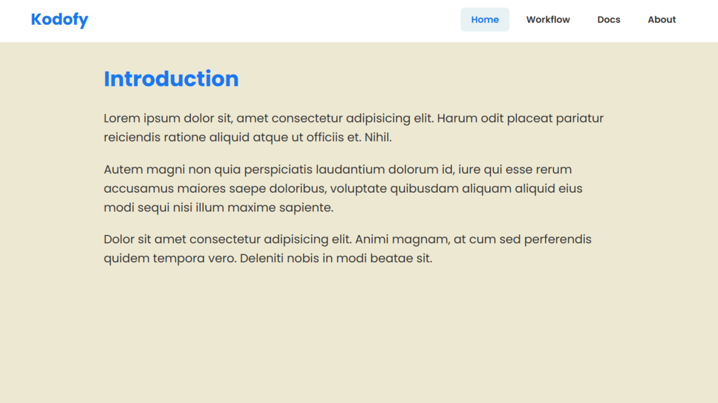
Project demo
💡 Introduction: What Are We Building?
In this tutorial, we’re going to build a responsive navigation bar using HTML, CSS, and JavaScript. The goal is to create a clean and modern navbar that adapts beautifully to different screen sizes—whether it’s a desktop or a mobile device.
✨ Key Features We’ll Cover:
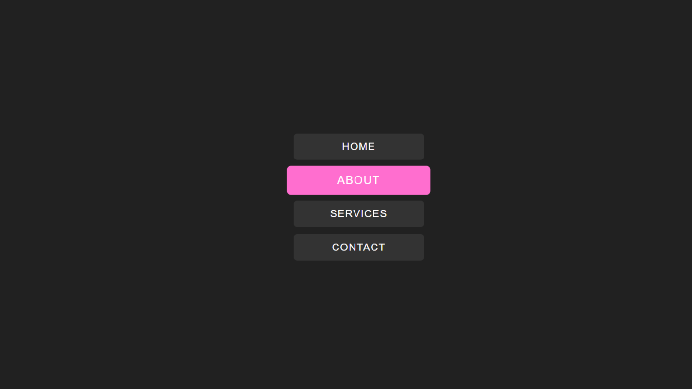
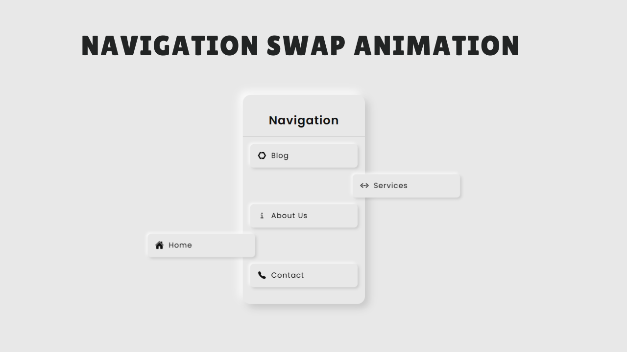
Logo and Navigation Menu: A stylish layout with a brand name and navigation links like Home, Docs, Services, About, and Contact.
Responsive Design: The navbar looks great on both large screens and mobile devices, thanks to media queries.
Mobile Menu Toggle: On smaller screens, the menu collapses into a hamburger icon. When clicked, it expands into a vertical menu with a smooth toggle animation and switches to a close (X) icon.
Icon Integration: We use Ionicons for the hamburger and close icons, giving the navbar a modern touch.
Interactive JavaScript: A simple JavaScript function controls the toggle behavior of the mobile menu and icons dynamically.
By the end of this tutorial, you’ll have a fully functional responsive navigation bar that you can customize and integrate into any modern website or project.
Watch complete video tutorial on my youtube channel: Watch
Let’s get started! 🚀
HTML Code:
<!DOCTYPE html>
<html lang="en">

<head>
  <meta charset="UTF-8">
  <meta name="viewport" content="width=device-width, initial-scale=1.0">
  <title>Responsive Navigation Bar</title>
  <!-- Link to external stylesheet -->
  <link rel="stylesheet" href="style.css">
</head>

<body>
    <!-- Navigation bar section -->
    <div class="navbar-section">
      <nav class="navbar">
        <!-- Logo -->
        <div class="logo">
          <h2>TechNeo</h2>
        </div>
        <!-- Navigation menu links -->
        <ul class="navbar-menu menu">

          <li class="navbar-item">
            <a href="">Home</a>
          </li>

          <li class="navbar-item">
            <a href="">Docs</a>
          </li>

          <li class="navbar-item">
            <a href="">Services</a>
          </li>

          <li class="navbar-item">
            <a href="">About</a>
          </li>

          <li class="navbar-item">
            <a href="">Contact</a>
          </li>

        </ul>
        <!-- Toggle icon for mobile menu (hamburger and close icons) -->
        <div class="toggle-icon">
          <ion-icon class="bar-icon" name="menu-outline"></ion-icon>
          <ion-icon class="cross-icon" name="close-outline"></ion-icon>
        </div>
      </nav>

      <!-- Main content area -->
      <div class="content">
        <h2>Web  Heading</h2>
        <p>
          <!-- Example text content -->
          Lorem ipsum dolor sit amet consectetur adipisicing elit. Eaque inventore, mollitia laborum blanditiis quis iure veniam officiis consectetur totam modi porro incidunt. Est blanditiis suscipit cum asperiores assumenda deserunt molestias cupiditate sint, deleniti eveniet. Consequatur, dolore ipsam eaque accusantium at laboriosam dolor, ipsum doloribus repellat numquam aliquid assumenda, tenetur ex architecto expedita labore in atque. Alias itaque, similique praesentium distinctio dolorum sit ipsam numquam, veniam debitis cum, ex tempora beatae cumque molestiae in consequuntur placeat sed accusantium! Quam enim mollitia eum nostrum ex a distinctio vero omnis accusamus sunt illo, animi, sapiente qui ad. Nesciunt reiciendis harum enim at dolorem!
        </p>
      </div>
    </div>

    <!-- Ionicons library for icons -->
    <script type="module" src="https://unpkg.com/ionicons@7.1.0/dist/ionicons/ionicons.esm.js"></script>
    <script nomodule src="https://unpkg.com/ionicons@7.1.0/dist/ionicons/ionicons.js"></script>

    <!-- Script for toggling mobile menu and icons -->
    <script src="script.js"></script>
</body>

</html>
</html>
Explanation:
It is structured into two primary parts: the navigation bar and the content section, all enclosed within a parent container.
The navigation bar itself begins with a logo area represented by a heading TechNeo allowing users to identify the brand or name of the site. Next to the logo is an unordered list containing individual navigation links wrapped in list items. These links represent typical website sections such as Home, Docs, Services, About, and Contact, which can be connected to different parts of the site.
A toggle icon container is also included inside the navigation bar. This contains two Ionicons: one is a hamburger icon for opening the mobile menu, and the other is a cross icon for closing it. These icons are displayed conditionally based on the screen size and user interaction, providing a responsive mobile navigation experience.
Beneath the navigation bar, the content section includes a heading and a paragraph filled with placeholder text. This area simulates the main content of the page, giving context and structure to the layout.
On smaller screens, the navigation menu is hidden by default and can be toggled using the hamburger icon, which transforms into a close icon once the menu is open. This interactivity is achieved via a linked JavaScript file, while styling and responsiveness are handled through the associated CSS.
CSS Code:
/* Import Google Fonts for typography */
@import url('https://fonts.googleapis.com/css2?family=Poppins:ital,wght@0,100;0,200;0,300;0,400;0,500;0,600;0,700;0,800;0,900;1,100;1,200;1,300;1,400;1,500;1,600;1,700;1,800;1,900&display=swap');

/* Reset default browser styles and set box-sizing */
* {
    padding: 0;
    margin: 0;
    box-sizing: border-box;
}

/* Body layout and font */
body {
    display: flex;
    justify-content: center;
    align-items: center;
    font-family: 'Poppins', sans-serif;
    height: 97vh;
    background: #f5f5f5;
}

/* Main navbar section container */
.navbar-section {
    position: relative;
    width: 100%;
    height: 70vh;
    margin: 0 6rem;
    border: 1px solid #000;
    overflow: hidden;
    background: rgb(218, 218, 235);
}

/* Navbar styles */
.navbar {
    display: grid;
    grid-template-columns: repeat(2, 1fr);
    width: 100%;
    background: purple;
    color: #fff;
    box-shadow: rgba(0, 0, 0, 0.11) 0 4px 10px;
}

/* Logo styles */
.logo {
    margin: auto 2rem;
}

/* Navbar menu container */
.navbar .navbar-menu {
    display: flex;
    justify-content: end;
    margin: 0 1rem;
}

/* Navbar menu items */
.navbar-item {
    list-style: none;
    margin: 0 .1rem;
}

/* Navbar links */
.navbar-item a {
    display: inline-block;
    text-decoration: none;
    color: #fff;
    padding: 1rem 1.3rem;
    font-size: .8rem;
    letter-spacing: 1px;
    transition: color .3s;
}

/* Hover effect for navbar links */
.navbar .navbar-menu a:hover {
    background: rgb(156, 1, 156);
    border-radius: 7px;
}

/* Toggle icon (hamburger/cross) for mobile menu */
.toggle-icon {
    position: absolute;
    right: 0;
    display: none;
    background: #fff;
    align-items: center;
    width: 60px;
    cursor: pointer;
    margin: .6rem 1rem;
    border-radius: 4px;
}

/* Icon styles for hamburger and cross */
.bar-icon,
.cross-icon {
    color: #000;
    font-size: 2rem;
    margin: 0 auto;
}

/* Website Content section */
.content {
    padding: 2rem;
}

/* Heading in content */
.content h2 {
    text-align: center;
    margin: 1rem 0;
    font-size: .1.3rem;
    letter-spacing: 1px;
}

/* Paragraph in content: clamp lines and ellipsis */
.content p {
    display: -webkit-box;
    -webkit-line-clamp: 8;
    -webkit-box-orient: vertical;
    overflow: hidden;
    text-overflow: ellipsis;
}

/* Responsive styles for mobile screens */
@media screen and (max-width: 968px) {

    /* Hide menu by default on mobile */
    .navbar-menu {
        display: none !important;
    }

    .logo {
        margin: .6rem 1.5rem;
    }

    /* Show toggle icon on mobile */
    .toggle-icon {
        display: flex;
    }

    /* Mobile menu styles */
    .menu {
        display: flex !important;
        position: absolute;
        width: 50%;
        top: 55px;
        left: -17px;
        transform: scaleY(0);
        transform-origin: top;
        transition: transform 0.3s;
        flex-direction: column;
        background: rgba(151, 30, 151, 0.776);
        z-index: 1000;
        opacity: 0;
    }

    /* Show menu when mobile-menu class is active */
    .mobile-menu {
        transform: scaleY(1);
        opacity: 1;
    }

    /* Larger padding for mobile menu links */
    .mobile-menu .navbar-item a {
        padding: 1rem 2rem;
    }

    /* Border and pointer for mobile menu items */
    .mobile-menu .navbar-item {
        border-bottom: 1px solid #000;
        cursor: pointer;
    }

    /* Hide cross icon by default */
    .cross-icon {
        display: none;
    }

    /* Hover effect for mobile menu items */
    .mobile-menu .navbar-item:hover {
        background: rgba(128, 0, 128, 0.833);
    }
}
Explanation:
At the beginning, it imports the Poppins font from Google Fonts to enhance the overall typography. A universal selector (*) resets default margin and padding for all elements and sets box-sizing: border-box to ensure consistent sizing across elements.
The body is styled to center its content both horizontally and vertically using Flexbox and is given a light gray background with a viewport height of 97% to nearly fill the screen.
The .navbar-section class wraps the entire visible structure. It has a fixed height (70vh), margin on both sides, a border, and a subtle background color. It also includes overflow: hidden to keep internal elements within bounds.
The navigation bar is laid out as a two-column CSS grid—one for the logo and one for the navigation menu. It has a purple background, white text, and a box-shadow to add visual depth. The logo is styled with margin for spacing, while the navigation menu (.navbar-menu) is displayed using Flexbox aligned to the end (right side) of the grid.
Each navigation item is stripped of its bullet styling and given horizontal spacing. Links (a tags) within these items are styled with padding, white color, smaller font size, and a hover effect that changes the background to a darker purple with rounded corners.
The .toggle-icon is hidden by default display: none but becomes visible on smaller screens. It’s absolutely positioned in the top-right corner, styled with a white background, center alignment, and a cursor pointer. Both icons inside it—the hamburger and cross icons—are styled in black and scaled to a large size. The cross icon is initially hidden.
The .content section is simply styled with padding and contains a centered heading and a paragraph. The paragraph uses -webkit-line-clamp and -webkit-box to display only a limited number of lines (8), creating a neat text truncation with ellipsis, which keeps the layout clean and prevents overflow.
A responsive media query targets screen widths below 968px. In this mode, the .navbar-menu is hidden by default. The logo’s margin is reduced to save space. The .toggle-icon becomes visible display: flexand can be clicked to toggle the menu. The .menu class is styled to behave like a dropdown: it appears below the navbar, covers half the width, and animates its visibility using transform: scaleY and opacity. When active, it uses the mobile-menu class to become visible. Menu links inside this dropdown get larger padding, and items are separated by borders with a pointer cursor to improve mobile usability. A hover effect is also applied to each menu item for better interactivity on touch devices.
In short, this CSS controls everything from typography, layout, responsiveness, icon toggling, and even the mobile menu animation, ensuring that the interface looks modern and works across both desktop and mobile screens.
JavaScript Code:
// Get references to toggle icon and menu elements
const navbarIcon = document.querySelector(".toggle-icon"),
  barIcon = document.querySelector(".bar-icon"),
  crossIcon = document.querySelector(".cross-icon"),
  navMenu = document.querySelector(".navbar-menu");

// Toggle mobile menu and switch icons on click
navbarIcon.addEventListener("click", () => {
  const isOpen = navMenu.classList.toggle("mobile-menu");

  if (isOpen) {
    // Show close icon, hide hamburger icon
    barIcon.style.setProperty("display", "none", "important");
    crossIcon.style.setProperty("display", "block", "important");
  } else {
    // Show hamburger icon, hide close icon
    barIcon.style.setProperty("display", "block", "important");
    crossIcon.style.setProperty("display", "none", "important");
  }
});
Explanation:
The JavaScript code provided is a simple script that enables the toggle functionality for the mobile navigation menu in the responsive navbar. It adds interactivity to the HTML and CSS layout by listening for a user’s click on the toggle icon (hamburger/cross icon) and dynamically controlling which icon is shown and whether the menu is visible.
First, the script retrieves references to several key DOM elements using querySelector,.toggle-icon: the container that holds both the hamburger and close icons..bar-icon: the hamburger (menu) icon that appears when the mobile menu is closed..cross-icon: the close (X) icon that appears when the mobile menu is open..navbar-menu: the container for the navigation links, which is shown or hidden depending on the menu state.
Next, an event listener is attached to the toggle icon container using addEventListener. When the toggle icon is clicked, the script performs the following actions:
It toggles the mobile-menu class on the .navbar-menu element. This class is responsible for showing or hiding the mobile menu by applying CSS transformations and opacity changes.
It checks whether the menu is currently open (i.e. whether the mobile-menu class is now applied). If the menu is open, it hides the hamburger icon and displays the close icon by changing their display styles directly. If the menu is closed, it reverses the display properties — showing the hamburger icon and hiding the close icon.
This interaction allows users on smaller screens to toggle the menu open and closed, making the navigation accessible while maintaining a clean layout. The toggling is smooth and the icons give visual feedback, enhancing the user experience. The script works in conjunction with CSS transitions and responsive rules to make the navbar adaptive and functional across devices.
Source Code:
Conclusions:
In this tutorial, we built a responsive navigation bar using HTML, CSS, and JavaScript. We started by creating the layout with HTML, which included a logo, navigation links, and toggle icons for mobile view. Then, we styled the layout using CSS, ensuring it looked modern, clean, and functional on both desktop and mobile devices. The responsive design was achieved using media queries, flexbox, and transitions. Finally, we added interactivity with JavaScript by enabling the toggle functionality for the mobile menu — allowing users to open and close the menu with a smooth icon switch between a hamburger and a close icon. This tutorial gave us a practical understanding of combining structure, styling, and behavior to create user-friendly, mobile-first web interfaces.