Introduction:
In this tutorial, we’ll create a neumorphic sidebar menu using html css and javascript. The sidebar will feature smooth card-style menu items using the trendy neumorphism design. We’ll make the menu items automatically shuffle positions with eye-catching animations.
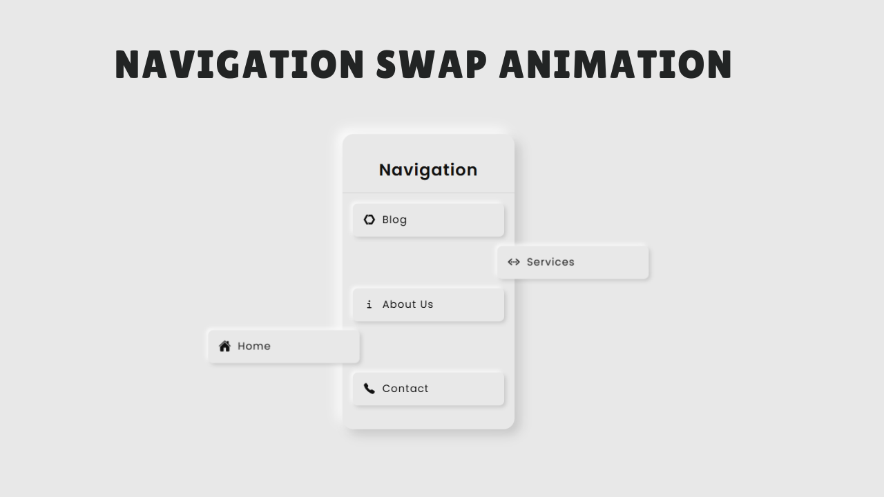
When you hover over the sidebar, the items will instantly return to their original order.
Html Code
<!DOCTYPE html>
<html lang="en">

<head>
  <meta charset="utf-8" />
  <meta name="viewport" content="width=device-width,initial-scale=1" />
  <title>Neumorphic Sidebar Swap Animation</title>
  <link rel="stylesheet" href="style.css">
  <script type="module" src="https://unpkg.com/ionicons@7.1.0/dist/ionicons/ionicons.esm.js"></script>
  <script nomodule src="https://unpkg.com/ionicons@7.1.0/dist/ionicons/ionicons.js"></script>
</head>

<body>
  <div class="sidebar" id="sidebar">
    <h2 class="menu-title">Navigation</h2>
    <ul class="menu-items" id="menuItems">

      <li class="menu-item" data-key="home">
        <i><ion-icon name="home"></ion-icon></i>
        <span>Home</span>
      </li>

      <li class="menu-item" data-key="blog">
        <i><ion-icon name="logo-web-component"></ion-icon></i>
        <span>Blog</span>
      </li>

      <li class="menu-item" data-key="services">
        <i><ion-icon name="code-working"></ion-icon></i>
        <span>Services</span>
      </li>

      <li class="menu-item" data-key="about">
        <i><ion-icon name="information"></ion-icon></i>
        <span>About Us</span>
      </li>

      <li class="menu-item" data-key="contact">
        <i><ion-icon name="call"></ion-icon></i>
        <span>Contact</span>
      </li>

    </ul>
  </div>

  <script src="script.js"></script>
</body>

</html>
Overview
The HTML structure is simple and consists of a sidebar container that holds the navigation menu. Inside the <body>, we have a <div> with the class sidebar, which acts as the main wrapper for the menu. It contains a heading <h2> with the class menu-title to display the title “Navigation.” Below this heading, there is an unordered list <ul> with the class menu-items, which holds multiple <li> elements representing each menu option. Every list item has the class menu-item and includes an <i> tag for icons (using Ionicons) and a <span> tag for the text label like Home, Blog, Services, About Us, and Contact. This semantic structure makes it easy to style with CSS and manipulate with JavaScript for animations.
CSS Code
...

@import url('https://fonts.googleapis.com/css2?family=Poppins:ital,wght@0,100;0,200;0,300;0,400;0,500;0,600;0,700;0,800;0,900;1,100;1,200;1,300;1,400;1,500;1,600;1,700;1,800;1,900&display=swap');

:root {
    --neo-bg: #e8e8e8;
    --neo-bg-hover: #ffffff;
    --neo-text: #111;
    --neo-text-hover: #000;
    --neo-shadow-dark: rgba(0, 0, 0, 0.15);
    --neo-shadow-light: rgba(255, 255, 255, 0.9);
}

* {
    margin: 0;
    padding: 0;
    box-sizing: border-box;
    font-family: 'Poppins', sans-serif;
}

body {
    background: var(--neo-bg);
    display: flex;
    justify-content: center;
    align-items: center;
    min-height: 100vh;
    color: var(--neo-text);
}

.sidebar {
    width: 250px;
    background: var(--neo-bg);
    color: var(--neo-text);
    border-radius: 16px;
    padding: 20px 0;
    overflow: visible;
    transition: background 0.25s ease, color 0.25s ease;
    box-shadow:
        8px 8px 16px var(--neo-shadow-dark),
        -8px -8px 16px var(--neo-shadow-light);
}

.menu-title {
    font-size: 1.5rem;
    text-align: center;
    padding: 15px 0;
    font-weight: 600;
    letter-spacing: 1px;
    border-bottom: 1px solid rgba(0, 0, 0, 0.1);
}

.menu-items {
    list-style: none;
    padding: 15px;
    display: flex;
    flex-direction: column;
    gap: 14px;
    position: relative;
}

.menu-item {
    display: flex;
    align-items: center;
    background: var(--neo-bg);
    color: var(--neo-text);
    padding: 14px 15px;
    border-radius: 7px;
    line-height: 14px;
    cursor: pointer;
    position: relative;
    transition:
        background 0.25s ease,
        color 0.25s ease,
        box-shadow 0.25s ease;
    box-shadow:
        3px 3px 6px var(--neo-shadow-dark),
        -3px -3px 6px var(--neo-shadow-light);
    will-change: transform;
    backface-visibility: hidden;
}

.menu-item:hover {
    background: var(--neo-bg-hover);
    color: var(--neo-text-hover);
    box-shadow:
        inset 2px 2px 4px var(--neo-shadow-dark),
        inset -2px -2px 4px var(--neo-shadow-light);
}

.menu-item span {
    letter-spacing: 1px;
    font-size: 15px;
}

.menu-item i {
    font-size: 18px;
    margin-right: 10px;
}

..
Overview
JavaScript Code
..
....

document.addEventListener("DOMContentLoaded", () => {
  const sidebar = document.getElementById("sidebar");
  const container = document.getElementById("menuItems");

  /* Capture original DOM order (restore to this on hover) */
  const origOrder = Array.from(container.children);

  /* Mutable working list */
  let items = [...origOrder];

  /* Shuffle control */
  let shuffleTimer = null;
  const SHUFFLE_INTERVAL = 3000; // ms

  /* State */
  let isHovered = false;
  let isAnimating = false;

  /* Track current animation objects so we can cancel on hover */
  let currentAnimations = []; // array of Animation objects
  let animPairA = null;
  let animPairB = null;
  let swapCommitted = false;

  /* ------------- Helpers ------------- */

  function clearShuffleTimer() {
    if (shuffleTimer) {
      clearInterval(shuffleTimer);
      shuffleTimer = null;
    }
  }

  function startShuffleTimer() {
    clearShuffleTimer();
    shuffleTimer = setInterval(runShuffleCycle, SHUFFLE_INTERVAL);
  }

  function cancelCurrentAnimations() {
    currentAnimations.forEach((anim) => {
      try {
        anim.cancel();
      } catch (_) {}
    });
    currentAnimations = [];
  }

  function restoreOriginalOrder() {
    origOrder.forEach((node) => container.appendChild(node));
    items = Array.from(container.children);
  }

  function commitCurrentSwapIfNeeded() {
    if (isAnimating && animPairA && animPairB && !swapCommitted) {
      swapElements(animPairA, animPairB);
      swapCommitted = true;
      items = Array.from(container.children);
    }
  }

  /* Swap two children in the list */
  function swapElements(el1, el2) {
    const el1Next = el1.nextSibling;
    const el2Next = el2.nextSibling;

    if (el1Next === el2) {
      // adjacent el1 before el2
      container.insertBefore(el2, el1);
      return;
    }
    if (el2Next === el1) {
      // adjacent el2 before el1
      container.insertBefore(el1, el2);
      return;
    }
    const placeholder = document.createElement("div");
    container.insertBefore(placeholder, el1);
    container.insertBefore(el1, el2Next);
    container.insertBefore(el2, placeholder);
    container.removeChild(placeholder);
  }

  /* Get random upper/lower pair */
  function getRandomPair() {
    if (items.length < 2) return null;
    const shuffled = [...items].sort(() => Math.random() - 0.5);
    const a = shuffled[0];
    const b = shuffled[1];
    const ia = items.indexOf(a);
    const ib = items.indexOf(b);
    return ia < ib ? [a, b] : [b, a]; // ensure [upper, lower]
  }

  /* ----- Core WAAPI swap animation ----- */
  async function animateSwapWAAPI(itemUpper, itemLower) {
    isAnimating = true;
    animPairA = itemUpper;
    animPairB = itemLower;
    swapCommitted = false;

    // Measure
    const rU = itemUpper.getBoundingClientRect();
    const rL = itemLower.getBoundingClientRect();
    const verticalOffset = rL.top - rU.top; // positive distance downward
    const horizontalOffset = sidebar.offsetWidth + 20;

    // Durations (ms)
    const d1 = 400; // out
    const d2 = 400; // vertical cross outside
    const d3 = 400; // back in

    // Step 1: slide out horizontally
    const animU1 = itemUpper.animate(
      [
        { transform: "translate(0,0)" },
        { transform: `translate(${-horizontalOffset}px,0)` },
      ],
      { duration: d1, easing: "ease" }
    );

    const animL1 = itemLower.animate(
      [
        { transform: "translate(0,0)" },
        { transform: `translate(${horizontalOffset}px,0)` },
      ],
      { duration: d1, easing: "ease" }
    );

    currentAnimations.push(animU1, animL1);
    await Promise.all([animU1.finished, animL1.finished]).catch(() => {});

    if (isHovered) {
      finishEarly();
      return;
    }

    // Step 2: move vertically while outside
    const animU2 = itemUpper.animate(
      [
        { transform: `translate(${-horizontalOffset}px,0)` },
        { transform: `translate(${-horizontalOffset}px,${verticalOffset}px)` },
      ],
      { duration: d2, easing: "ease" }
    );

    const animL2 = itemLower.animate(
      [
        { transform: `translate(${horizontalOffset}px,0)` },
        { transform: `translate(${horizontalOffset}px,${-verticalOffset}px)` },
      ],
      { duration: d2, easing: "ease" }
    );

    currentAnimations.push(animU2, animL2);
    await Promise.all([animU2.finished, animL2.finished]).catch(() => {});

    if (isHovered) {
      finishEarly();
      return;
    }

    // Step 3: slide back in swapped vertically
    const animU3 = itemUpper.animate(
      [
        { transform: `translate(${-horizontalOffset}px,${verticalOffset}px)` },
        { transform: `translate(0,${verticalOffset}px)` },
      ],
      { duration: d3, easing: "ease" }
    );

    const animL3 = itemLower.animate(
      [
        { transform: `translate(${horizontalOffset}px,${-verticalOffset}px)` },
        { transform: `translate(0,${-verticalOffset}px)` },
      ],
      { duration: d3, easing: "ease" }
    );

    currentAnimations.push(animU3, animL3);
    await Promise.all([animU3.finished, animL3.finished]).catch(() => {});

    if (isHovered) {
      finishEarly();
      return;
    }

    // Commit swap + cleanup
    finalizeSwap(itemUpper, itemLower, verticalOffset);
  }

  /* Called if hover interrupts mid-animation */
  function finishEarly() {
    cancelCurrentAnimations();
    commitCurrentSwapIfNeeded(); // commit if mid-flight (so DOM valid)
    resetTransformsAll(); // snap to layout
    isAnimating = false;
    animPairA = animPairB = null;
  }

  /* Called when animation completes normally */
  function finalizeSwap(itemUpper, itemLower) {
    cancelCurrentAnimations();
    if (!swapCommitted) {
      swapElements(itemUpper, itemLower);
      swapCommitted = true;
    }
    items = Array.from(container.children);
    resetTransformsAll(); // remove any residual transforms
    isAnimating = false;
    animPairA = animPairB = null;
  }

  /* Clear transforms on every item */
  function resetTransformsAll() {
    items.forEach((el) => {
      el.style.transform = "none"; // keep as 'none' (no transition here)
    });
    // force reflow so next animation starts from clean 0,0
    container.offsetWidth;
  }

  /* ----- Shuffle cycle ----- */
  function runShuffleCycle() {
    if (isHovered || isAnimating) return;
    const pair = getRandomPair();
    if (!pair) return;
    const [upper, lower] = pair;
    animateSwapWAAPI(upper, lower);
  }

  /* ----- Hover behaviour ----- */
  sidebar.addEventListener("mouseenter", () => {
    isHovered = true;
    clearShuffleTimer();
    // stop animations
    finishEarly();
    // always restore to original HTML order per your spec
    restoreOriginalOrder();
    resetTransformsAll();
  });

  sidebar.addEventListener("mouseleave", () => {
    isHovered = false;
    // give layout a moment to settle before restarting
    setTimeout(() => {
      if (!isHovered) startShuffleTimer();
    }, 150);
  });

  /* Start! */
  startShuffleTimer();
});
Overview
The JavaScript adds interactivity by creating a swap animation effect for the sidebar menu items. It starts by selecting the sidebar and its list of menu items, storing their original order. A timer runs every few seconds to randomly pick two items and animate them swapping positions using the Web Animations API. The animation happens in three steps: sliding out horizontally, moving vertically, and sliding back in at swapped positions. When the user hovers over the sidebar, the shuffle stops, any ongoing animations are canceled, and the original order is restored. When the mouse leaves, the shuffle resumes. This approach makes the sidebar dynamic and visually engaging while keeping the hover experience smooth and user-friendly.
Source Code:
Download “Sidebar-Swap-Menu.7z” Sidebar-Swap-Menu.7z – Downloaded 444 times – 3.29 KBConclusions:
In this project, we created a modern neumorphic sidebar menu with an interactive swap animation effect. Using HTML, we built a clean and semantic structure for the navigation items with icons and labels. With CSS, we styled the sidebar using a neumorphism design that gives a soft, 3D look and smooth hover effects. Finally, with JavaScript and the Web Animations API, we added automatic shuffling animations where menu items swap positions dynamically, and restored the original order when hovered. This combination of design and animation gives a futuristic, user-friendly navigation component that enhances any web interface.