project preview
Folder Structure:
- First we will create our main folder for our project
- Then we will create our files for project index.html, style.css, and script.js
- At last we will link our css and javascript files with html files
Introduction:
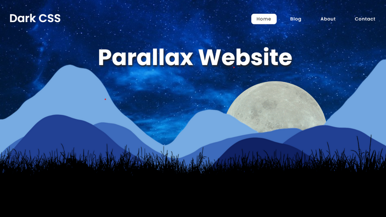
This code creates a visually engaging parallax scrolling website using HTML, CSS, and JavaScript. It features a dynamic background where elements like the moon, mountains, and grass move at different speeds when the user scrolls, creating a 3D-like depth effect. The header includes navigation links, and the page is styled for responsiveness using CSS. JavaScript is used to control the movement of the background elements in sync with the scroll position.
HTML Code:
...
<!DOCTYPE html>
<html lang="en">

<head>
    <meta charset="UTF-8">
    <meta name="viewport" content="width=device-width, initial-scale=1.0">
    <title>Parallax Scrolling Website</title>
    <link rel="stylesheet" href="style.css">
</head>

<body>
    <header>
        <div id="logo">Dark CSS</div>

        <div class="menu">
            <a href="" class="active">Home</a>
            <a href="">Blog</a>
            <a href="">About</a>
            <a href="">Contact</a>
        </div>
    </header>

    <div class="parallax">
        <h2 id="heading">Parallax Website</h2>
        <img src="images/moon.png" alt="" id="moon">
        <img src="images/layer.png" alt="" id="mountain">
        <img src="images/grass.png" alt="" id="grass">
    </div>

    <section>
        <h2>Parallax Scrolling Website</h2>

        <p>
            Lorem ipsum dolor sit amet consectetur adipisicing elit. Iste sunt numquam tempora eligendi ipsa commodi, ex
            magni fugit in consequuntur velit, cupiditate illum? Animi, cupiditate eligendi iure sit facilis repudiandae
            unde dicta numquam magni illo reiciendis ea quasi rerum corporis explicabo consectetur nisi maiores
            temporibus. Officiis quod iusto voluptas fugit illo cupiditate necessitatibus quos tempore saepe corrupti
            sed, odit vel quis rerum itaque consequuntur ea harum veniam ab laboriosam accusamus quibusdam nihil!
            Doloremque perferendis placeat minima at ut vero cum atque, nesciunt unde iste aspernatur consequuntur
            voluptatem, deserunt officiis delectus similique quis neque dolor officia, nisi laudantium ipsa cupiditate!
            Architecto nesciunt exercitationem in neque temporibus, ut quisquam minima repellendus, hic totam est
            dolorem numquam accusantium incidunt eum aliquam? Cumque, commodi?
        </p><br>

        <p>
            Lorem ipsum, dolor sit amet consectetur adipisicing elit. Consequatur doloribus labore dignissimos? Ad,
            quas? Maxime, dolorem. Velit iure possimus non quidem similique provident modi eius soluta dolorum,
            quibusdam doloremque impedit dolorem, repellendus cupiditate! Facere necessitatibus distinctio iste
            voluptates aperiam quisquam laboriosam ab nulla sunt recusandae, nemo laudantium sapiente? Consequuntur
            temporibus assumenda ipsum deleniti eligendi quam libero minus tempora aliquid neque?
        </p><br>

        <p>
            Lorem ipsum dolor sit amet consectetur adipisicing elit. Dolore minima earum assumenda soluta temporibus
            ipsum, modi aperiam, sint iusto rerum ad quis natus voluptatibus inventore corporis! Libero ad non
            exercitationem.
        </p><br>

        <p>
            Lorem ipsum dolor sit amet consectetur, adipisicing elit. Officia minima sit vero laborum quidem, mollitia
            reiciendis praesentium perferendis aperiam dolor placeat odit minus, distinctio aut obcaecati molestiae?
            Doloribus, voluptatum provident.
        </p><br>

        <p>
            Lorem ipsum dolor sit amet, consectetur adipisicing elit. Nemo natus suscipit sed laboriosam officia beatae
            quisquam, magnam, vel ab, veritatis eum consequatur ducimus numquam non quod repellat! Quia doloremque
            animi, voluptates laudantium iusto eaque corporis fugiat aspernatur excepturi? Porro architecto iusto
            perferendis labore possimus consectetur rerum obcaecati saepe, molestiae totam ea dolorem qui ad quisquam
            provident ducimus aut maiores quas, nemo dolor! Doloribus natus dolores illo architecto, saepe perspiciatis
            ab placeat cumque labore repellendus accusantium atque deserunt numquam eveniet, mollitia beatae, tenetur
            amet nulla. Numquam aliquid enim eaque neque accusantium amet architecto nesciunt nam at hic, maiores
            perferendis porro ipsam assumenda veniam. Quia itaque earum quis corporis consequuntur voluptate
            voluptatibus! Porro nesciunt unde saepe sunt excepturi non praesentium quia ullam est earum dolore, officiis
            necessitatibus natus consequuntur eos laudantium suscipit harum. Illum aspernatur tenetur incidunt animi
            laboriosam possimus sapiente eaque eligendi totam iure cupiditate provident reiciendis illo, qui quod cumque
            ad sed, delectus rem ipsa minima pariatur fuga? Ipsa ut suscipit odio illo natus repellendus beatae, atque
            velit adipisci aspernatur soluta modi sapiente nulla, placeat accusamus possimus. Neque deleniti autem
            expedita quasi consequuntur possimus voluptatibus, eligendi rerum commodi veniam vel eius ab! Doloremque
            totam amet possimus error asperiores, fuga voluptatibus.
        </p><br>
        <p>
            Lorem ipsum dolor sit amet consectetur adipisicing elit. Consequuntur ex eveniet suscipit quaerat quasi
            laudantium, eum beatae, voluptate laboriosam tempora aliquid non nihil soluta, accusamus nobis? Adipisci
            eveniet quam ab. Lorem ipsum dolor sit amet consectetur adipisicing elit. Porro ea accusantium, dolorem
            consequatur delectus non libero odio voluptatibus magnam est ipsum atque, dignissimos voluptate corrupti cum
            fugit ullam nam reiciendis! Lorem ipsum dolor sit amet consectetur adipisicing elit. Exercitationem
            voluptates, laudantium, officia excepturi sapiente dolorum ipsam, repudiandae voluptatibus quibusdam
            corrupti blanditiis similique fuga? Consequuntur nulla quas aut quasi et labore! Lorem ipsum dolor sit amet
            consectetur adipisicing elit. Dignissimos itaque quis minus magni tempore odio doloremque numquam. Eius
            perferendis natus molestiae ab! Facere inventore sed in iste? Ipsum, itaque est.
        </p>
    </section>
</body>

</html>
...
Explanation:
The <body> contains the main structure of the page. The first section is the <header>, which includes a logo and a navigation menu enclosed within a <div> element. The #logo is assigned to a div with the text “Dark CSS”, representing the website’s brand, and the .menu class groups the navigation links (<a> tags) for the homepage, blog, about, and contact sections. The active page is highlighted with the class active on the first link.
Next is the parallax section, marked by a <div> which houses the key elements for the parallax effect: a heading (<h2>), and three images (moon.png, mountain layer4.png, and grass.png), each with unique ids (moon, mountain, grass). These IDs allow JavaScript to manipulate these elements dynamically, creating the scrolling effect.
Following this is a content <section> that contains several paragraphs (<p>) of placeholder text. This section adds body content to the website and provides users with information or text. The paragraphs are separated by <br> tags for extra spacing.
At the end, a <script> tag is used to insert custom JavaScript. This script listens to the scroll event and adjusts the position of the heading and images as the user scrolls, giving the page its signature parallax effect. The use of document.getElementById allows the script to manipulate specific elements based on their id, creating dynamic movement based on the scroll position (window.scrollY). This ensures that as users scroll down, the moon, mountains, and other elements shift, enhancing the visual experience.
CSS Code:
...
@import url('https://fonts.googleapis.com/css2?family=Poppins:ital,wght@0,100;0,200;0,300;0,400;0,500;0,600;0,700;0,800;0,900;1,100;1,200;1,300;1,400;1,500;1,600;1,700;1,800;1,900&display=swap');

* {
    padding: 0;
    margin: 0;
    box-sizing: border-box;
    font-family: "Poppins", sans-serif;
}

body {
    min-height: 100vh;
}

header {
    position: fixed;
    top: 0;
    left: 0;
    width: 100%;
    padding: 30px 100px;
    display: flex;
    justify-content: space-between;
    align-items: center;
    z-index: 100;
}

#logo {
    font-size: 2em;
    color: #fff;
    user-select: none;
    font-weight: 600;
}

.menu a {
    font-size: 0.8em;
    color: #fff;
    font-weight: 500;
    text-decoration: none;
    margin-left: 20px;
    letter-spacing: 1px;
    padding: 6px 15px;
    border-radius: 8px;
    transition: 0.5s;
}

.menu a:hover,
a.active {
    color: #333;
    background: #fff;
}

.parallax {
    position: relative;
    display: flex;
    justify-content: center;
    align-items: center;
    height: 100vh;
    background: url('images/background.jpg') no-repeat;
    background-size: cover;
    background-position: center;
    background-attachment: fixed;
}

#heading {
    position: absolute;
    top: 20%;
    font-size: 4em;
    color: #fff;
    text-shadow: 2px 4px 5px #232121;
}

.parallax img {
    position: absolute;
    width: 100%;
    pointer-events: none;
}

.parallax img#moon {
    width: 300px;
    top: 40%;
    right: 20%;
}

.parallax img#mountain {
    position: fixed;
    bottom: 0;
}

.parallax img#grass {
    bottom: -40%;
}

section {
    position: relative;
    background-color: #020912;
    padding: 30px 100px;
}

h2 {
    color: #fff;
    font-size: 3em;
    margin-bottom: 25px;
}

p {
    color: #fff;
    font-size: 1em;
    font-weight: 300
}

@media (max-width: 768px) {
    header {
        padding: 30px 50px;
    }

    #heading {
        font-size: 3em;
    }

    .parallax img#moon {
        width: 180px;
    }

    .parallax img#mountain {
        bottom: 20%;
    }

    .parallax img#grass {
        bottom: -10%;
    }

    section {
        margin-top: -60px;
        padding: 30px 50px;
    }

    section h2 {
        font-size: 2em;
    }
}

@media (max-width: 468px) {
    header {
        padding: 30px 50px;
    }

    #logo {
        font-size: 1.5em;
    }

    .menu {
        display: none;
    }

    #heading {
        font-size: 3em;
    }

    .parallax img#moon {
        width: 180px;
        top: 65%;
        right: 10%;
    }

    .parallax img#mountain {
        width: 130%;
        bottom: 20%;
    }

    .parallax img#grass {
        bottom: -5%;
        width: 130%;
    }

    section {
        margin-top: -60px;
        padding: 30px 50px;
    }

    section h2 {
        font-size: 2em;
    }
}
..
Explanation:
It starts by applying basic styling rules for various elements like the body, header, and the parallax section. The body typically has some global styling applied, including the background color, font family, and margin or padding adjustments to ensure consistent spacing across different browsers. This foundational styling sets the base for the entire layout.
The header, which includes the logo and navigation menu, is usually styled with properties like background-color, height, display, and justify-content to ensure that the logo and navigation links are properly aligned.
A position: fixed or sticky might be applied to keep the header in view as the user scrolls, enhancing navigation usability. The links in the navigation (<a> tags) are styled with hover effects, such as changing colors, to provide a visual cue when a user interacts with them. The active class is often styled differently, such as with bold text or an underline, to show the current page the user is on.
For the parallax effect itself, the images (moon.png, mountain layer4.png, and grass.png) are positioned using CSS properties like position: absolute and given specific top, right, bottom, or left values to control their placement on the page.
The z-index property is used to layer these images on top of each other in a specific order, creating the illusion of depth. The transform property might be used to scale or shift elements slightly, and transitions are often applied for smooth movements when scrolling. Each image’s movement is coordinated with JavaScript, but CSS provides the initial layout and ensures that elements are responsive.
Additionally, the heading (<h2>) in the parallax section is styled with a larger font size and a prominent color, often centered on the page using text-align: center and margin or padding adjustments.
The rest of the text in the content section is styled to ensure readability, with appropriate font sizes, line heights, and spacing between paragraphs. A responsive layout is often achieved using media queries, adjusting font sizes, margins, and image positions for smaller screens to ensure that the design looks good on both desktop and mobile devices.
Overall, the CSS ensures that the page not only looks aesthetically pleasing but also provides a smooth, interactive experience as users scroll through, with fluid transitions between elements and a consistent, visually engaging layout.
JavaScript Code:
...
        const heading = document.getElementById("heading");
        const moon = document.getElementById("moon");

        window.addEventListener("scroll", () => {
            let value = window.scrollY;

            if (value <= 500) {
                heading.style.marginTop = value * 2.5 + 'px';
                moon.style.right = 20 + value * 0.1 + '%';
            }
        });
Explanation:
The code begins by selecting the HTML elements that will be manipulated, using the document.getElementById() method to target the heading (#heading) and the moon image (#moon).
The key to this effect is the window.addEventListener("scroll", ...) function, which listens for the “scroll” event. Each time the user scrolls, the function is triggered, and the current scroll position is captured using window.scrollY, which returns the number of pixels the document has been scrolled vertically.
This value is stored in a variable, value, which is then used to calculate the movement of specific elements.
For instance, the heading’s vertical position is adjusted by modifying its marginTop property. The calculation value * 2.5 + 'px' makes the heading move faster than the scroll, giving it a more dramatic shift upwards as the user scrolls.
Similarly, the moon image is moved horizontally by modifying its right property. The calculation 20 + value * 0.1 + '%' causes the moon to gradually shift to the right as the user scrolls down the page, creating the illusion of distance and depth.
The if (value <= 500) condition ensures that the parallax effect is limited to a certain scroll range, preventing the elements from moving too far off-screen or becoming misaligned when the user scrolls beyond a set limit. This approach helps maintain the visual integrity of the design by constraining the movement to a controlled range, ensuring that the parallax effect enhances the user experience without disrupting it.
Source Code:
Download “Parallax-Website.zip” Parallax-Website.zip – Downloaded 412 times – 2.60 MBConclusions:
In this parallax scrolling project, we created a visually dynamic website using HTML, CSS, and JavaScript. We implemented a fixed header with navigation links, and built a parallax effect where elements like the moon, mountains, and grass move at different speeds as the user scrolls. This effect was achieved by combining absolute positioning in CSS and scroll-based movement through JavaScript. Additionally, we ensured the website is responsive for various screen sizes. The result is an interactive and immersive design, ideal for creating an engaging user experience.
