Project preview
Folder Structure:
- First you have to create a main folder for our project.
- Then inside it create files index.html, style.css, and script.js.
- At last link css and js files with html file to get start.
Introduction:
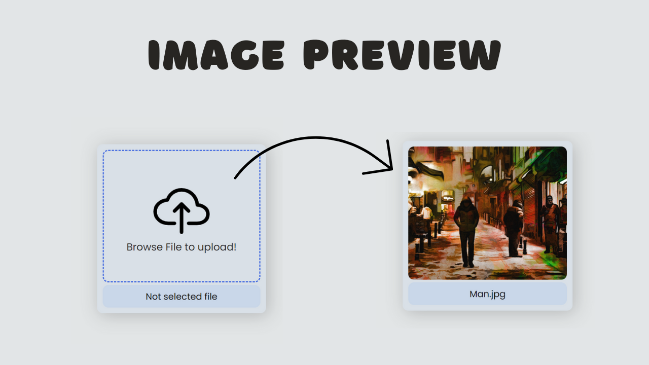
In this project, we are going to create an image preview feature using HTML, CSS, and JavaScript. The goal is to design a simple and intuitive interface that allows users to upload an image file and immediately preview it within the browser. Once a file is selected, the chosen image will replace the placeholder elements, displaying the preview while also showing the file name below.
HTML Code:
...
<!DOCTYPE html>
<html lang="en">

<head>
    <meta charset="UTF-8">
    <meta name="viewport" content="width=device-width, initial-scale=1.0">
    <title>Image Preview</title>
    <link rel="stylesheet" href="style.css">
</head>

<body>
    <div class="container">
        <label for="file" class="header">
            <div class="upload-file">
                <a href="">
                <ion-icon id="upload-icon" name="cloud-upload-outline"></ion-icon>
                </a>
                <p id="upload-text">Browse File to upload!</p>
            </div>
        </label>
        <label for="file" class="footer">
            <p>Not selected file</p>
        </label>
        <input type="file" id="file" accept="Image/*"
        onchange="showPreview(event);">
    </div>

    <script>
        function showPreview(event){
            const fileInput = event.target;
            const file = fileInput.files[0];
            const header = document.querySelector(".header");
            const uploadIcon = document.getElementById("upload-icon");
            const uploadText = document.getElementById("upload-text");
            const footer = document.querySelector(".footer");

            if(file) {
                const reader = new FileReader();
                reader.onload = function (e) {
                    header.style.backgroundImage =
                    `url(${e.target.result})`;
                    header.style.border = 'none';
                    uploadIcon.style.display = 'none';
                    uploadText.style.display = 'none';
                    footer.innerHTML = `<p>${file.name}</p>`
                }
                reader.readAsDataURL(file);
            }

        }
    </script>

    <script type="module" src="https://unpkg.com/ionicons@7.1.0/dist/ionicons/ionicons.esm.js"></script>
    <script nomodule src="https://unpkg.com/ionicons@7.1.0/dist/ionicons/ionicons.js"></script>

</body>

</html>
...
Explanation:
Within the body section, a div element with the class container serves as the main wrapper for the content, ensuring everything stays organized and aligned.
Inside this container, the first label element with the header class acts as a clickable area for uploading a file. It contains another div with the class upload-file, which houses an icon (<ion-icon>) and a text prompt (<p id="upload-text">Browse File to upload!</p>), instructing users to select a file.
This label is linked to the hidden file input (<input type="file" id="file">) via the for="file" attribute, making the entire label area interactive.
The second label, with the class footer, is placed below the header and initially displays the text “Not selected file,” which will be updated with the file name once an image is chosen.
The input element with the type="file" allows users to select an image file, and the accept="Image/*" attribute restricts the file types to images only. The onchange="showPreview(event);" attribute is an event handler that triggers the showPreview() JavaScript function whenever a file is selected, initiating the image preview process.
Finally, the HTML includes two script tags at the bottom: one that imports the ionicons library to display icons, and another for handling older browsers. The HTML structure is simple and intuitive, focusing on providing a seamless user experience for image uploads and previews.
CSS Code:
...
@import url('https://fonts.googleapis.com/css2?family=Poppins:ital,wght@0,100;0,200;0,300;0,400;0,500;0,600;0,700;0,800;0,900;1,100;1,200;1,300;1,400;1,500;1,600;1,700;1,800;1,900&display=swap');

* {
    padding: 0;
    margin: 0;
    box-sizing: border-box;
    font-family: 'Poppins', sans-serif;
}

html,body {
    display: grid;
    height: 100%;
    place-items: center;
    background: #e2e5e6;
}

.container {
    height: 300px;
    width: 300px;
    border-radius: 10px;
    box-shadow: 4px 4px 30px rgba(0,0,0,0.2);
    display: flex;
    justify-content: space-between;
    align-items: center;
    padding: 10px;
    flex-direction: column;
    gap: 5px;
    background-color: rgba(0, 110, 255, 0.041);
}

.header {
    flex: 1;
    width: 100%;
    border: 2px dashed royalblue;
    display: flex;
    justify-content: center;
    align-items: center;
    flex-direction: column;
    border-radius: 10px;
    background-position: center;
    background-size: cover;
}

.upload-file {
    display: flex;
    align-items: center;
    justify-content: center;
    flex-direction: column;
}

.upload-file a {
    font-size: 100px;
    color: #000;
}

.upload-file p {
    text-align: center;
    color: rgb(41, 40, 40);
    font-weight: 400;
    font-size: 18px;
    margin-top: -40px;
}

.footer {
    background-color: rgba(0, 110, 255, 0.075);
    width: 100%;
    height: 40px;
    padding: 8px;
    border-radius: 10px;
    cursor: pointer;
    display: flex;
    justify-content: flex-end;
    align-items: center;
    color: #000;
    border: none;
}

.footer p {
    flex: 1;
    text-align: center;
}

#file {
    display: none;
}
...
Explanation:
The code begins with an @import statement that imports the “Poppins” font from Google Fonts, ensuring that the text throughout the interface is stylish and modern. The universal selector * applies basic styles like padding: 0, margin: 0, and box-sizing: border-box to reset the default browser styling, ensuring consistency across different devices and browsers. The font-family is globally set to ‘Poppins’, giving the text a uniform and professional look.
The html and body selectors use display: grid, height: 100%, and place-items: center to center the content both vertically and horizontally within the viewport. This ensures that the container holding the image preview interface is always centered, providing a balanced layout regardless of screen size. The background property is set to a soft greyish-blue color (#e2e5e6), offering a neutral backdrop that makes the elements stand out without overwhelming the design.
The .container class defines the primary structure of the interface. It sets a fixed height and width of 300px each, ensuring the upload area is compact and easy to interact with.
The container is styled with a border-radius: 10px to give it rounded corners, and a box-shadow is applied to add depth, making the container appear slightly elevated from the background. Inside the container, the display: flex, justify-content: space-between, and align-items: center properties are used to center the content and provide spacing between elements.
The flex-direction: column and gap: 5px properties ensure that the header and footer elements are stacked vertically with a small gap between them, creating a clean, organized layout. The background color is set to a light, semi-transparent blue (rgba(0, 110, 255, 0.041)), adding a subtle emphasis on the container.
The .header class styles the area where the image preview or upload prompt is displayed. The element is set to flex: 1 to make it occupy most of the container’s space, and width: 100% ensures it stretches across the full width.
The border: 2px dashed royalblue creates a dashed border around the header, visually indicating the drop area for the image file. The border-radius: 10px continues the rounded corners theme, and background-position: center along with background-size: cover prepares the header to display the image preview properly by centering and covering the available space.
The .upload-file class further structures the content within the header, aligning the icon and text both vertically and horizontally using display: flex and flex-direction: column. This makes the upload prompt visually centered and easy to read. The icon size is controlled by .upload-file a, which sets font-size: 100px to make it prominent, and color: #000 for a clear, black icon.
The text within .upload-file p is styled with text-align: center to ensure it’s centrally aligned, while color: rgb(41, 40, 40) sets a dark grey color for legibility. The font-weight: 400 and font-size: 18px provide a medium-weight, easily readable text.
The margin-top: -40px is used to slightly overlap the text with the icon above it, creating a cohesive visual grouping.
The .footer class styles the area below the header, where the file name is displayed. It uses background-color: rgba(0, 110, 255, 0.075) to apply a light, semi-transparent blue background, matching the overall color scheme.
The width: 100%, height: 40px, and padding: 8px properties ensure the footer is proportionate and spacious enough to display the file name clearly. The border-radius: 10px provides consistent rounded corners, and cursor: pointer indicates that the footer is interactive.
The display: flex, justify-content: flex-end, and align-items: center properties align the content within the footer to the right, creating a clean and professional look. The text color is set to black (color: #000), ensuring readability.
The #file input element is hidden from view (display: none), as it is not necessary for the user to see this element directly. Instead, the label elements are styled to act as the interface for file selection, making the experience more intuitive and visually appealing.
JavaScript Code:
...
         function showPreview(event){
            const fileInput = event.target;
            const file = fileInput.files[0];
            const header = document.querySelector(".header");
            const uploadIcon = document.getElementById("upload-icon");
            const uploadText = document.getElementById("upload-text");
            const footer = document.querySelector(".footer");

            if(file) {
                const reader = new FileReader();
                reader.onload = function (e) {
                    header.style.backgroundImage =
                    `url(${e.target.result})`;
                    header.style.border = 'none';
                    uploadIcon.style.display = 'none';
                    uploadText.style.display = 'none';
                    footer.innerHTML = `<p>${file.name}</p>`
                }
                reader.readAsDataURL(file);
            }

        }
Explanation:
The script begins by defining the `showPreview(event)` function, which is triggered when a user selects an image file through the file input element. This function first captures the file input element using `event.target` and extracts the selected file using `fileInput.files[0]`.
It then references key elements on the page, such as the `header`, `uploadIcon`, `uploadText`, and `footer`, which will be dynamically updated based on the selected file.
If a file is selected, a `FileReader` object is created to read the content of the image file. The `reader.onload` event is triggered once the file is successfully read, allowing the script to update the `header` element’s background image to display the selected image using the `backgroundImage` property.
The script also hides the upload icon and text by setting their display styles to `none`, creating a cleaner, image-focused interface.
Additionally, the border of the header is removed by setting it to `none`, further emphasizing the uploaded image. The file name is displayed in the footer by replacing its inner HTML with the file name, providing feedback to the user about the selected file.
Finally, the `reader.readAsDataURL(file)` method converts the image file into a base64-encoded URL that can be used as the background image source, completing the preview functionality.
This script seamlessly integrates with the HTML and CSS to provide a smooth, interactive experience for users when selecting and previewing images.
Source Code:
Download “Preview-Image.zip” Preview-Image.zip – Downloaded 478 times – 2.08 MB
Conclusions:
In this project, we successfully developed an image preview feature that allows users to upload and preview images directly within their browser. The interface provides an intuitive experience by displaying an upload prompt and dynamically updating to show the selected image. We used HTML to structure the layout, CSS to style and position the elements, and JavaScript to handle file input and image rendering. This project enhances user interaction by offering instant visual feedback and a clean, modern design for file uploads.
