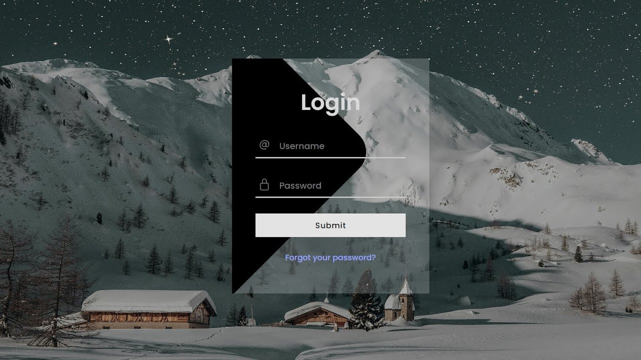
project preview
Folder Structure:
- First we will need to create a folder for our project
- Then we will create files index.html and style.css for our project
- At last we will link css file with html file to start our work
Introduction:
In this project, we are going to create a modern login form with background image using HTML and CSS. This form is designed with a sleek and minimalist approach, incorporating custom styles and icons to enhance the user experience. The form will include input fields for the username and password, styled with custom icons, and a “Forgot your password?” link. Additionally, a submit button will be styled to fit seamlessly with the overall design. The background image will provide a visually appealing backdrop, giving the login form a professional and polished look.
HTML Code:
...
<!DOCTYPE html>
<html lang="en">

<head>
    <meta charset="UTF-8">
    <meta name="viewport" content="width=device-width, initial-scale=1.0">
    <title>Login Form with Background Image</title>
    <link rel="stylesheet" href="style.css">
</head>

<body>
    <!-- Form for user login -->
    <form action="" class="form_main">
        <!-- Heading for the form -->
        <p class="heading">Login</p>
        <!-- Container for username input field -->
        <div class="inputContainer">
            <!-- Icon for username input field -->
            <i>
                <ion-icon name="at-outline"></ion-icon>
            </i>
            <!-- Username input field -->
            <input type="text" placeholder="Username" autocomplete="off" class="inputField">
        </div>
        <!-- Container for password input field -->
        <div class="inputContainer">
            <!-- Icon for password input field -->
            <i>
                <ion-icon name="lock-closed-outline"></ion-icon>
            </i>
            <!-- Password input field -->
            <input type="password" placeholder="Password" autocomplete="off" class="inputField">
        </div>
        <!-- Submit button -->
        <button id="button">Submit</button>
        <!-- Link for forgot password -->
        <a href="" class="forgotbutton">Forgot your password?</a>
    </form>

    <!-- Script to include Ionicons library for icons -->
    <script type="module" src="https://unpkg.com/ionicons@7.1.0/dist/ionicons/ionicons.esm.js"></script>
    <script nomodule src="https://unpkg.com/ionicons@7.1.0/dist/ionicons/ionicons.js"></script>
</body>

</html>
...
Explanation:
A link to an external CSS file, style.css, is included to style the form. The <body> section contains a <form> element with the class form_main that serves as the main container for the login form.
Inside the form, there are several elements: a <p> tag with the class heading displays the form title “Login,” followed by two <div> elements with the class inputContainer that serve as wrappers for the input fields. Each input container has an <i> tag, which includes an Ionicon for visual enhancement, representing the input type (username or password).
The input fields themselves are defined with <input> tags, one for the username (type text) and the other for the password (type password), both styled using the class inputField.
A <button> tag with the id button is used for the submit action. Additionally, an <a> tag with the class forgotbutton provides a link for users who have forgotten their password.
The Ionicons library is included via <script> tags at the end of the body, enabling the use of icon fonts within the form. This HTML structure, when paired with the corresponding CSS, results in a visually appealing, functional login form.
CSS Code:
...
/* Importing Google Fonts */
@import url('https://fonts.googleapis.com/css2?family=Poppins:ital,wght@0,100;0,200;0,300;0,400;0,500;0,600;0,700;0,800;0,900;1,100;1,200;1,300;1,400;1,500;1,600;1,700;1,800;1,900&display=swap');

/* Resetting default styles and setting font family */
* {
    padding: 0;
    margin: 0;
    box-sizing: border-box;
    font-family: "Poppins", sans-serif;
}

/* Styling for the html and body elements */
html,
body {
    display: grid;
    height: 100%;
    place-items: center;
}

/* Styling for the body, including background image */
body {
    background-image: url("images/Mount.jpg");
    background-size: cover;
    background-position: center;
}

/* Styling for the main form container */
.form_main {
    width: 250px;
    display: flex;
    justify-content: center;
    align-items: center;
    flex-direction: column;
    padding: 30px;
    box-shadow: 0px 0px 40px rgba(0, 0, 0, 0.062);
    position: relative;
    overflow: hidden;
    background-color: rgba(255, 255, 255, 0.2);
}

/* Styling for the decorative element before the form */
.form_main::before {
    position: absolute;
    content: "";
    width: 300px;
    height: 300px;
    background-color: #000;
    transform: rotate(45deg);
    left: -180px;
    bottom: 30px;
    border-radius: 30px;
    z-index: 1;
    box-shadow: 5px 5px 10px rgba(0, 0, 0, 0.082);
}

/* Styling for the heading text within the form */
.heading {
    font-size: 28px;
    font-weight: 600;
    color: #d9d9d9;
    margin: 5px 0 10px 0;
    z-index: 99;
}

/* Styling for the container of input fields */
.inputContainer {
    width: 100%;
    position: relative;
    display: flex;
    align-items: center;
    justify-content: center;
    z-index: 2;
}

/* Styling for icons within input containers */
.inputContainer i {
    position: absolute;
    left: 3px;
    color: rgb(120, 120, 120);
}

/* Styling for input fields */
.inputField {
    width: 100%;
    height: 30px;
    background-color: transparent;
    border: none;
    border-bottom: 2px solid rgb(203, 203, 203);
    margin: 10px 0;
    color: rgb(155, 155, 155);
    font-size: 12px;
    font-weight: 500;
    padding-left: 30px;
    box-sizing: border-box;
    outline: none;
}

/* Styling for input fields when focused */
.inputField:focus {
    border-bottom: 2px solid rgb(246, 246, 246);
}

/* Styling for placeholder text within input fields */
.inputField::placeholder {
    color: rgb(120, 120, 120);
    font-size: 11px;
    font-weight: 500;
}

/* Styling for the submit button */
#button {
    z-index: 2;
    position: relative;
    width: 100%;
    border: none;
    background-color: rgb(227, 227, 227);
    height: 30px;
    color: rgb(8, 8, 8);
    font-size: 10px;
    font-weight: 500;
    letter-spacing: .5px;
    margin: 10px;
    cursor: pointer;
}

/* Styling for the submit button when hovered */
#button:hover {
    background-color: rgb(220, 220, 220);
}

/* Styling for the "Forgot your password?" link */
.forgotbutton {
    z-index: 2;
    font-size: 10px;
    font-weight: 500;
    color: rgb(152, 164, 255);
    text-decoration: none;
    padding: 8px 15px;
}
..
Explanation:
It begins by importing the “Poppins” font from Google Fonts, which gives the text a modern and clean look.
The universal selector (`*`) resets all margins, padding, and box-sizing to ensure consistent styling across different browsers, while also setting the default font family to “Poppins” for all elements.
The `html` and `body` elements are styled to use a grid layout that centers the content vertically and horizontally, making the form appear in the middle of the screen.
The `body` also has a background image set with `background-image: url(“images/Mount.jpg”)`, and properties like `background-size: cover` and `background-position: center` ensure that the image covers the entire background and remains centered, providing a visually appealing backdrop.
The `.form_main` class styles the main container of the form by setting its width, centering its contents using flexbox, and adding padding for spacing. The use of `box-shadow` creates a subtle shadow effect around the form, enhancing its depth against the background.
The form’s background color is semi-transparent (`rgba(255, 255, 255, 0.2)`), allowing the background image to slightly show through, adding a layered visual effect. A pseudo-element (`::before`) is used to add a decorative shape behind the form, enhancing its aesthetic with a rotated and shadowed black square.
The `.heading` class styles the “Login” title within the form to be large, bold, and light-colored, which contrasts well with the form’s background.
The `.inputContainer` class is used to style the input fields and their icons by setting a relative position for layout purposes and centering the content. The `<i>` elements within `.inputContainer` are absolutely positioned to appear inside the input fields, providing a visual cue for users.
The `.inputField` class styles the input fields themselves to be borderless and semi-transparent with a solid underline that changes color on focus, creating a modern look and visual feedback for user interaction.
The `::placeholder` selector further customizes the placeholder text color and style. The `#button` ID styles the submit button with a specific background color, font size, and hover effect, making it stand out while remaining cohesive with the overall design.
Finally, the `.forgotbutton` class styles the “Forgot your password?” link with a specific color and font size, integrating seamlessly with the form’s design. These comprehensive CSS rules, when combined, create a cohesive and visually engaging login form that is both functional and aesthetically pleasing.
Source Code:
Download “Login-Form-Bg.zip” Login-Form-Bg.zip – Downloaded 465 times – 2.58 MB
Conclusions:
This project demonstrates how to create a modern and visually appealing login form using HTML and CSS. By incorporating a background image and utilizing various CSS techniques such as flexbox, pseudo-elements, and hover effects, the design achieves a professional and user-friendly interface.