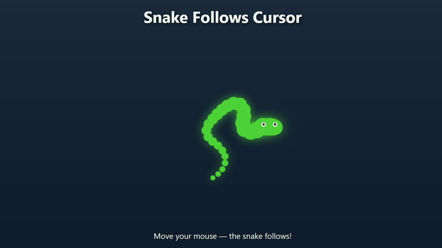
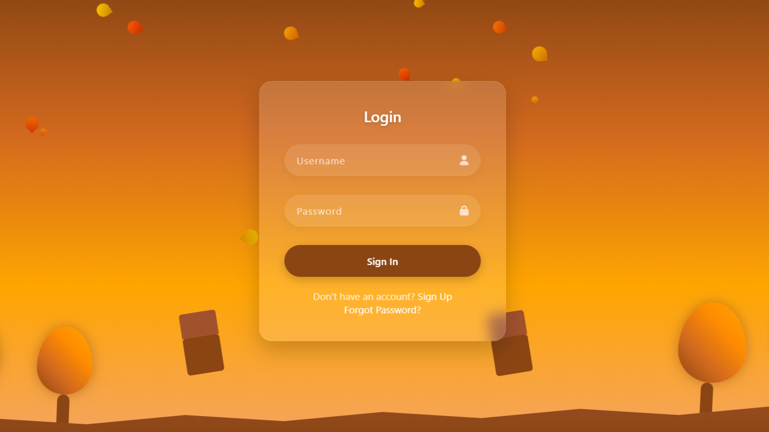
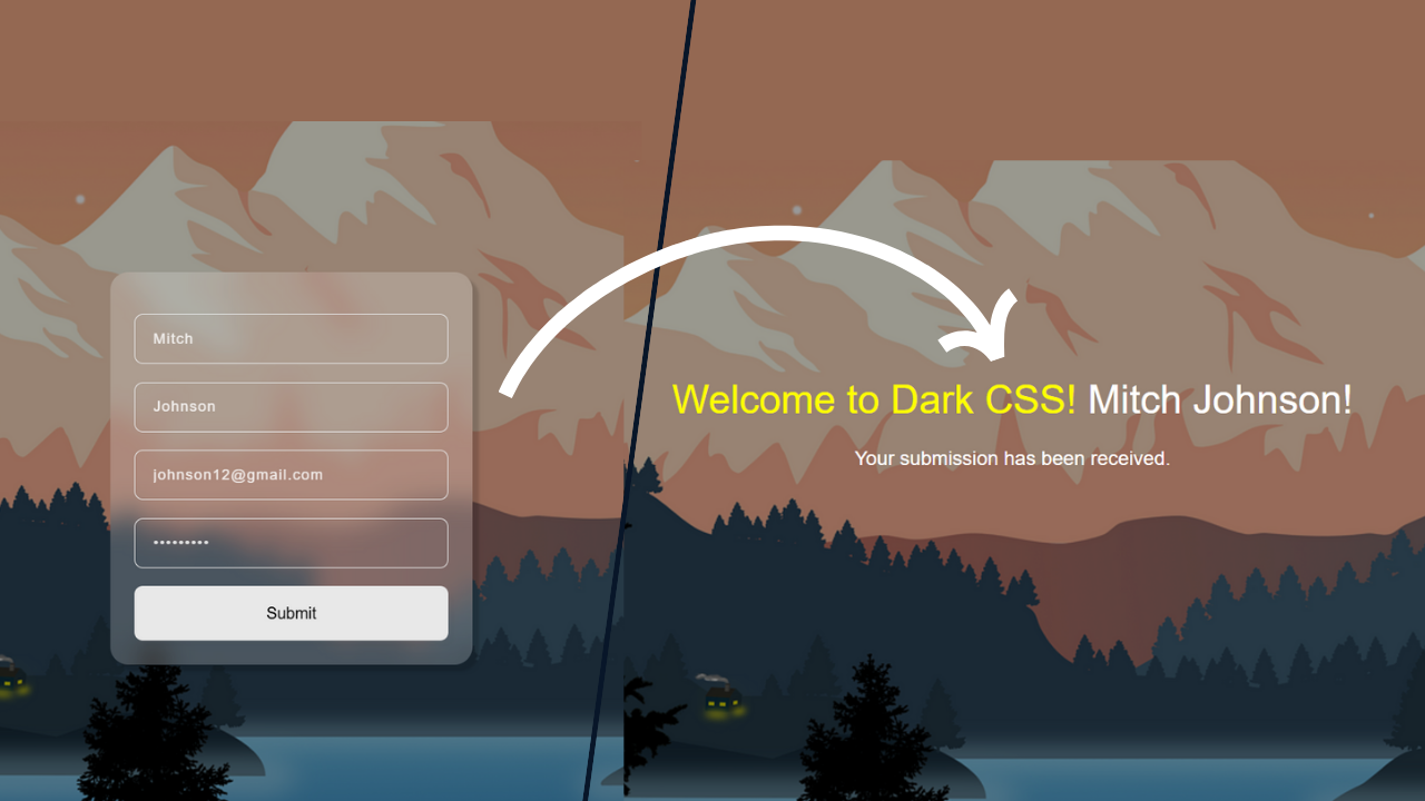
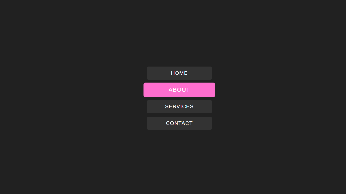
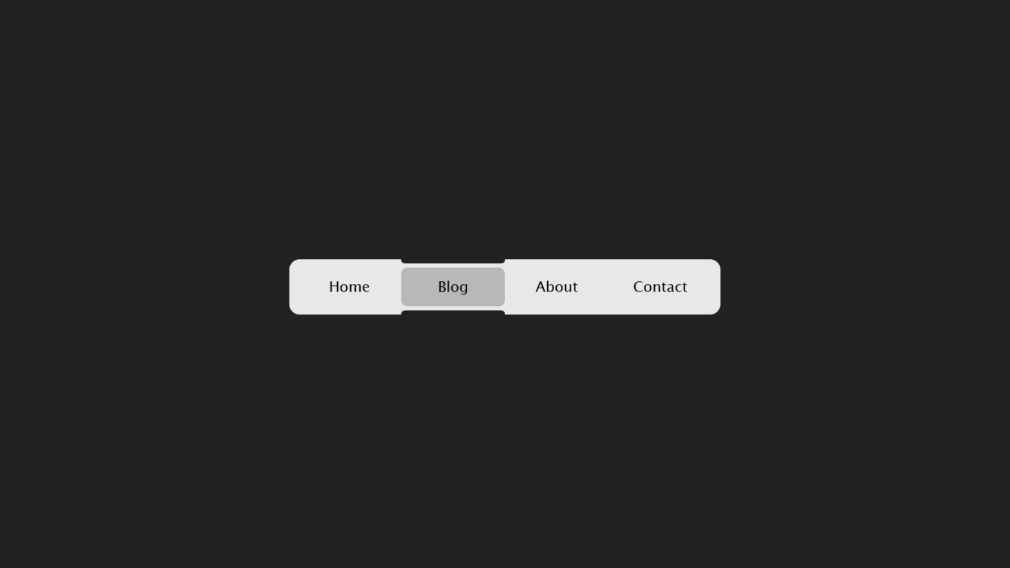
Project preview
Folder Structure:
- First we will need to create a folder for over project name it MajicMenuIndicator.
- Then we will create files index.html and style.css for over project.
- At last we will link over css file with index.html
Introduction:
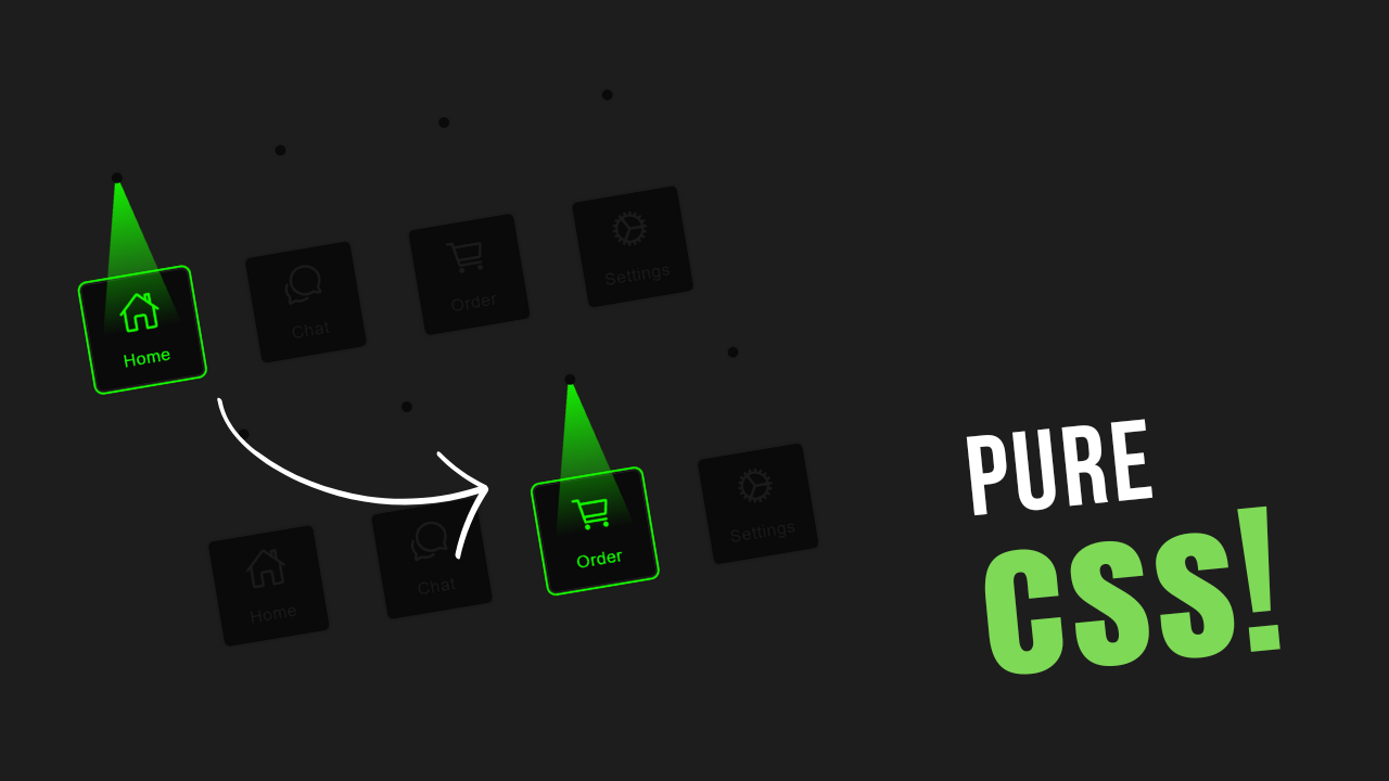
In this project, we will create css creative menu hover effects. The menu will feature interactive buttons that glow with a light effect when hovered over, enhancing the visual appeal of your website. Each button will have an icon and a label, and the glow effect will be achieved using CSS animations and gradients.
HTML Code:
...
<!DOCTYPE html>
<html lang="en">

<head>
    <meta charset="UTF-8">
    <meta name="viewport" content="width=device-width, initial-scale=1.0">
    <title>Glowing Navigation Menu On Hover</title>
    <link rel="stylesheet" href="style.css">
</head>

<body>
    <!-- Navigation Menu Wrapper -->
    <div class="wrapper">
        <ul>
            <!-- Navigation Menu Items -->
            <li>
                <div class="light-button">
                    <!-- Button Element -->
                    <button class="bt">
                        <!-- Light Holder for Glow Effect -->
                        <div class="light-holder">
                            <div class="dot"></div>
                            <!-- Light effect overlay -->
                            <div class="light"></div>
                        </div>
                        <!-- Button Content Holder -->
                        <div class="button-holder">
                            <a href="">
                                <ion-icon name="home-outline"></ion-icon>
                            </a>
                            <p>Home</p> <!-- Text label -->
                        </div>
                    </button>
                </div>
            </li>
            <li>
                <div class="light-button">
                    <button class="bt">
                        <div class="light-holder">
                            <div class="dot"></div>
                            <div class="light"></div>
                        </div>
                        <div class="button-holder">
                            <a href="">
                                <ion-icon name="chatbubbles-outline"></ion-icon>
                            </a>
                            <p>Chat</p>
                        </div>
                    </button>
                </div>
            </li>
            <li>
                <div class="light-button">
                    <button class="bt">
                        <div class="light-holder">
                            <div class="dot"></div>
                            <div class="light"></div>
                        </div>
                        <div class="button-holder">
                            <a href="">
                                <ion-icon name="cart-outline"></ion-icon>
                            </a>
                            <p>Order</p>
                        </div>
                    </button>
                </div>
            </li>
            <li>
                <div class="light-button">
                    <button class="bt">
                        <div class="light-holder">
                            <div class="dot"></div>
                            <div class="light"></div>
                        </div>
                        <div class="button-holder">
                            <a href="">
                                <ion-icon name="cog-outline"></ion-icon>
                            </a>
                            <p>Settings</p>
                        </div>
                    </button>
                </div>
            </li>
        </ul>
    </div>
    <script type="module" src="https://unpkg.com/ionicons@7.1.0/dist/ionicons/ionicons.esm.js"></script>
    <script nomodule src="https://unpkg.com/ionicons@7.1.0/dist/ionicons/ionicons.js"></script>
</body>

</html>
..
Explanation:
Within the <body>, a <div> with the class wrapper acts as a container for the navigation menu.
Inside this container, an unordered list (<ul>) represents the navigation items, each wrapped in a <li> element. Each navigation item is designed using a <div> with the class light-button, which contains a <button> element with the class bt.
Inside each button, there are two main divisions: light-holder for the glow effect, containing a dot and light for visual enhancements, and button-holder that houses an anchor (<a>) with an icon (using Ionicons) and a descriptive <p> tag.
Ionicons, a library for icons, is loaded at the end of the body section using <script> tags, ensuring the icons display correctly. This HTML structure sets up a dynamic and interactive navigation menu with glowing effects on hover.
CSS Code:
...
/* Import Google Font */
@import url('https://fonts.googleapis.com/css2?family=Poppins:wght@400;500;600&display=swap');

/* Global Reset */
* {
    padding: 0;
    margin: 0;
    box-sizing: border-box;
    font-family: 'Poppins', sans-serif;
}

/* Body Styling */
html,
body {
    display: grid;
    height: 100%;
    place-items: center;
    background: #1e1d1d;
    /* Dark background color */
}

/* Navigation Menu Wrapper */
.wrapper {
    position: relative;
    height: 120px;
    width: 620px;
}

/* Navigation Menu Items */
.wrapper ul {
    display: flex;
    justify-content: space-between;
    transform: translateY(-100px);
    /* Adjust position of menu items */
}

.wrapper ul li {
    list-style: none;
    display: flex;
    align-items: center;
    justify-content: center;
    text-align: center;
}

/* Button Styling */
.light-button button.bt {
    position: relative;
    height: 200px;
    display: flex;
    align-items: flex-end;
    outline: none;
    background: none;
    border: none;
    cursor: pointer;
}

/* Button Content Holder Styling */
.light-button button.bt .button-holder {
    display: flex;
    flex-direction: column;
    justify-content: center;
    align-items: center;
    width: 100px;
    height: 100px;
    background-color: #0a0a0a;
    /* Dark background color for button */
    border-radius: 5px;
    color: #1c1b1b;
    transition: 300ms;
    /* Smooth transition effect */
    outline: #1c1b1b 2px solid;
    /* Initial outline color and thickness */
    outline-offset: 20;
    /* Offset outline from button */
    font-weight: 500;
}

/* Icon Styling */
.light-button button.bt .button-holder a {
    font-size: 40px;
    color: #1c1b1b;
    transition: 300ms;
    /* Smooth transition effect */
}

/* Text Label Styling */
.light-button button.bt .button-holder p {
    font-size: 16px;
    letter-spacing: 0.6px;
}

/* Light Holder Styling */
.light-button button.bt .light-holder {
    position: absolute;
    height: 200px;
    width: 100px;
    display: flex;
    flex-direction: column;
    align-items: center;
}

/* Light Dot (not used in current CSS) */
.light-button button.bt .light-holder .dot {
    position: absolute;
    top: 0;
    width: 10px;
    height: 10px;
    background: #0a0a0a;
    border-radius: 50%;
    z-index: 2;
}

/* Light Effect Styling */
.light-button button.bt .light-holder .light {
    position: absolute;
    top: 0;
    width: 200px;
    height: 200px;
    clip-path: polygon(50% 0%, 25% 100%, 75% 100%);
    background: transparent;
}

/* Light Effect on Hover */
.light-button button.bt:hover .button-holder a {
    color: rgb(21, 249, 0);
    /* Change icon color on hover */
}

.light-button button.bt:hover .button-holder {
    color: rgb(21, 249, 0);
    /* Change text color on hover */
    outline: rgb(21, 249, 0) 2px solid;
    /* Change outline color on hover */
    outline-offset: 2px;
    /* Adjust outline offset on hover */
}

.light-button button.bt:hover .light-holder .light {
    background: rgb(255, 255, 255);
    /* White background for light effect on hover */
    background: linear-gradient(180deg,
            rgb(21, 249, 0) 0%,
            rgba(255, 255, 255, 0) 75%,
            rgba(255, 255, 255, 0) 100%);
    /* Linear gradient for glowing effect */
}

/* Tablet styles - reduce by 30% */
@media (max-width: 1024px) and (min-width: 768px) {
    .wrapper {
        width: 434px;
        height: 84px;
    }

    .wrapper ul {
        transform: translateY(-70px);
    }

    .light-button button.bt {
        height: 140px;
    }

    .light-button button.bt .button-holder {
        width: 70px;
        height: 70px;
    }

    .light-button button.bt .button-holder a {
        font-size: 28px;
    }

    .light-button button.bt .button-holder p {
        font-size: 11px;
    }

    .light-button button.bt .light-holder {
        width: 70px;
        height: 140px;
    }

    .light-button button.bt .light-holder .light {
        width: 140px;
        height: 140px;
    }
}

/* Mobile styles - reduce by 50% */
@media (max-width: 767px) {
    .wrapper {
        width: 310px;
        height: 60px;
    }

    .wrapper ul {
        transform: translateY(-50px);
    }

    .light-button button.bt {
        height: 100px;
    }

    .light-button button.bt .button-holder {
        width: 50px;
        height: 50px;
    }

    .light-button button.bt .button-holder a {
        font-size: 20px;
    }

    .light-button button.bt .button-holder p {
        font-size: 8px;
    }

    .light-button button.bt .light-holder {
        width: 50px;
        height: 100px;
    }

    .light-button button.bt .light-holder .light {
        width: 100px;
        height: 100px;
    }
}
...
Explanation:
It starts by importing the ‘Poppins’ font from Google Fonts to give the text a clean and contemporary look. A global reset is applied using * to remove default padding and margin and to set box-sizing to border-box, ensuring consistent sizing of elements across all browsers. The overall background of the page is set to a dark color (#1e1d1d), which provides a strong contrast for the glowing effects and enhances visual appeal.
The .wrapper class defines the container for the navigation menu, positioned in the center of the viewport using CSS Grid by applying display: grid and place-items: center. This container has a fixed width and height, tailored to accommodate the menu items.
The unordered list (ul) within the wrapper uses display: flex and justify-content: space-between to evenly distribute the menu items across the available space. The list items (li) are styled to be flex containers themselves, aligning their children centrally for a neat, consistent appearance.
Each button (.bt) is styled with a position: relative to allow for absolutely positioned children, like the glowing effect elements. The buttons are visually designed without a default border or background using border: none and background: none to create a minimalist base. The cursor: pointer property indicates interactivity.
The .button-holder inside each button is styled to be a flex container arranged in a column, centering its content—icons and text. It has a fixed size and a dark background color (#0a0a0a), with a subtle rounded corner using border-radius: 5px.
The text and icon color is set to a dark shade (#1c1b1b), and an initial outline is defined with outline: #1c1b1b 2px solid and outline-offset: 20 to create an interesting visual effect that changes upon hover.
Hover effects are critical in this design, and they are implemented using the :hover pseudo-class. When the user hovers over a button, the icon and text color change to a bright green (rgb(21, 249, 0)), and the outline color and offset are dynamically adjusted, creating an engaging glow effect.
The .light-holder and its child elements, .dot and .light, are used to enhance the visual effects with glowing animations. The .light element has a clip-path property set to a triangle shape using polygon for a unique light effect, and it’s initially transparent but changes on hover with a linear gradient that creates a white to green glow.
Media queries are used to make the design responsive, this approach ensures that the menu is not only visually appealing but also functional and user-friendly on any device.
Source Code:
Download “Majic-Navigation-Menu.zip” Majic-Navigation-Menu.zip – Downloaded 577 times – 1.89 KBConclusions:
In this project, we have successfully created a glowing navigation menu using HTML, CSS, and Ionicons for icons. We began by structuring the menu with semantic HTML, including buttons and icons for each navigation item. The CSS was carefully crafted to provide a dark theme, with vibrant hover effects that give each button a glowing appearance. We used various CSS techniques such as flexbox, grid, and clip-path to achieve a unique layout and hover animations that enhance the user experience.
